Playing with AI art - Turning Delicate into Daring
AI
What if we take a main focal point piece of something that is quite detailed and picturesque, and see if we can rough it up! It's a notable landmark in Brighton, but doesn't really give off that urban feel that we're looking for. Could we turn it into a place that is not just for weddings, dances and make it into something a bit more tantalizing for our eyes? Feast your eyes on this journey!
Source image
This was the source image
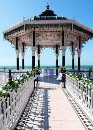
Image 1
Text - give this a grungy rougher street feel
Style - default
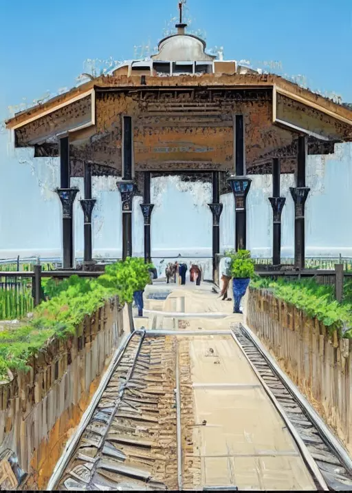
Interestingly, this has given it more of a monet vibe. I don't really get a street vibe to it, I guess turning it rougher and more street is taking wooden planks out of the walkway ;)
Image 2
Text - make the main focal point look more urban and in the hood, not so polished and refined. Make the people also more cool and from the streets.
Style - default
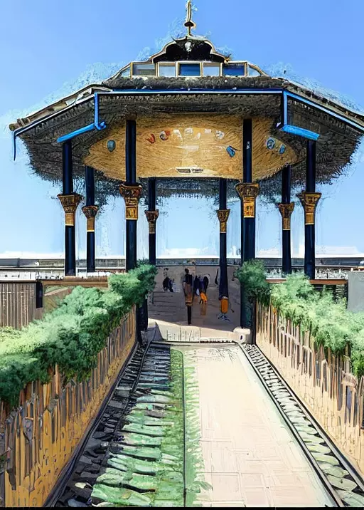
Looks like it's kept the same missing planks, but turned them into rocks with moss. I'm realizing that it's reading the shadows as another item, and not keeping the shadows, will see if speaking specifically to that aspect will change things. The ask to make the people look more urban and cool has turned them into unrecognizable humans :)
Image 3
Text - make the main focal point look more urban and in the hood, not so polished and refined. Make the people also more cool and from the streets. keep all the shadows intact.
Style - default
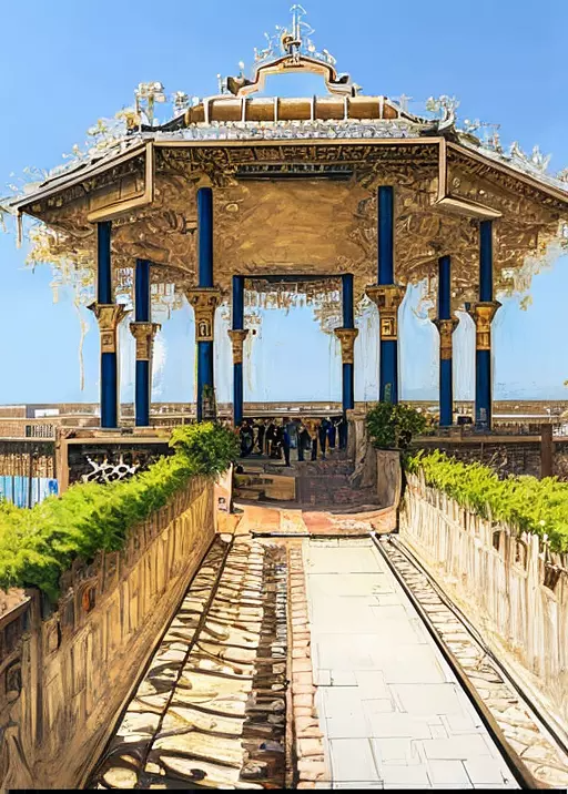
It's trying hard to keep the shadows intact, and has somehow made the rest of the picture look more like a scene from Bridgerton. It has made the band stand look quite opulent and laced in gold, which is interesting because all I did was add a line, without changing any of the other verbiage. You would think it would just adjust the shadows, but it has affected everything.
Image 4
Text - turn this entire image into a new york city urban scene with graffiti and a hard feel
Style - default
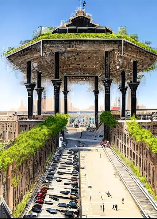
This one is hilarious because it has turned the shadow part of the walkway into a parking lot! I guess 'new york urban scene' means cram it with cars. It's also extended the back into almost a shopping mall entrance.
Underneath the roof it looks like a maze and the side railings of the walkway have become buildings, like you're walking on the streets of New York!
Image 5
Text - turn this entire image into a new york city urban scene with graffiti and a hard feel
Style - default
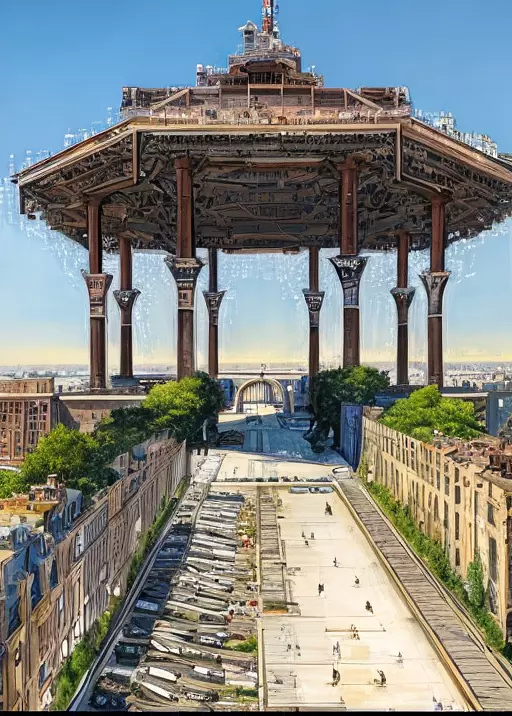
Yes, I kept the text and style completely the same for this one to test if it would be any different if I hit the generate button again and it looks like it will keep refining the image more. It's added a lot more detail and less opulence to the underside of the roof and it's almost made the back of the walkway a bridge and entrance to a highway! The parking lot is slowly turning into a somewhat organized junkyard ground.
Image 6
Text - add graffiti to make this look more urban, give pops of colour, but keep the grungy feel and make it look like a scene from a run-down neighbourhood
Style - default
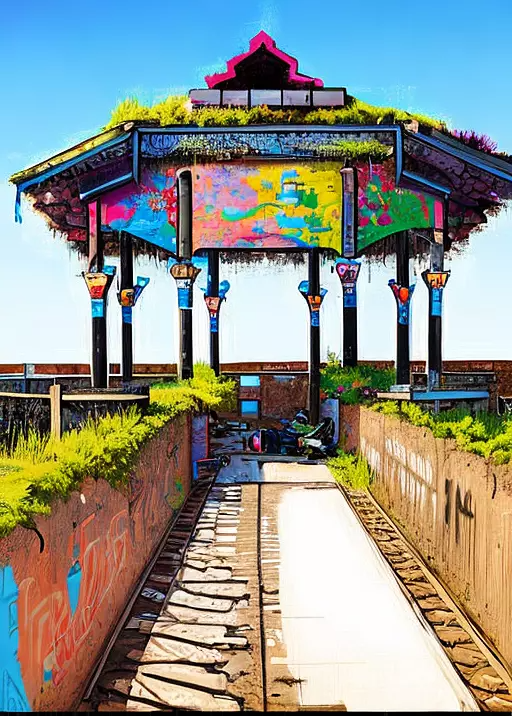
This is the most interesting one so far and the pops of colour and attempt at graffiti has really emulated a totally different feel to the picture, It no longer looks like a fancy band stand to host weddings. It's also added some sort of broken down rubble or crash motorcycle at the end of the walkway. I do like the graffiti on the railing walls. Let's try keeping the same verbiage but switching up the style
Image 7
Text - add graffiti to make this look more urban, give pops of colour, but keep the grungy feel and make it look like a scene from a run-down neighbourhood
Style - ghibli studio
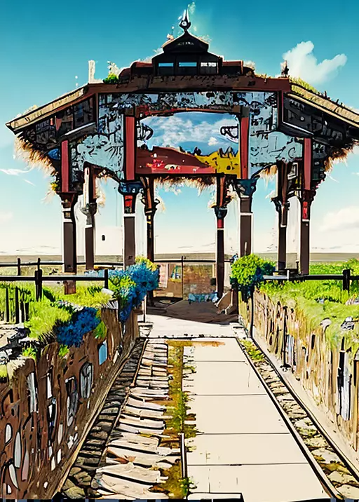
Now we're really adding elements of intrigue to what was originally something quite standard and basic. The top of the band stand almost looks like an entry into a fantasy land, which makes sense with switching it up to ghibli studio. There's almost no more of that delicate nature left to the image. Let's get crazy and give cyber punk the final try, who knows where it'll take us!
Image 8
Text - add graffiti to make this look more urban, give pops of colour, but keep the grungy feel and make it look like a scene from a run-down neighbourhood
Style - cyber punk
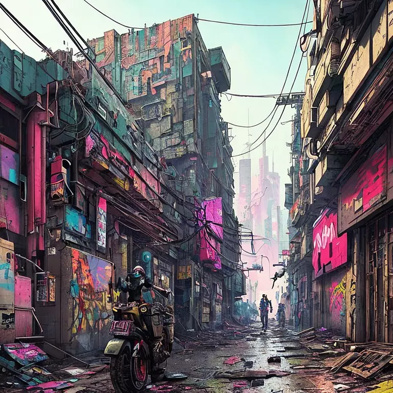
Our good friend cyberpunk always manages to go rogue and turn this into something unrecognizable to the original source image. So perhaps we steer clear of this in the future, it's not really giving us the look and feel that we want, which is a shame because cyber punk urban landscape could totally give us something extremely interesting to sink our eyes into.
Conclusion
This has been shockingly a really fun one to work with. And it's opened up a new perspective to be able to take something that is not urban or rough at all, and if we speak to AI the way that it wants to be spoken to, it could actually give us something that is completely different from the OG. So is anything possible then on AI? Within reason.... for now.... :)
We appreciate all the support we get from the Hive community. Remember that you can earn 15% APR paid in Legion, in daily dividends, if you delegate Hive Power to @stickupcurator. By doing so, you also support music and art on Hive because that’s our main focus when curating. You can buy our records on our favourite blockchain game Rising Star or at the awesome NFT Tunz. We also have our own art, video and GIF NFTs on NFT Showroom. For more information or to give us a follow, check out all our socials and say hello! https://www.stickupboys.co.uk
Fun images! It's interesting seeing what commands you used.
ye defo learning curve we just started playing with AI music too lol
I like it! Embrace AI. Except for music lol
ye it is fun, was playing with music AI a few days ago lol it is fun
The benefits of this technology are many. We see that it makes a picture much more beautiful and also provides us with more knowledge about it.
Very interesting that it had so much trouble keeping the shadows intact and replaced them very consistently. Playing with AI is a lot of fun. I'm going to have to do some more and focus only on the shadows, that might be fun!
!BBH
@stickupboys! Your Content Is Awesome so I just sent 1 $BBH (Bitcoin Backed Hive) to your account on behalf of @thebighigg. (10/50)
yes that could be good fun! Just started with the music AI now lol
I haven't tried that yet but have been meaning to try it out. Just need an afternoon to myself! I can't wait to hear how yours comes out!
ye has been fun so far will definitely be posting about it at some point