BTS of a Brand Identity Design for Crowns
My satisfaction and passion as a designer is to make sure I get to the origin of my client’s problem and get it solved.
As a brand identity designer, I have learned to always, firstly, get to know about my client’s business, and what kind of products, services, or offers they deal with. I proceed to get to know why they need me. What problem do they have? How long they have had this problem? What the problem has cost them. Getting to know all of these will lead me to know how I can get their problems solved.
I worked with Crowns as a Brand Identity Designer. The brand, being a startup, I was able to help create a simple logo depiction of the brand personality coupled with other guidelines in creating a cohesive and consistent look for the brand over time.
HOW DID THE PROCESS GO?
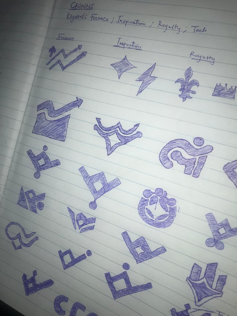
- Logo Sketching: This part is the hardest and most time-consuming part of creating a brand identity design for a business, especially startups. It took me over a week to get this logo mark drafted out. Keywords for this project were Finance, Royalty, and Inspiration. To get all of these illustrated into a simple symbol was quite tasking. I had over 20 drafts of logo sketches before the final one which was finally approved by the client.
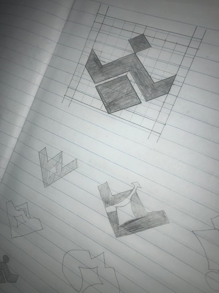
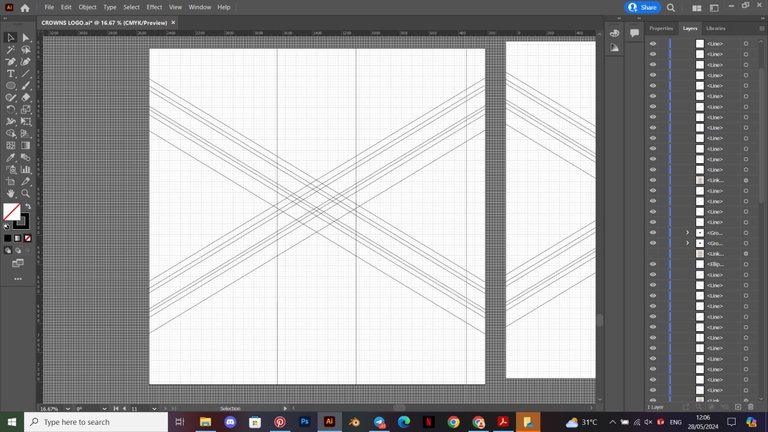
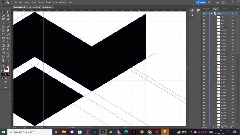
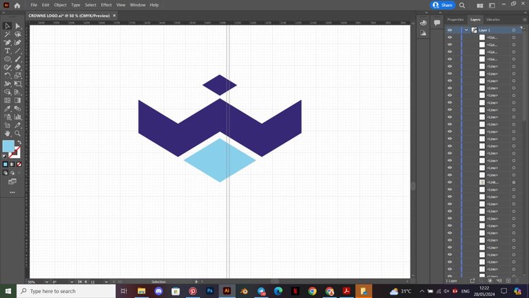
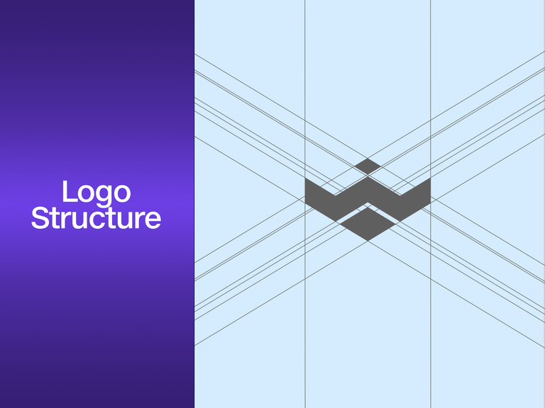
- Mark Construction: I proceeded to design the logo sketch in Adobe Illustrator. I started by creating my grid lines and working my way around the grid lines using my shape tool to bring out the logo mark.

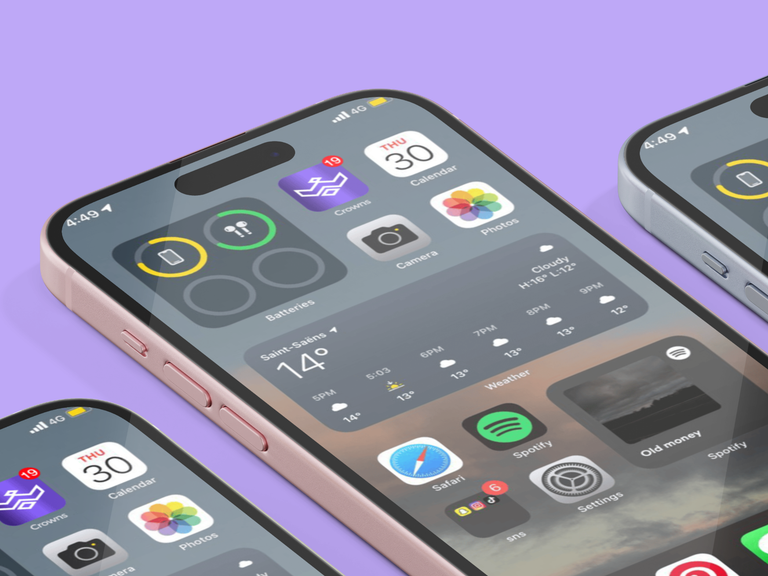
- Mock-ups: I had issues getting so many mock-up templates familiar to the brand. I had surfed different sites I know in hopes of getting these templates but sadly the good ones were paid and highly-priced. Eventually, I had to create my mock-up designs myself. I love this part so much because it allows me to bring my designs to life. It helps to see how they will look like in live objects.


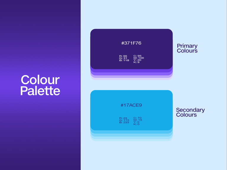
- Visual Presentation: Yes! The Real Deal. Without this, the brand has no visual recognition. I put my all into this part. Every business startup should have this. The colours, fonts, styles, and many other things you see a brand visually represent were picked from their brand visual presentation. I went on to design the visual presentation in Adobe Photoshop. Choice of colours was selected according to their personalities in resonance with the brand’s ideas and values.

Fonts! Every designer knows we can spend several minutes looking for the right one but yeah, I came up with one.
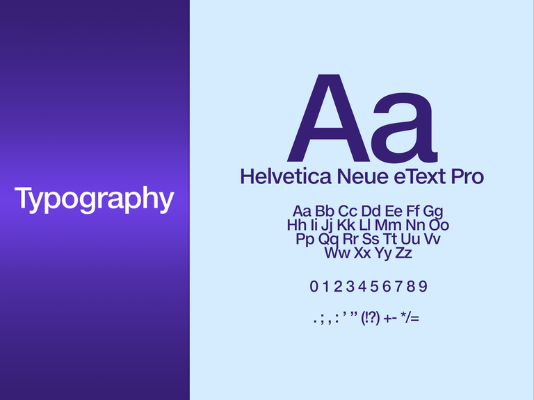
I helped Crowns create a colour palette depicting the keywords of this project.
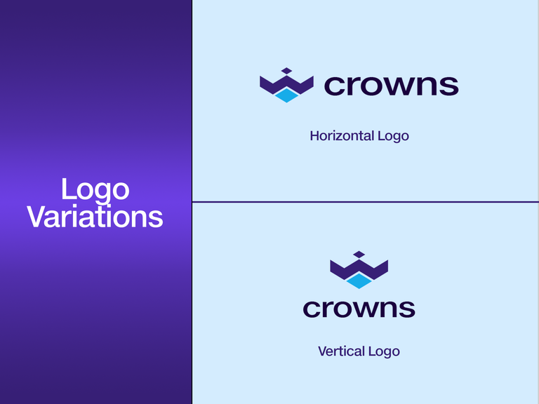
In this presentation, I displayed how I designed the mark with grid lines isolating each element in the logo. I displayed the Logo Meaning, Variations and usage, Iconography, The MoodBoard (To give my client an understanding of how and where I got my inspiration for the design), and Mock-ups (To show my client, how the logo and other brand identities will look like in live objects).



I enjoyed doing this project. Every project I have done has opened my understanding to another learning.
LET’S GROW 1% DAILY.
PS: My client has approved sharing this on the internet.
I appreciate your perfect effort.
Thank you so much. It is a great pleasure for me for you to appreciate me.
Are you using Ecency or Leo Finance to post this? Just curious because I can't seem to see images on some of the posts. I'm reading this on PeakD.
I think it's from your end. I asked someone who uses both Ecency and PeakD, and they can see all the images. You can try refreshing the page.
It's not working on both Ecency and PeakD without a VPN... so prolly on my end! Right now, I'm reading your post on Hive Blog, and it's working perfectly.
As a designer myself, I was eager to see the images. I specialize more in Brand Personality, which is a strong suit in marketing. Logo design has always been a struggle for me, so it's great to see the BTS of someone who started from sketch. Thanks for sharing!
I love how your logo turned out, but I think the images could use some tweaking. They seem too shiny and striking for the minimalist flat logo you used.
The contrast is a bit jarring—while the logo exudes simplicity and clarity, the images' glossiness might distract from that clean aesthetic. Either a different imagery or keepign the same gloss with the favicon version of the logo might help. Just my 2 cents!
Finding a balance where the visuals complement rather than compete with the logo's style would enhance the consistency of the brand.
That being said, this was a helpful share and I !LUV it. Thanks for sharing!
I'm glad you were able to see the images at last.
It's so nice to meet a designer like you. I appreciate your words and I'm glad this was helpful.
I love how you did a breakdown of this post. It shows you’re a great professional in what you do. I have learned and discovered where you pointed out those little mistakes and sure will take note next time I am working on another branding project. We can only get better.
I am glad I shared this here so people like you can help review it and we can learn from it.
Thank you so much @janwrites
You're welcome! I followed you so I can be on a lookout for more of your posts like these. It's very rare on Hive. This has been an enjoyable read!
Awww. Thank you so much, my friend. I followed you back. You're a designer too, right? I will be looking forward to seeing your posts about them too.
This is skill, my guy. Very admirable. And the process is way cooler.
I can imagine how challenging brainstorming the right concept can be, but I trust your client would have been very satisfied. I'm even satisfied their behalf.
You are welcome to share your works, tools, and processes with us in the Digital Lifestyle community.
My guy, brainstorming can be intense and demanding. I face a lot of creativity blocks when it comes to brainstorming to get the right logo concept befitting a brand.
A professional should always come up with something nice nowww. Thank you so much, man.
Congratulations @kayor! You have completed the following achievement on the Hive blockchain And have been rewarded with New badge(s)
Your next target is to reach 500 upvotes.
You can view your badges on your board and compare yourself to others in the Ranking
If you no longer want to receive notifications, reply to this comment with the word
STOPCheck out our last posts:
Congratulations on your logo artwork! I appreciate the professional work shared on-chain. Wishing you the best for your growth and future achievements. I occasionally hire artists for Hive-related projects and am currently seeking a banner designer within a limited budget which is given as a gift. Could you please contact me on Discord? I'll explain our requirements, and you can let me know if you're interested and what commission you'd propose. If we reach an agreement, we can proceed from there. Additionally, I'll consult with my colleagues to explore the possibility of allowing to share your work as a post on the blockchain.
Thank you so much @dlmmqb
I appreciate you so much. I am receptive to that. We can proceed to talk on Discord about the banner design project you have for me. But I don't have your discord. I also appreciate you making efforts to allow me to share my work as a post on the chain. I hope it turns out nice.
I am glad you came through in this post.
I am in HiveLearners, Hivepakistan, and Hive discord. It's easy to find me.