FEMALE LIGHT HEALER : HOLOZING CHARACTER FAN ART
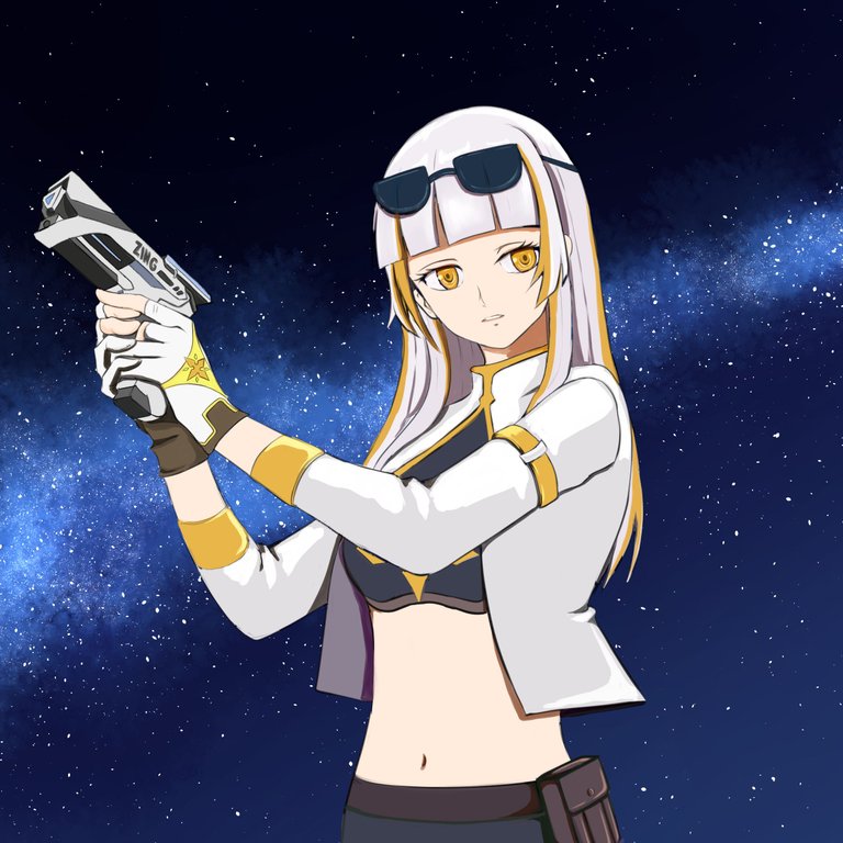
HELLO! This is my first time creating fan art in holozing that isn't connected to Zingtober. This means it’s no longer monochromatic, and the challenge of coloring begins.
DRAWING PROCESS
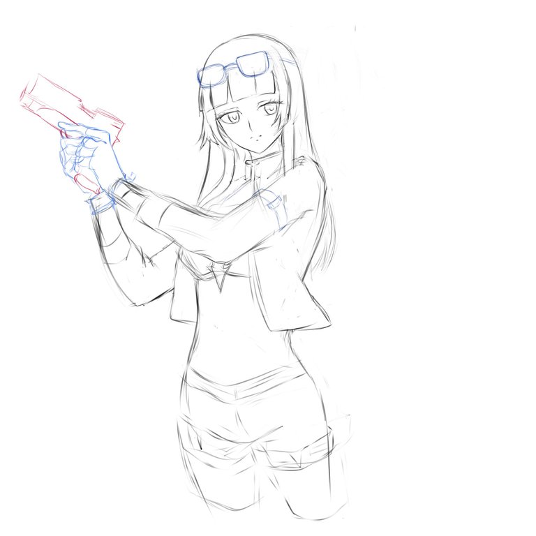
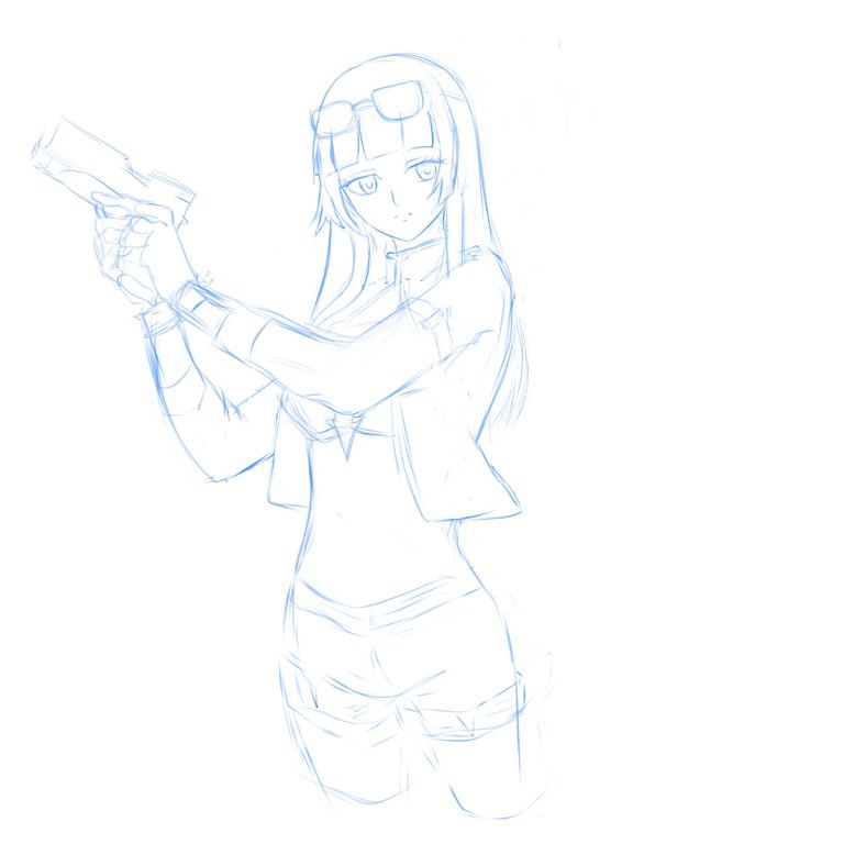
When I first saw the characters on Holozing, the one that caught my attention the most was female light healer.
Have you ever had a crush on a character? I do all the time, especially when they have white hair and are well drawn. At the same time, I often feel the urge to draw that character if I really, really like them. anyways I used a reference to it's gesture ~
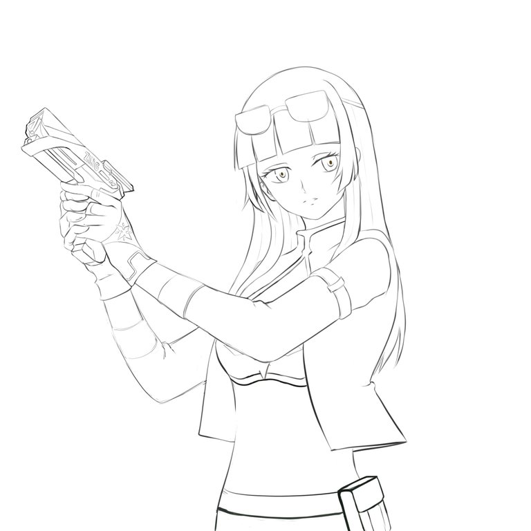
you know the thing about finding a good brush in Clip Studio Paint really helps with line art drawing, I downloaded a lot of free brushes in csp assets and I'm happy I found a good one that matches what my drawing skills I need.
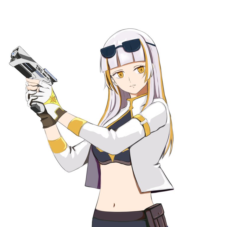
The thing about participating in the Zingtober challenges last month was that I learned how to use CSP (Clip Studio Paint). I wouldn't say I'm an expert yet, but I focused on understanding the layering functions. so far I already know how to use multiply for shadows and screen for highlights. I still need to explore other functions like add, add glow, darken etc. I'm a bit afraid of making mistakes, even if I'm practicing when I get disappointed I get frustrated and erase everything so I need more guidance, but I plan to try them out no matter how frustrating it gets, but If I have more time. For now, I want to see how far I can go with the techniques I already know.
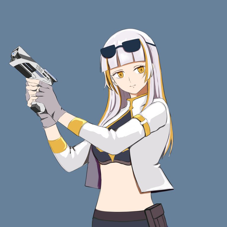
I know there’s still a lot to fix, but if I try to overdo it, I’ll end up erasing everything. So for now, I just want to keep things simple. I played around with a plain background to see what colors go well with the character, but I wasn’t feeling it. The plain look just isn’t doing it for me. Making a background takes a ton of time, and I don’t know enough about the software yet. I’ve tried looking up tutorials on YouTube, but the explanations just aren’t clicking for me. I really just need a simple guide. It’s one of those days where I need to dig around for something that makes sense to me.
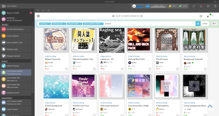
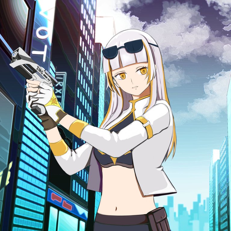
I looked at the free background materials offered by CSP and ended up selecting some good ones to download.
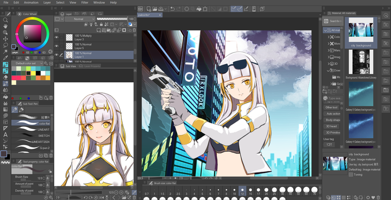
I was looking for my files in the materials and pulled the downloaded background out to see if they fit female light healer vibe. To my surprise, it actually did ! I was like, "Wow! whoever made this city background is amazing" If I find some time, I definitely want to practice working on backgrounds, especially like this city pop drawing. I’m starting to think I can pull it off with my current skills, But the more I think about it, the more I realize I’ll probably need to explore some other layer functions to achieve the same outcome.
 |  |  |
|---|
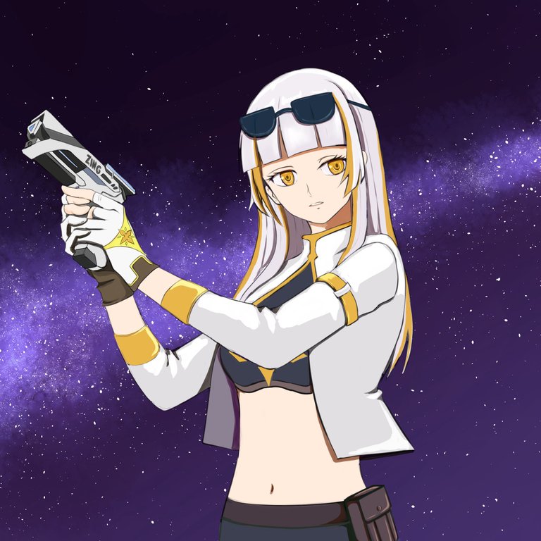
I also tried the other backgrounds I downloaded, and they still match the color scheme of female light healers. I can't help but admire the artist of Holozing. I admire the artist so much that I aspire to be as talented as that person.

Of all the backgrounds I've tried, this one's my favorite! It's not mine, but I have to give a shoutout to Clip Studio Paint material asset for it. If you use CSP and want to give the background a try, just comment for the content ID.
TIMELAPSE

There’s still a ton I want to improve and fix with the character I made. I could point out everything that needs work and fix them, but honestly, that would take me a week or two, and I don’t have that kind of time to spend on just one character right now. If I had more time without the stress of making ends meet, I could really make it shine. I’ll get to it someday, though! For now, I’m happy with how this turned out, and I really enjoyed making this fan art with my favorite character, female light healer.
Working with digital art this past month makes me not want to return to traditional painting, hahaha!
So good! I wouldn't be able to draw the right angle if I did this haha. The background and angle suits too! Although I can imagine that if the background was less vibrant and kinda blurry, it might give a more natural look.
Thankies vyankee ~ 😍
I think so too, I thought of lowering the opacity a little on the background to have more emphasize on female light healer then i still went through the full opacity ahaha I'll try to keep that in mind next time ~ ❤️
Those are the things that I learned in digital haha. I mean, we have been told that in art school too but never really emphasized or "forced" since art is more into creativity and freedom.
But for a naturalistic approach, I've learned that the colors usually are saturated and higher contrast if it's closest to the foreground then it fades in the middle ground then very less in the background. Think of the furthest distance to have like a "fog" on top of it. I have observed in various illustrations and they're right, they usually do it hahah. I guess in traditional painting we often just make everything in detailed since we don't really pay attention to the blurriness cos we thought that's how our eyes see it but in reality our eyes really just works like a camera, it has focus as well. :D
oh yeah like when doing landscape with mountains, man I clearly forgot about the basics, hahaha I may have got too used to my traditional flats type, I'll definitely keep this in mind thank you for this vyankee...😍 💞
Beautiful art work
Thank you ❤️
yey thank youuuu!!!
Wow, sexy! 😍
By the way, sometimes CSP has free clippy points for grabs, but I do not know exactly what months, just abang abang haha, or I will tell you if that happens. You can use clippy points to buy brushes and materials in the asset store. 😊
!PIZZA
madam ji ~ tell me if it happens ahahah, please and thank you! I'm curious at the other brushes that are bought from clippy points 😆
$PIZZA slices delivered:
@danzocal(2/10) tipped @jude.villarta
jijisaurart tipped jude.villarta
The background fits very well because for the futuristic vibe of the buildings. Holozing is set in the future so this looks very good together. I really like how you draw lineart. It looks like someone drew it on a paper and kept all the lines instead of erasing to get the perfect lineart.
Very refreshing!
thank you! if you noticed it I'm so thankful because it's actually what I want to achieve I've been watching youtube tutorials of digital artists just leaving their line art drawing and then do color and then it looks so cool when done, I want to have that style kind of style in digital too thank you so much for passing by ~ 😍
You are welcome 🤗
!PIZZA
It turned out great, I hope I'm as good