BioShock 2 Fan Art | Johnny Topside
Hello, everyone!
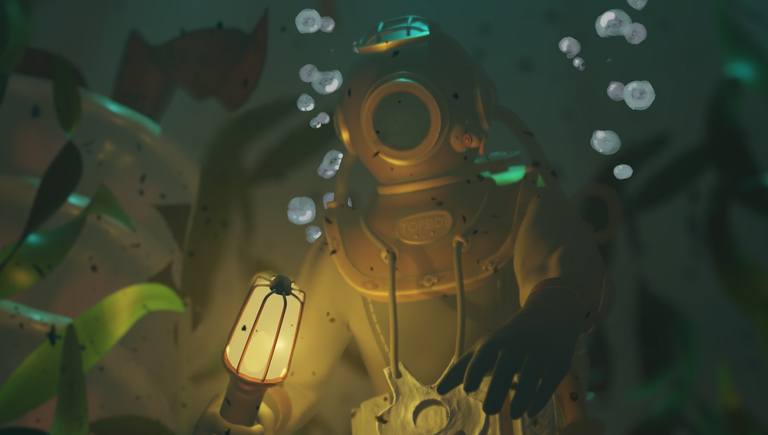
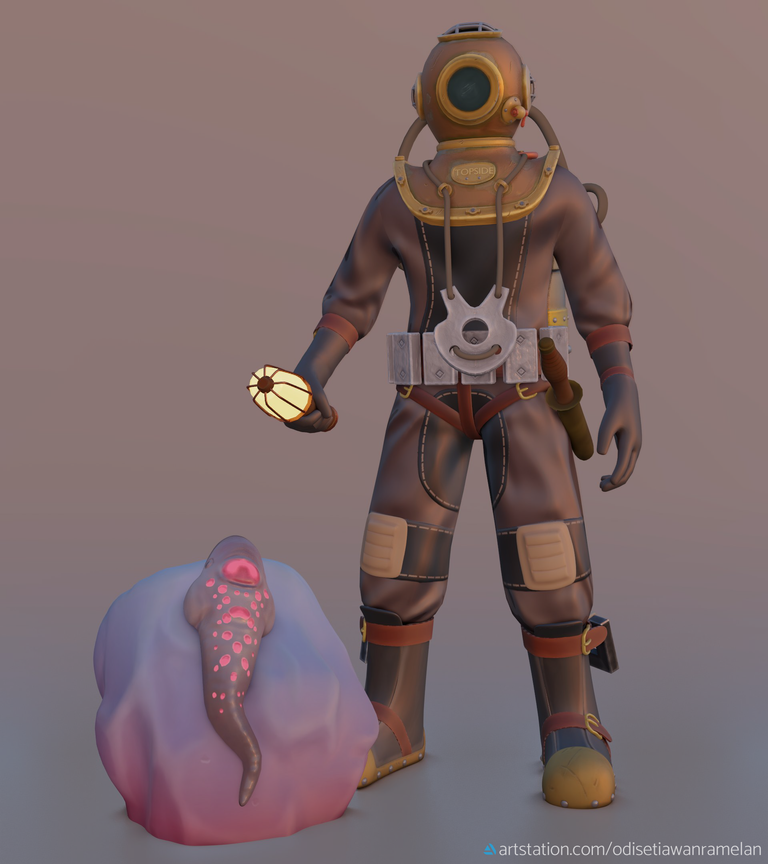
So I made a post a couple of days ago about my WIP characters—if you’re interested in checking that out you can go here—and now I’d like to share one of them that I have finished. Here’s the final render of Johnny Topside rendered in Blender 2.8 EEVEE.
This scene is about Johnny Topside—the main character of BioShock 2 before he turned into a Big Daddy called Subject Delta—discovering the ADAM sea slug, one of the main driving elements of the story of BioShock universe.
In the lore, Topside was a deep sea diver who conducted an investigation regarding the disappearance of many ships on the Atlantic Ocean. He discovered the underwater utopia Rapture, and mistaken for a government spy by its leader. So he was imprisoned in there, used for twisted experiments of genetic and physiological conditioning, and became the Subject Delta. If you play the game, you can visit the horrid place where all this happened.
Since we only know his history from conversation, I put my own personal touch to his appearance in this 3d model.

I started to learn how to use normal map in this project and wow, is it amazing. Normal map is like… arcane magic. For those who don’t know what it is, normal map is an image texture that contain not the colour of the model, but angle information of the surface normal.
The result is it give the illusion of bump, crevices, and all the little details that would otherwise require hundreds, if not thousands, of extra polygons. So, in short, normal map make low-res object look like it’s high-res without costing (a lot of) extra performance. For those who are more savvy about this, correct me if I said something wrong.

Click for full-res
In this character, I haven’t understood the most optimal use of normal map yet as this was my first time, so there’s not that much different. I only applied it on the suit, helmet, and the slug. But in my other and next characters, I hope I can learn how to use it more effectively real quick. I don’t want to ‘fix’ this character because I’m done with it.
“Wow, you’re so lazy!” Well yeah, but no, actually. I learnt from other artists that it’s not good to spend too much time on one personal project like this so I decide to move on.
I hope you like this rendered scene. If you have any question, critique, suggestion, or simply appreciating my work then feel free to leave them in the comment below. Thank you for visiting!
Oh oh oh, and I'd like to say thank you kindly @loreshapergames for the SBI share! Much appreciated.
©2019 Adam Rainite Lawsone




Hi rainite,
Visit curiesteem.com or join the Curie Discord community to learn more.
Would you kindly take my gratitude?
Great work on this. It turned out very well and I think it is good to spend some time working on what you love:) Especially with these results:)
Thank you ^^
Yeah I spend a lot of my time making 3d characters, but I'm trying not to stuck too long on just one. I found out that's not a good habit for an artist apparently.
People have different processess.
Congratulations @rainite! You have completed the following achievement on the Steem blockchain and have been rewarded with new badge(s) :
You can view your badges on your Steem Board and compare to others on the Steem Ranking
If you no longer want to receive notifications, reply to this comment with the word
STOPVote for @Steemitboard as a witness to get one more award and increased upvotes!
Normal or displacement map? It looks like it's throwing shadows and I didn't think normal maps did that. Maybe I need to check terminology seeing as I never know the names for what I'm doing (which always makes communication entertaining XD).
My youngest walked in while I was scrolling down and said "That looks really familiar. It looks like something from Bioshock. That slug definitely looks like something from Bioshock."
I said "It's Johnny Topside," (which means nothing to me as while I've seen him playing the game I haven't played it myself and know just enough to know abuot the slugs and Big Daddies and Little Sisters and Big Sisters and...not much else XD) and he started excitedly flailing and "I KNEW IT!" XD
Did you do the entire scene in Blender? Looks great :) I'm kind of looking forward to 2.8 but still too lazy to just download it XD
I'm glad that someone is so happy to see this as much as flailing excitedly xD because they knew where it's from. If you play BioShock chances are you'll either love it so much or hate it. Some hate it with passion. I personally can't get enough of the series but sadly it ends. So yeah, that's why I pour my admiration into fanart. I wasn't so confident about the result so thank you very much for the compliment (´∀`)Why embarrassed? If you got the term wrong the worst that's going to happen is that you're going to momentarily confuse whoever it is you're talking to if they happen to be more familiar with it than you are. The biggest problem I have with not knowing terms is having trouble searching if I need help with something XD
On this particular example my understanding is that normal maps just make low poly look like higher poly without adding geometry, but displacement was better if you wanted better shadows and to actually see bumps close up (because normal maps apparently didn't do shadows well or at all and if you zoom in enough you can see that the bumps are a lie XD). I don't know if there are different ways to use them, think just the painting is slightly different? I've just been plugging a map into the "displacement" connector on the output node and that seems to do the job :S
My youngest son loves Bioshock :) I haven't had time to game for a while x_x
Whenever I do, I do feel like I shouldn't be embarassed that much about it, but somehow I just… can't handle my minor mistakes. It did happen quite a few times actually. In public. On some art related Discord servers. God, now I remember it again ╥﹏╥
I watched someone modelling with displacement on YouTube before and it was neat. They simply paint the surface with the colour between black and white and bam! The high and low on the surface was made based on how dark/light the colour was.
I also tried to see my normal mapped model in different angles and, well, it's like street magic trick. It's cool, yes, but it's actually a lie XD Whatever 3d modelling trick out there I'm willing to try it. Maybe after I learn texture mapping like, roughness, AO, metallic, etc.
"Texture mapping"… I hope that's the correct term. Otherwise, ugh! (-‸ლ)
It is a bit magical XD though I use 3d Coat rather than Blender to do sculpting, retopo and all the mapping.
I still haven't figured out AO. Technically it's not that hard, just haven't grokked why I would need a map for it o_O
Congratulations @rainite!
Your post was mentioned in the Steem Hit Parade in the following category:
wow that looks amazing. I like the shape and size of front mirror of the suit, its just not too big like those of astronauts and not too small to be impractical. The diameter is such that the viewer's eye would find it unique and catchy. I like the neon pink creatures lying on the stone, specially the angle on which it is lying and looking towards the front side, I am guessing its a lizard probably or some mysterious lizardy creature. Amazing share, I got the chance to watch a work that I don't see often and yes congrats on your curie :):)
Oooh thank you! I put so much thought on the size of the helmet and its features so I'm glad it turned out fine in the viewer's (of this artwork) eyes too ^^
That creature is a slug actually. A slimy, wiggly sea slug, which is the animal I don't really like. I cringed myself a litte sculpting it haha
Oh awesome, good to know that you actually had to put lots of thought work in that fine helmet. A slug,,ohh did not know about slugs yet, but interesting that you chose the one you don't like hehehe.
Thanks for the shout-out! I love giving people who don't yet have SBI shares some if they're making good content. It's not much, but it helps keep channels growing.
You're welcome! I didn't know about SBI, so I went to the linked post in its blog and it says that firstly I should say thanks to the person that gave me the SBI share. So yeah, thank you for the SBI share, and for thinking that my content is good enough for this ^^
Cool scene. It looks as if the slug caused quite an impression.
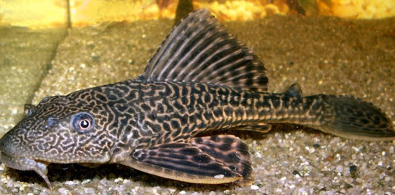
It actually made me remember a river fish I used to catch when I was little.
We'd go to the river and get our hands through the rocks and vegetation by the river bank. It was risky but fun. When the water was muddy you never knew what you'd touch.
We called it Guaraguara, they are of the Loricariidae family.
I liked the composition of your art. The light effects are great.
Ooh that fish! Does the name Guaraguara have an English translation? Or is it just a name? I'm asking because in my place we call it Sapu-Sapu. The literal translation of "sapu" would be "broom", but the name "Sapu-Sapu" means something like "cleaning", named after their habit of eating algae in the fish tank.
Playing outside like that I don't mind getting injuries, really, what I can't stand is accidentally touching something slimy, squishy, wiggly like... I don't know, an alien? XD
The only time when I can acknowledge my own skill is when somebody else says that my artwork is good. In this case, I wasn't so sure and confident about my lighting, so I'm glad that you think it's great. Thank you for that ^^
Interesting.
Guaraguara may very well be an indigenous word. I don't know, but coincidentally, the fish is also known as chupa piedra, stone sucker, because it sticks to stones undet water
Interesting write up and beautiful rendering, I have been wanting to try blender out for some time.
Thank you ^^
Perhaps the full version release of Blender 2.8 around July will get you interested.
Awesome
Thanks!
Awesome renderings. I always love anything bioshock. i also liked you WIP characters. Fan Gaming is the best! Thanks for sharing!