REDESIGNING THE SMFEST2024 WEBSITE
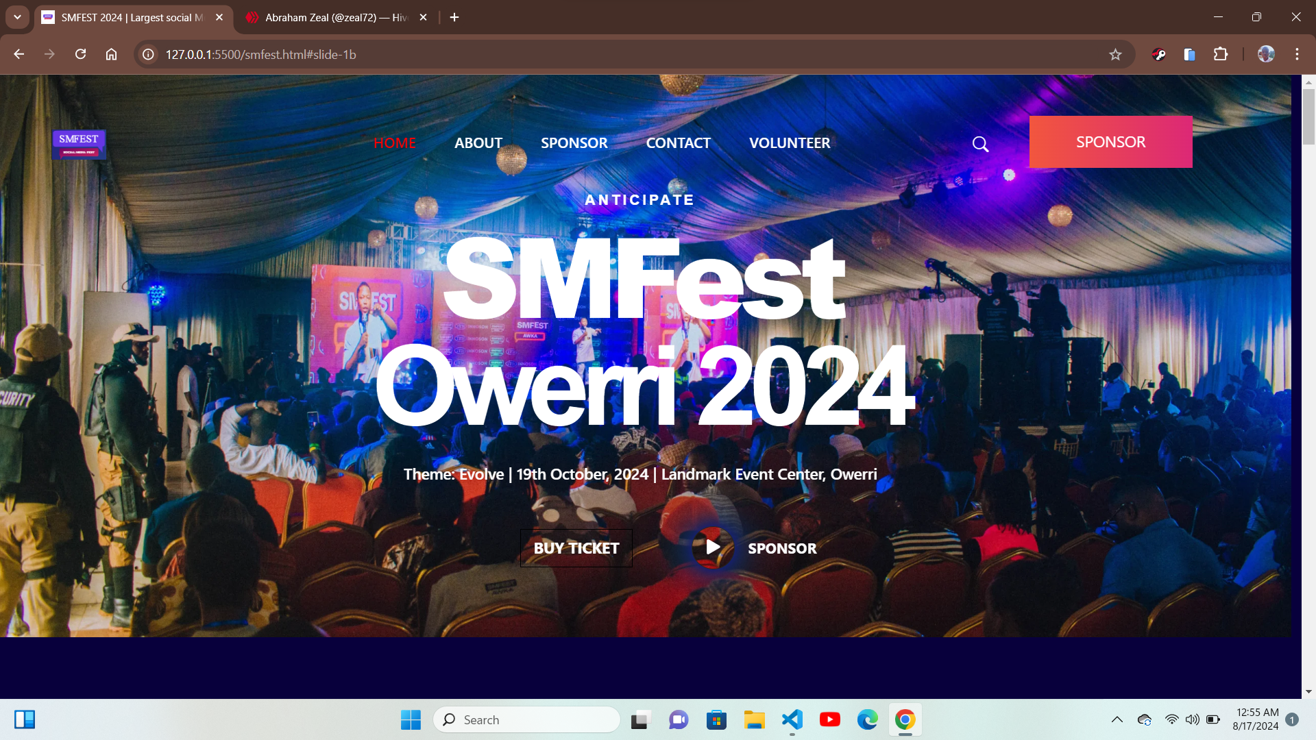
During the last week the front-end track of rad5 tech hub was all about their mid -term project which at the time was the duplication of the smfest2024 landing page ,which we were expected to complete in a week time, using html, css and the css framework of bootstrap, at first we were astonished by the sight of the elegant design of the landing page , which included a lot of animations, which was what made it seem unachievable within that time frame, but there was no opting out, we set to work immediately, this is the fun part .
I started with carefully analyzing the structure of the page which was very crucial to developing a very responsive design, then i set out to get the needed images in preparation for the task at hand, midway through the weekend i was done with getting the materials needed. and then i set out, with the header, before the end of the weekend i was done with the header and the hero section, but the header was not without its own challenges, the major one being that the button had a certain type of animation where the texts in the buttons slide out on hover to present a new text, but with research and help from friends and fellow developers i was able to achieve it,
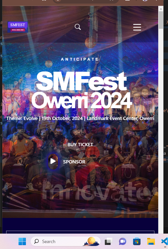
mobile view

desktop view
and by the end of the weekend i was done with the header and the hero section.
With that out of the way ,i proceeded to the next section of the page which was a table of numbers, which had a special effect which was achievable using the javascript programming language, but since i had very limited knowledge of the language i skipped the effects , and continued with the design , and not to forget it had to be mobile responsive, so the practice that proved to be so helpful was me using a mobile first approach, then later optimizing the design for larger screen sizes
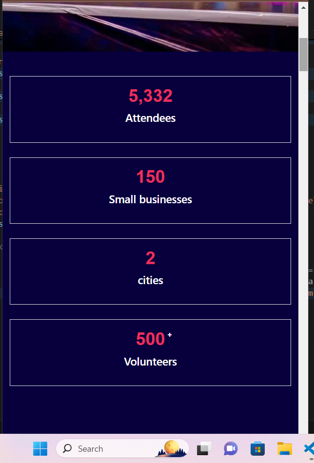
(Mobile view)
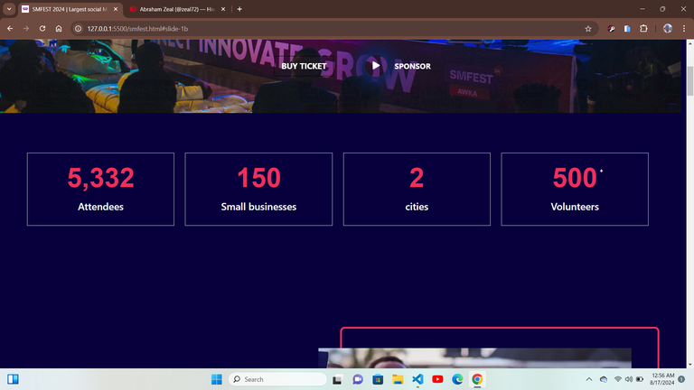
(Desktop view)
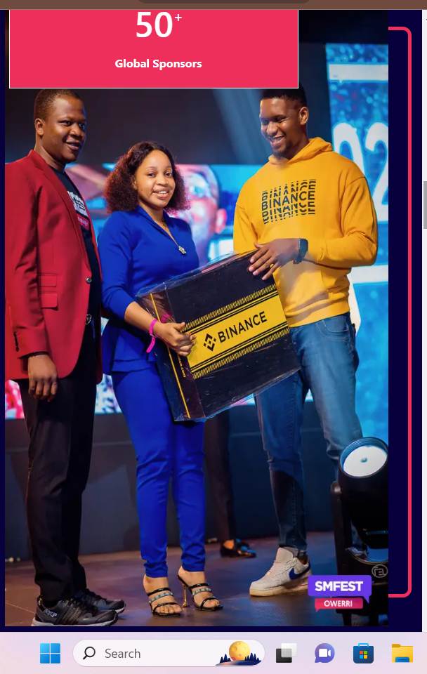
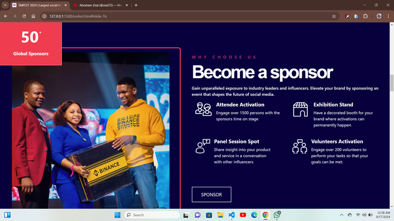
That brought me face to face with the most demanding aspect of the design, which was a write up and an image that was slightly placed out of its borders, placed side by side ,not to mention that it had animations within it that was also responsive ,and had to be perfectly fitted to look exactly like the original , it took me a while but i was able to get the work done and it was quite a relief, but then came the issue, while trying to optimize it for different screen sizes the display went crazy ,it was really not so encouraging but I had to find a way to fix it , but finally I was able to complete it
Which then looked like this
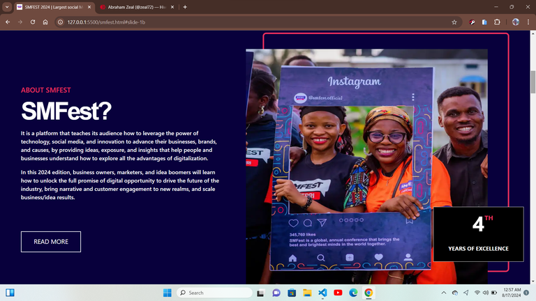
(Desktop view)
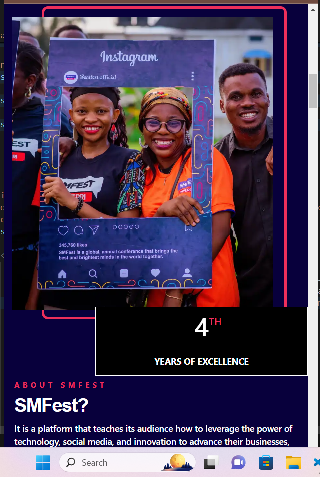
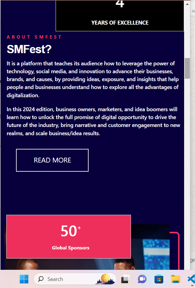
(Mobile views)
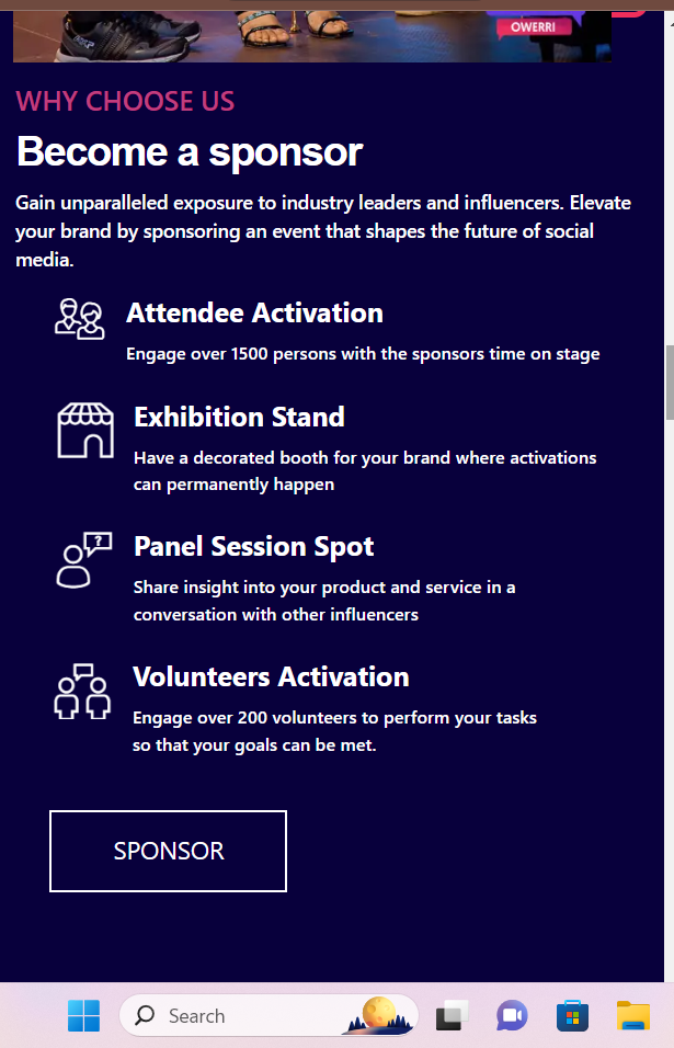
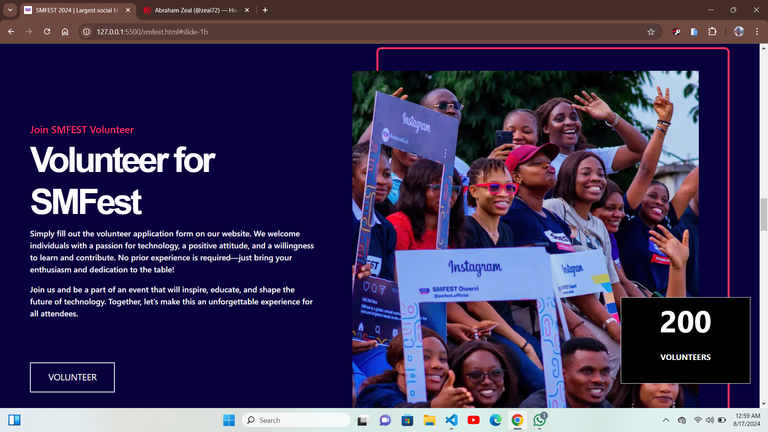
The next section and the one that followed was just reverse positions of the last section so it was pretty much easy around those areas as all I had to do was reverse structure them , to give me what I needed
Which is this

But there was still more to be done, the next section was a carousel section that include two image slides displayed at once that slided out when a button by the sides was clicked, it was easily achievable using bootstrap carousel, but I wanted to do it using html and css, so I read some documentations from the w3schools library and a couple of videos from youtube proved helpful, as they helped me get the job done to achieve some thing like this that was also responsive .
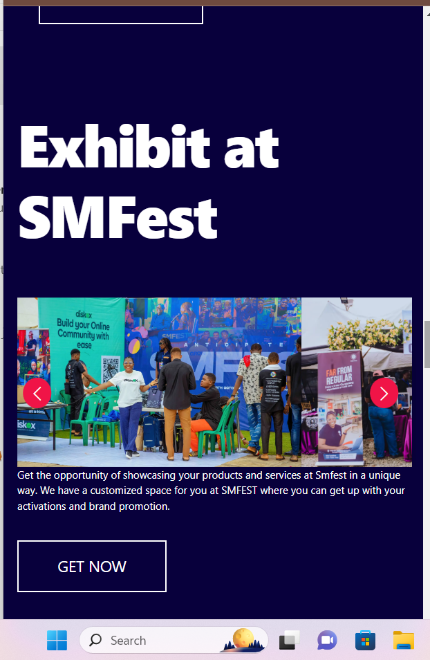
(mobie view)
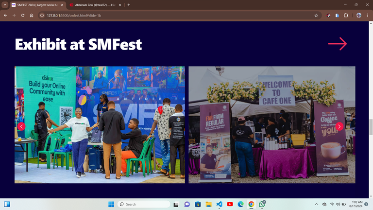
(Desktop view)
The next section was pretty much the same thing, so it wasn’t much of a problem, I just had to replicate the first one and make some little adjustments so it could fit in well, both on the desktop and on mobile
To get this look
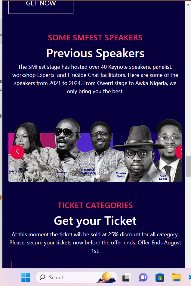
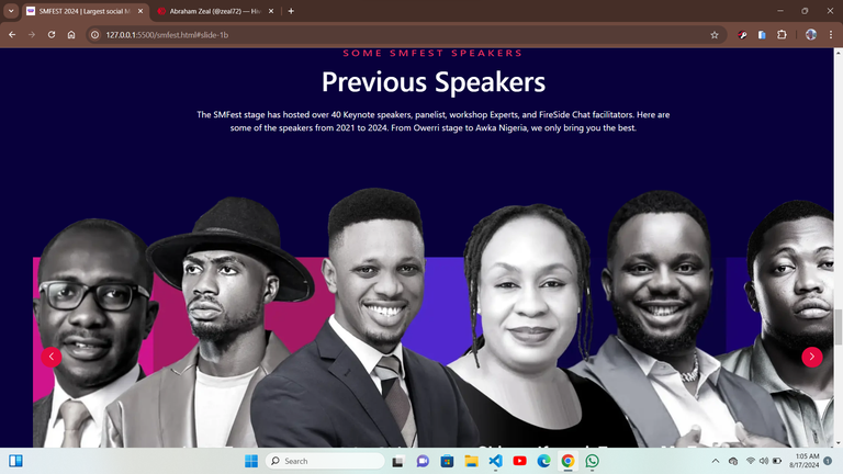
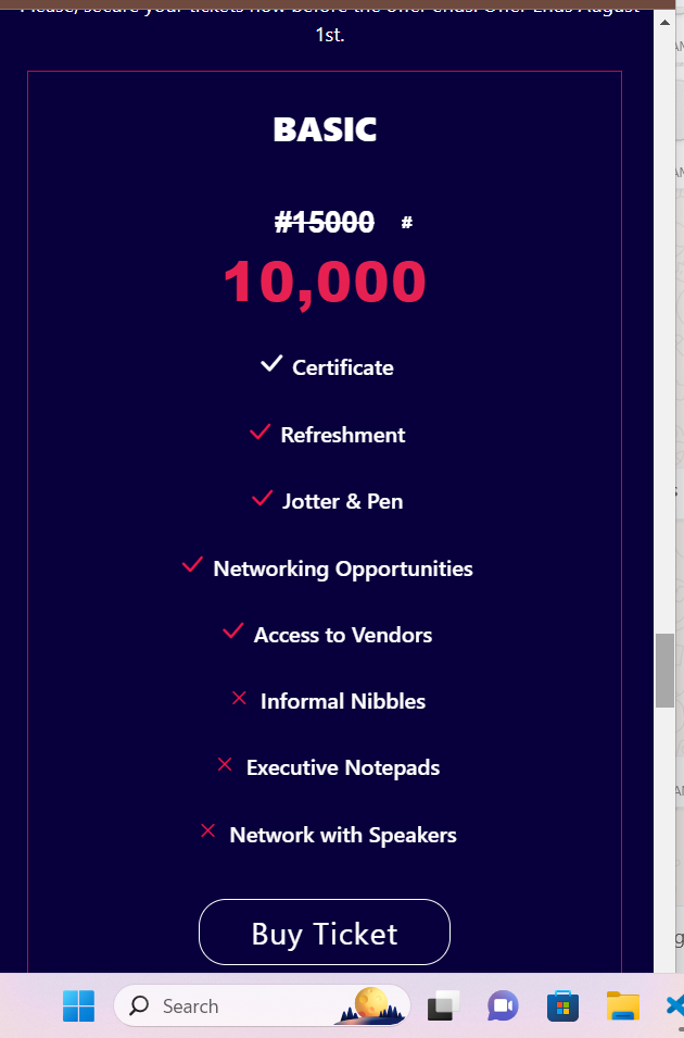
Now it was almost getting to an end I got to the last part preceeding the footer, it was a table that also had a special effect on hover, but was simple to replicate, and got over with that as the display was pleasing
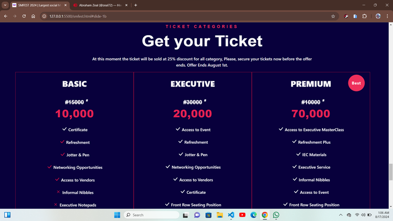
Now the footer was the last part, and together with a close friend we were able to replicate that within a small amount of time, and we were able to complete the project on time, and this was what the footer looked like
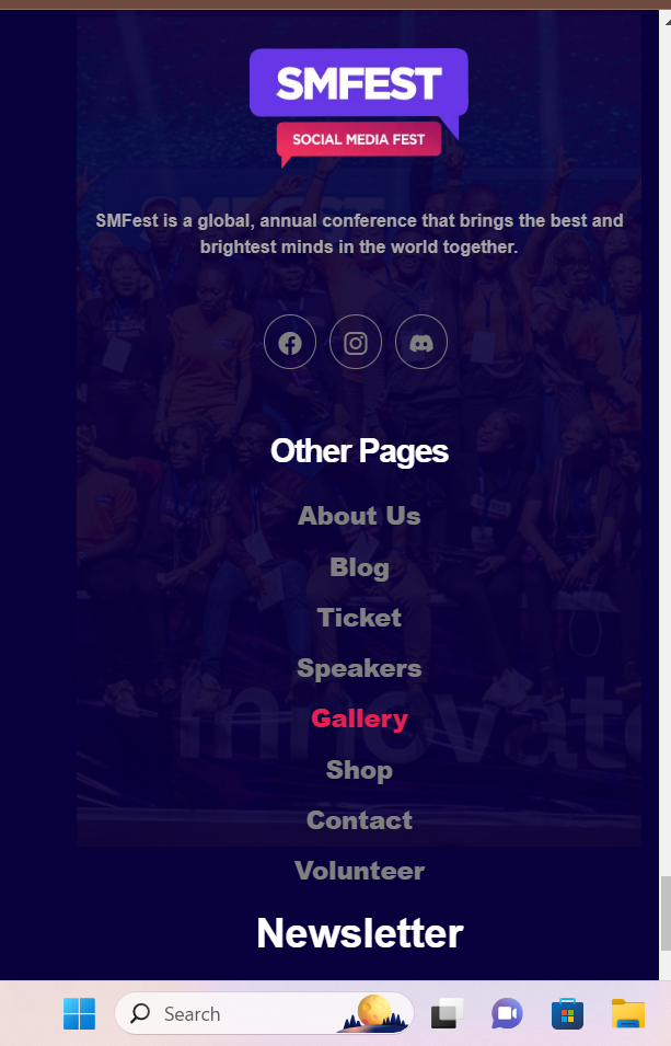
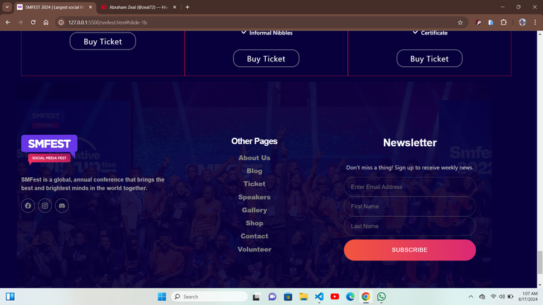
Though our instructor was instrumental in helping us ,make sure the design was good , as he pointed out areas of improvement and corrections, so far this project has really shown me the great power in team work and collaboration as a developer, and I feel that is a very valuable skill every developer should cultivate.
meet you on the next one !!!
Posted Using InLeo Alpha