Ocean Healer
Holoooooooo, Holozing Community!!
Today I want to show you what's new that I've created for the @holozing contest here .
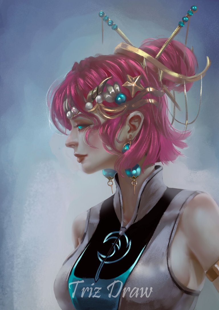
This time I went with the Ocean Healer, 'cause with the others I've seen a bunch of things, and this one I've only drawn once. This drawing, even though it started off a bit shaky, turned out pretty nice in the end, I think!
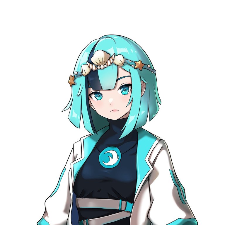
About the proposal for this design, I've completely changed the design and color, though the hair still remains short, which in the initial idea, I wanted to add two longer strands of hair. But well, after changing everything I was doing, I just left the hair short.
I made a video for this, in fact, I uploaded some gifs that were part of the video. For some reason, one of them didn't want to upload, but well, the images are still there.
Here are some pics of the process
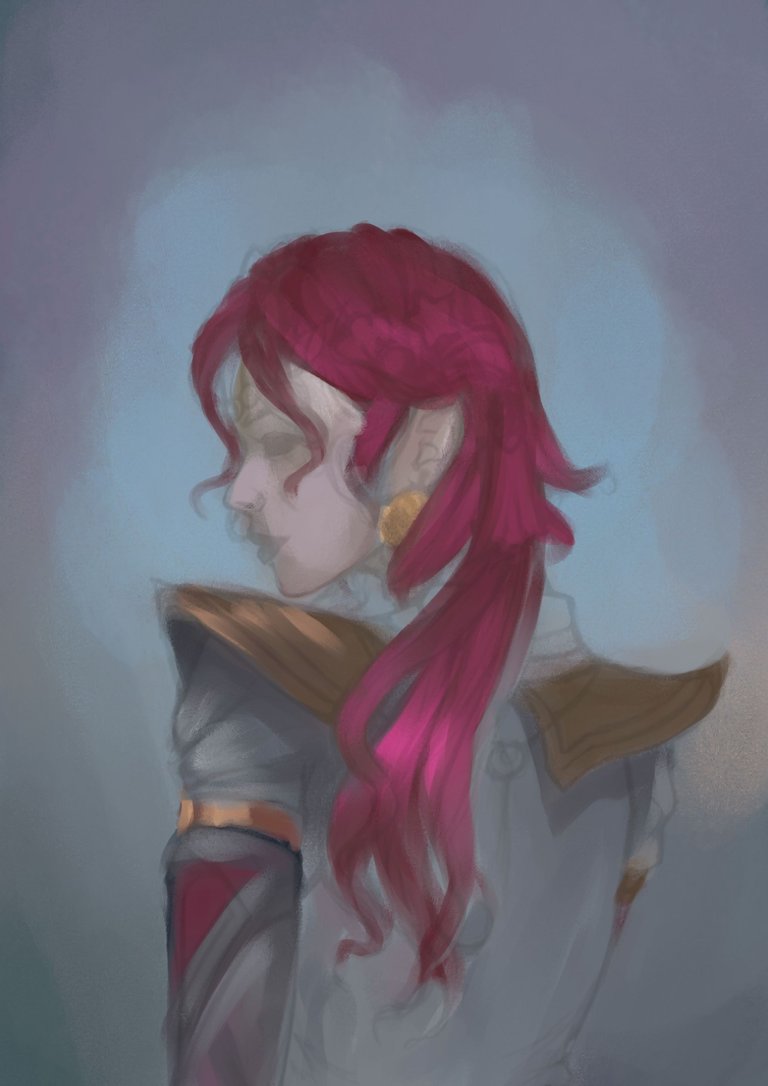

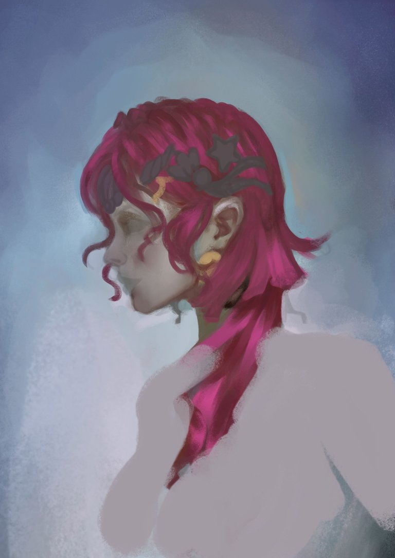


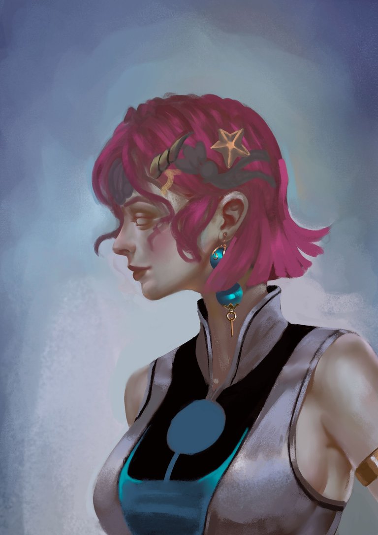


I made some regular adjustments like lights, intensity and added the tiara after all those modifications. After detailing and making those adjustments, I considered this portrait finished.
Thank you very much for taking the time to view my work.




Woaaah Truly amazing! I love how the strokes resembles like a traditional brush strokes ! 🎨✨
Thanks, friend ! Glad you like it! Oh yeah, those details are awesome, though it's not like in Corel; in Ps, you can get some really good ones. Smooth things are nice, but textures are exciting too hmmmmm it's like seeing a bit of traditional art.
If in PS you could accumulate and see the amount of paint and strokes you put in a drawing, it would look more like impasto, with a very thick layer of paint, haha.
Good morning dear friend @yanes94, how are you?
I loved seeing the creation process, the final work is beautiful
Beautiful work, I appreciate that you let us know all the details
have a great day
Hey, thanks! Good day to you too!
I'm glad you enjoyed the process, even though I've never posted a GIF step by step before. I fixed the format to make it look bigger. Appreciate you stopping by and checking out what I did!
Thanks a bunch!
Deyymmm Good as always Dear, I'm jealous with your talent.. HAHAHA
Keep up the good work Dear.
@callmedaks, sorry! You need more to stake more $PIZZA to use this command.
The minimum requirement is 20.0 PIZZA staked.
More $PIZZA is available from Hive-Engine or Tribaldex
🙈🙈 thanks 🤣
In love once again with your work, this illustration is incredible ❤️
Thanks Mario!
Este personaje con el cabello fucsia, quedó muy llamativo se ve muy bonito
Muchas gracias!😉