Architecture Design of Mineral Cafe
Architecture Design of Mineral Cafe

Mineral Cafe is a unique cafe in terms of the choice of name, as well as the icon that is used as a sign for the cafe, namely 3 Stones, which is also unique and makes this cafe look different. Mineral Cafe is a cafe with a home concept. In a video blog, the owner, Natasha Rizky, said that she wanted to evoke the atmosphere of home when drinking coffee. Yup, this cafe is owned by an Indonesian actress.
So this is Mineral Cafe which is use old house.
- Old House Full Of Philoshopy
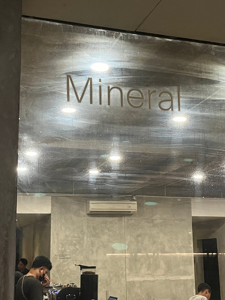
Before deciding to visit Mineral Cafe, I already knew that this cafe was owned by one of my favorite actresses. As soon as I found out that Mineral Cafe was not far from my house, I came here hoping to enjoy the menus at Mineral Cafe like at home.
Mineral Cafe is located in the Gandaria area, South Jakarta. This cafe was built in an old house, the building of which is still typical of the Netherlands. Consisting of two floors, Mineral Cafe is not as striking as a cafe. Apart from that, Mineral Cafe uses natural lighting which is renovations were carried out by removing the roof and several doors. Apart from that, wood frames were also added to the furniture which we can see around it.
- Indoor
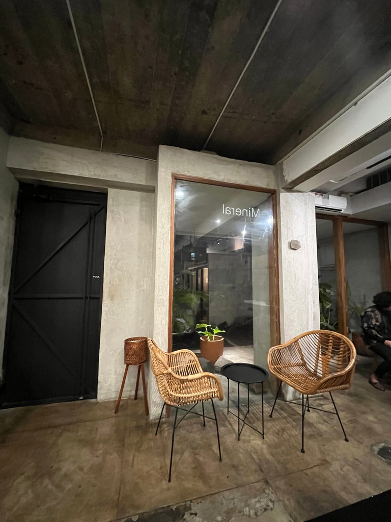
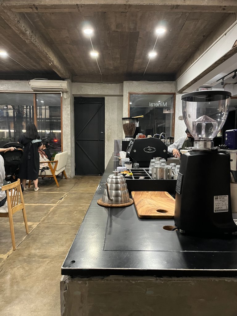
As I said before that this cafe is renovations results from an old house. You can still look at the interior which still typical Dutch. Even the floors is still rude. The walls looked like they had just been re-cemented. They were added the barista table in the middle of room with three walls behind this. I guess that was the bedrooms in that old house. As they said that they were removed the doors.
That re-touch of interior design made the Mineral Cafe look unique and different from aother aesthetic cafe shops. As they name, Mineral Cafe has a natural room color concept like their icon which combines three natural stones. As long as the room is clean, interior looks aesthetic and fit for millennials and gen z for hang out.
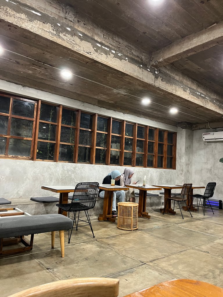
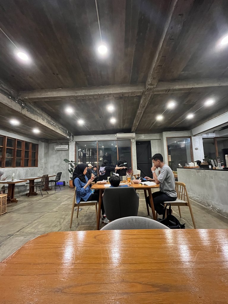
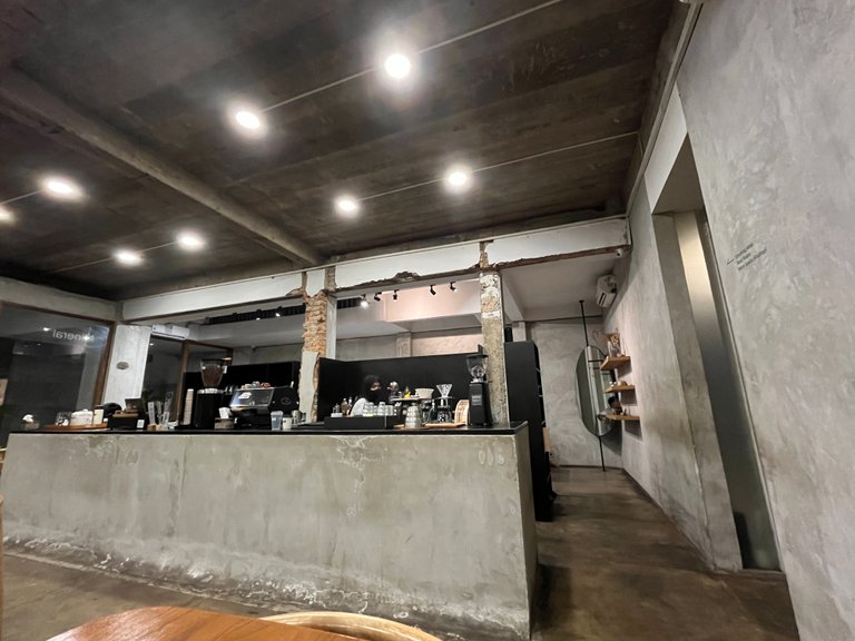
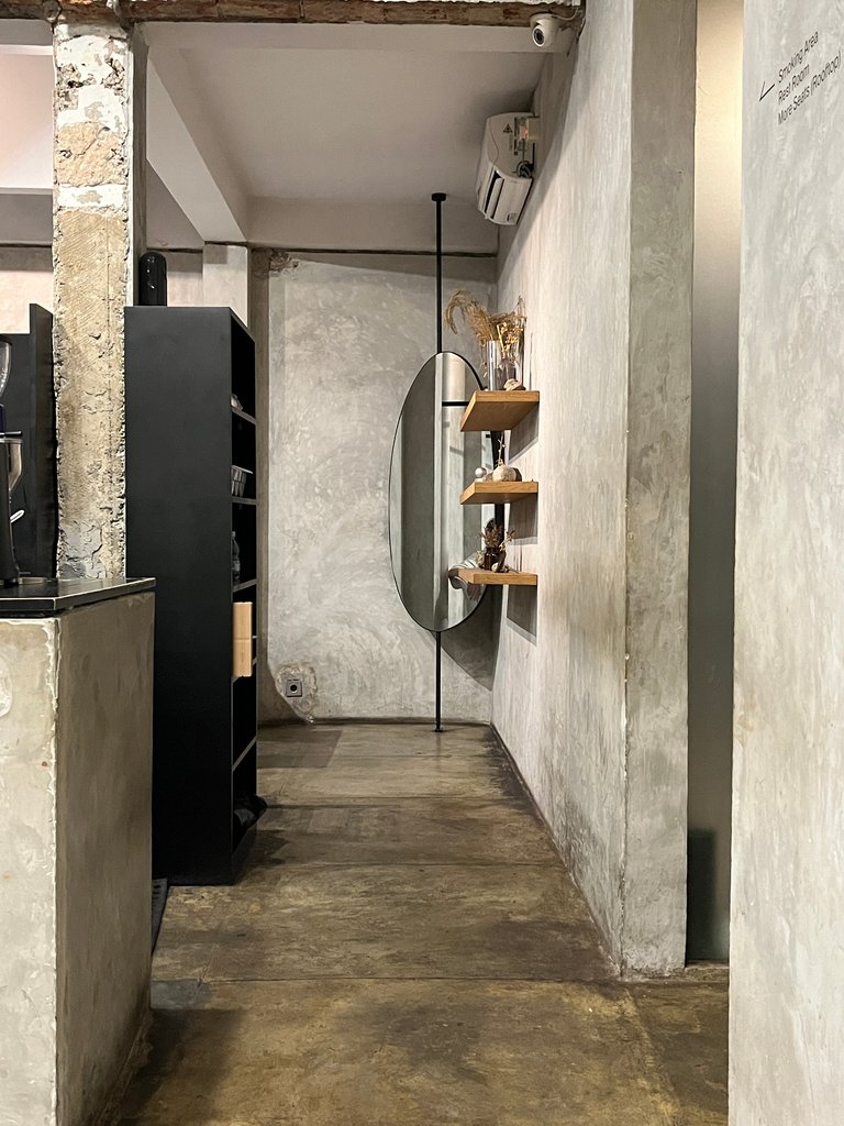
The furniture they choose is also very unique. Not all furniture is the same. Several types of furniture that fill the room. Namely a large table with chairs made of woven rattan. There are also chairs made of iron with a small wooden table. What's interesting is the seating made of cement, which is permanently attached to the wall. They just added a seat cushion. That's very unique.
- Rooftop
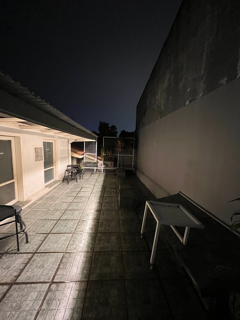
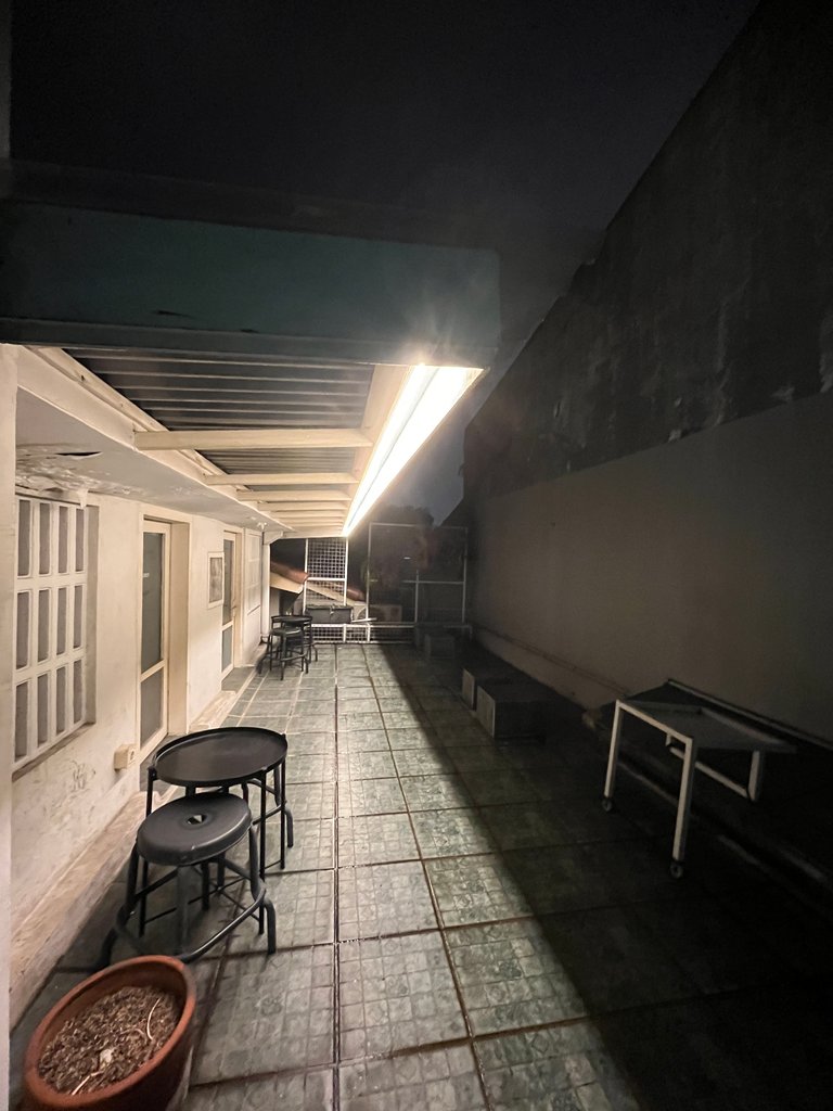
Unfortunately, I visited Mineral Cafe on the night day, so the rooftop space does not look good. As their motto, that they has natural lights, which means they have no bright lights, but dim. It is nice to sit down at the rooftop and enjoy the sunset. The weakness of this space is when a rainy day, because there is not enough haven.


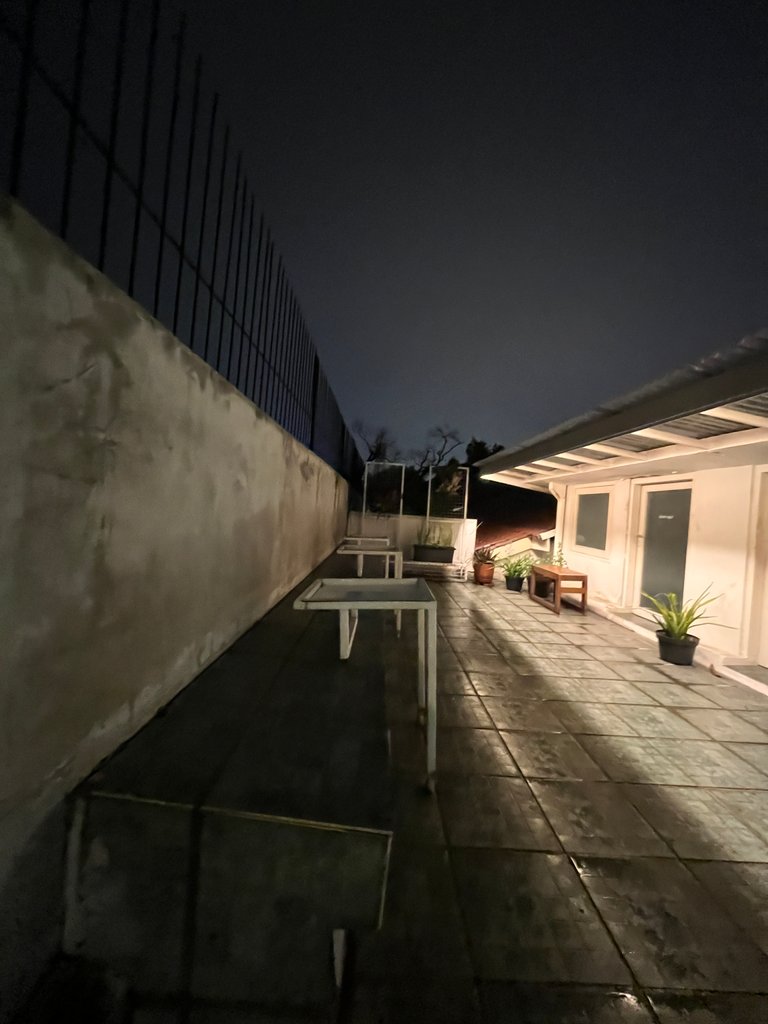

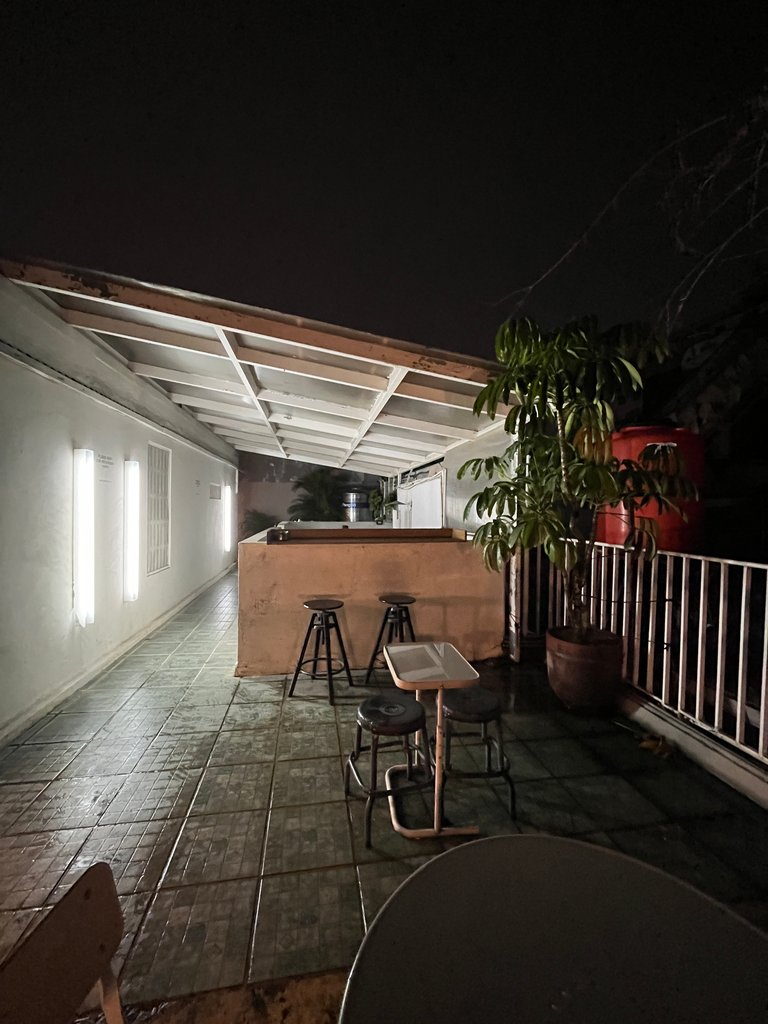
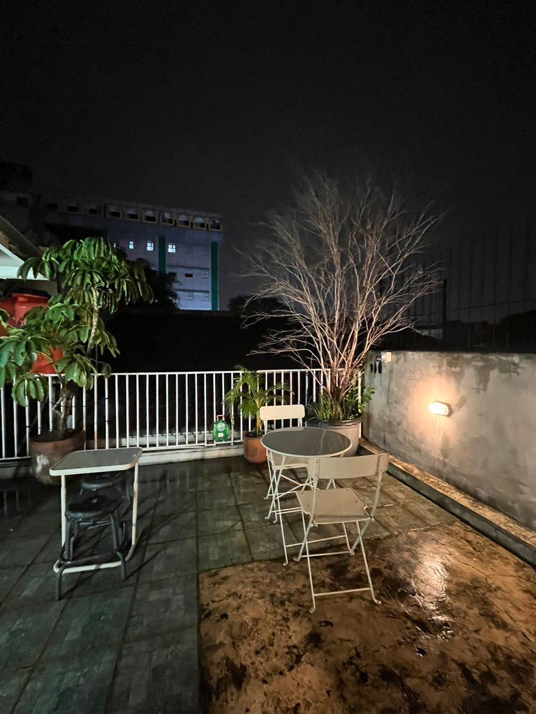
For this space you can feel the old house. If you take your family here, you will not feel that is a coffeeshop but your grandmother house.
Mineral Cafe have no striking ornaments who will make their cafe look too much. This is made the Cafe look cozy. Even though the architecture and polish they use look simple, even modest, this cafe still looks elegant and pricey.
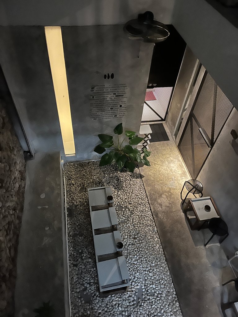
In my humble opinion, this cafe reflects the owner's simple personality but still looks classy. Yup, as a fan of Natasha Rizky, we know that she is a simple person, unlike most artists.
What do you think?
Thanks in advance, to read my blog and hope you like my post!
See you...
All photos taken by my Samsung Galaxy A22

Vivie Hardika
Hi, Halo, Annyeong! Welcome to my galaxy.
I have so much imagination in my head. Something that I can't achieve as a human and as a girl. So writing is very challenging. Since Junior High School, I have written whatever I want to write. Without skill, I just write what I want to read. Now I have 12th published novels and all of them are romance.
Yeah, I proudly say that I am a passionate author, traveler wannabe, and blogger.
It seems like this cafe is very comfortable for a writer to work.
Yup, you can work in that place..
Today's engineers are creating more beautiful designs that people like.

Thanks in advance
I saw it, it's very scary, sis. The cafe's paint color also seems to have a horror feel. I'm sorry, sis.
If there is no lighting, it will be creepy. But I think It is not that scary...
Congratulations dear @viviehardika! We are delighted to inform you that your outstanding publication was specially selected as an exclusive feature for our Curated Content Catalog and was awarded RUNNER UP in Architecture Anthology™ 77. More power!
Thank you for subscribing to Architecture+Design, an OCD incubated community on the Hive Blockchain.
Hi @aplusd thank you so much. I already stopped by...
That is wonderful dear @viviehardika. Thank you for always sticking with our beloved community! 😀