Playing with AI art - To Gak or Not to Gak - Let's take a gamble on some graffiti art generation
AI
Now let's take an iconic building with some amazing graffiti, to see if we can transform it into a more interesting story with an urban landscape and feel.
It will be interesting to see how the generator picks up the faces, because so far we seem to be working in zombie-land, which may or may not be your cup of tea.
Will the artwork be further enhanced for the better or will it completely distort to essence of a hand crafted piece?
Source image
This was the source image
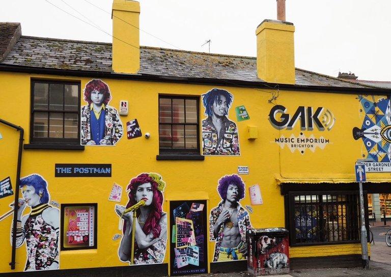
Image 1
Text - give me a hand drawn sketch with a run down, unrefined look
Style - default
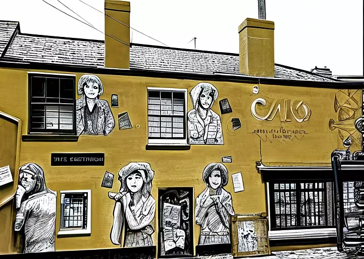
Definitely turned it into a hand-drawn sketch, but it's really morphed the faces into zombies and eliminated all the colour, with the exception of a yellow, is that supposed to be the colour of grunge?
Image 2
Text - feeling urban and give me some swagger
Style - default
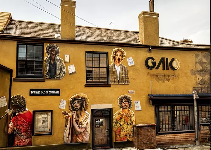
Apparently this is what happens when you add swagger to an image, but I'm not really getting the urban feel as much, perhaps the image is too close up and isn't picking up enough elements in the background and streets?
Image 3
Text - feeling urban and give me some swagger
Style - Ghibli Studio
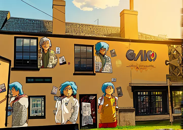
Ghibli studio this time around isn't hitting the same marks. It's turned the people into cartoon-like characters which isn't a shock, but the overall building doesn't scream urban.
Image 4
Text - turn this into a scene where you get a feel of urban grunge and eclectic style
Style - default
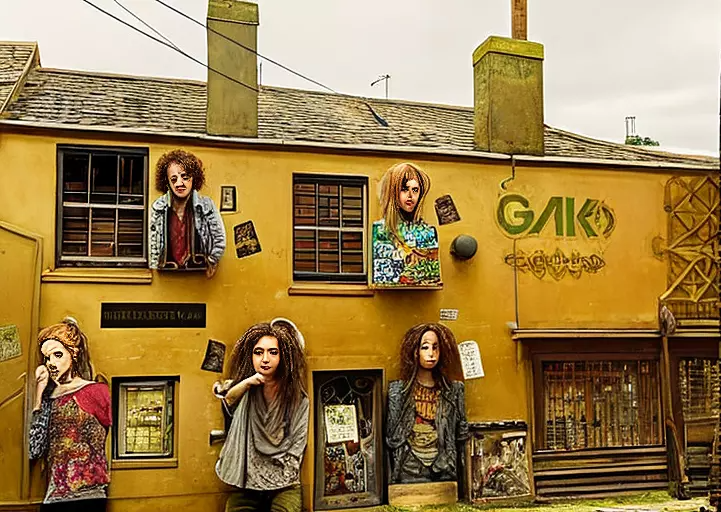
Looks like going to down the eclectic route makes the people appear to be more 3D and it looks like it's combatting between a psychadelic and urban vibe.
Image 5
Text - turn this into a scene where you get a feel of urban grunge and eclectic style
Style - Cartoon
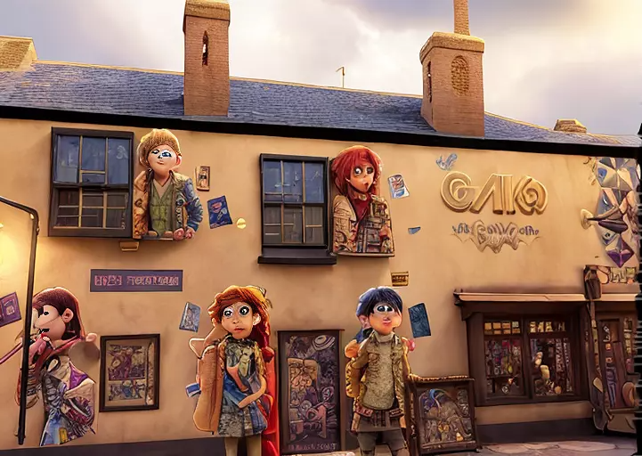
Entering the world of zombie cartoons! And trying to add some graffiti to the doors and windows is probably their take on the urban and grunge brief.
Image 6
Text - re-invent this image so it looks like it's on a street in an urban neighborhood of New York City
Style - default
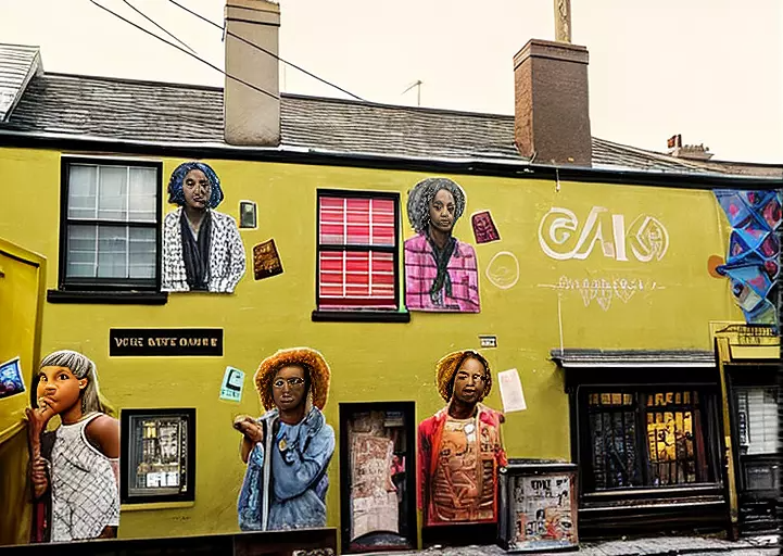
I tried to add to the description to try and pull out the building and insert it into a street, but clearly failed. It seems to just want to play around with the colours and images of the humans on the building.
Image 7
Text - re-invent this image so it looks like it's on a street in an urban neighborhood of New York City
Style - Landscape
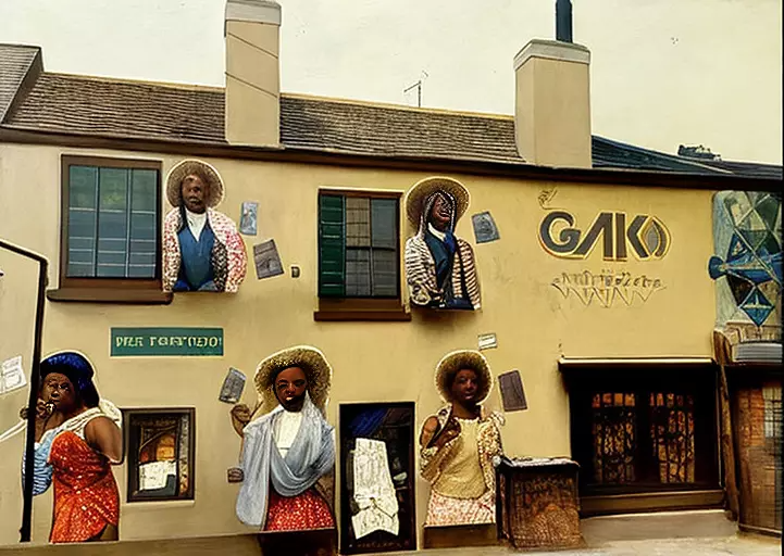
One last attempt at trying to 're-invent' the image, but I guess it can only do so much, which is odd because it seems to re-invent other uploaded images quit drastically.
Conclusion
I had high hopes for this one because of the imagery and colours. But I quickly learned that working with a close-up image versus one that had various elements in the background for a perspective shot, has it's challenges. Lesson learned, going to shift to working with more perspective images that the generator can pull more intriguing details from. And perhaps steer clear of faces, where possible?
We appreciate all the support we get from the Hive community. Remember that you can earn 15% APR paid in Legion, in daily dividends, if you delegate Hive Power to @stickupcurator. By doing so, you also support music and art on Hive because that’s our main focus when curating. You can buy our records on our favourite blockchain game Rising Star or at the awesome NFT Tunz. We also have our own art, video and GIF NFTs on NFT Showroom. For more information or to give us a follow, check out all our socials and say hello! https://www.stickupboys.co.uk
!pimp
You must be killin' it out here!
@justgl247 just slapped you with 1.000 PIMP, @stickupboys.
You earned 1.000 PIMP for the strong hand.
They're getting a workout and slapped 1/2 possible people today.
Read about some PIMP Shit or Look for the PIMP District
!PIZZA
$PIZZA slices delivered:
@nupulse(3/15) tipped @stickupboys
This technology is becoming very popular and people are making many special changes using it.