Playing with AI art - Shall we make it bilingual?
AI
Let's see how AI plays with text. Will it be tempted to turn it into another language or can it leave it alone? I'm guessing it will read the language as just another image and try to distort it, but I could stand corrected. Let's go, AI!
Source image
This was the source image
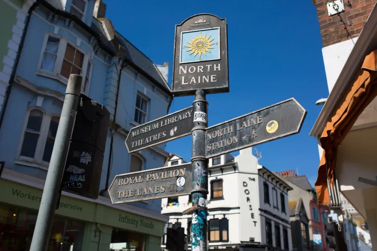
Image 1
Text - make this into a a New York City backdrop with a grungy feel and street vibes
Style - default
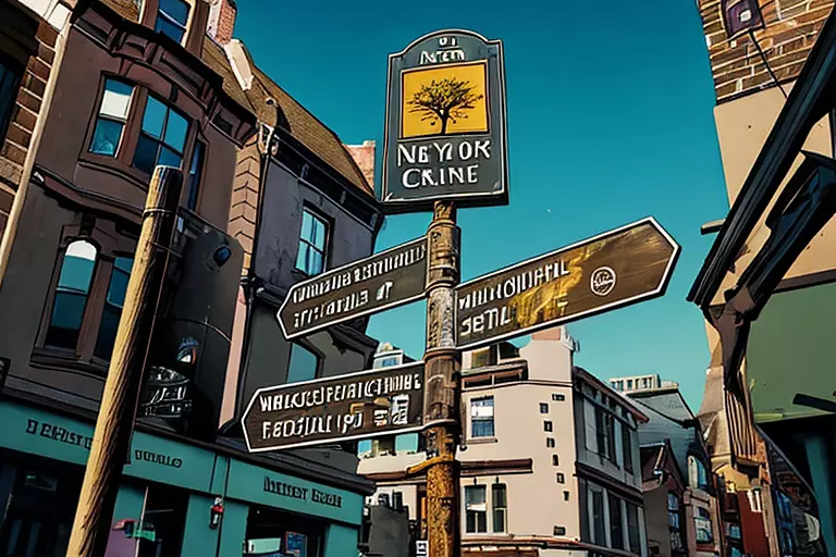
Looks like AI isn't really a fan of the english language, it's decided to either makeup a bunch of gibberish or try and develop a whole new language altogether.
Image 2
Text - make this into a a New York City backdrop with a grungy feel and street vibes
Style - ghibli studio
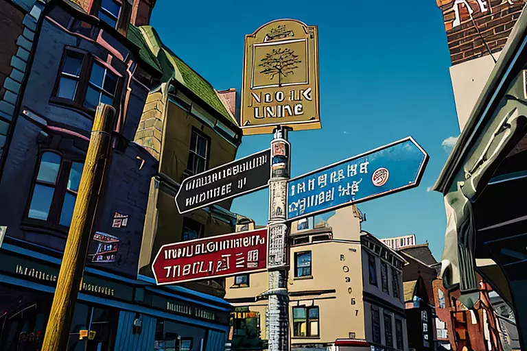
Looks like we are now adding some colour, turning the words from random gibberish to now characters that almost resemble a language from the southeast. Was hoping for more of a change in the background, but perhaps it's too focused on the main focal point.
Image 3
Text - add graffiti to the buildings, make this entire feel more urban and rough
Style - default
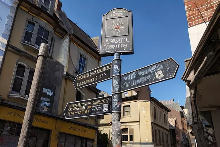
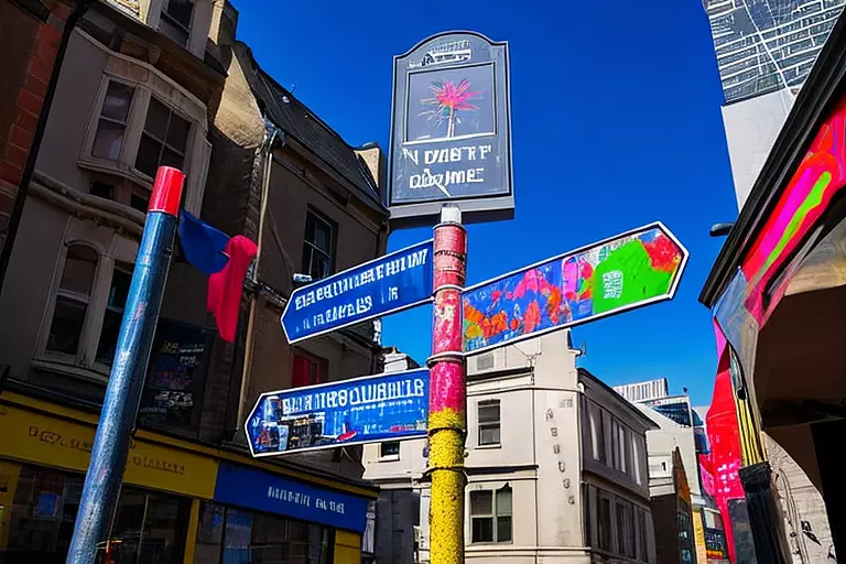
I was expecting them to add graffiti to the buildings in the background, but they are virtually untouched. It's added graffiti to the directional plates, but it's working with the smallest surface area... time to add some colour!
Image 4
Text - add graffiti to the buildings, make this entire feel more urban and rough. This needs to be in New York City, add pops of colour, liven this up!
Style - default
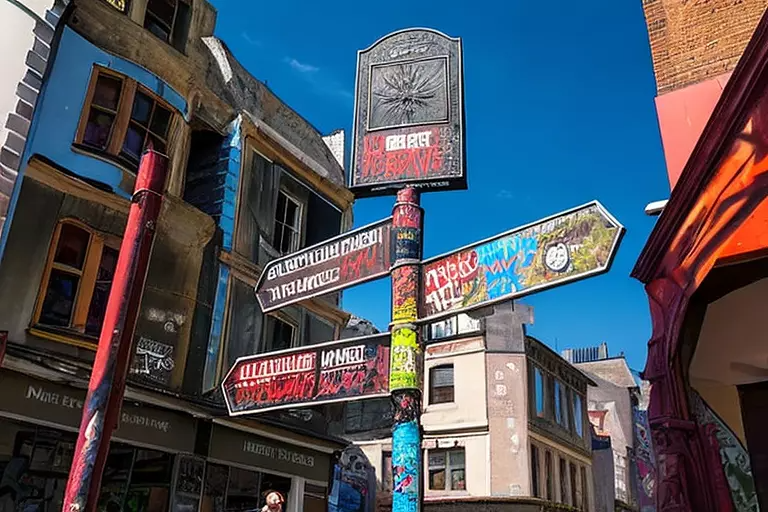
The pops of colour have made such a difference, I think we need to make sure we add colour to the text, otherwise it reads the urban and street vibe as quite dark and drab.
Image 5
Text - add graffiti to the buildings, make this entire feel more urban and rough. This needs to be in New York City, add pops of colour, liven this up!
Style - cartoon
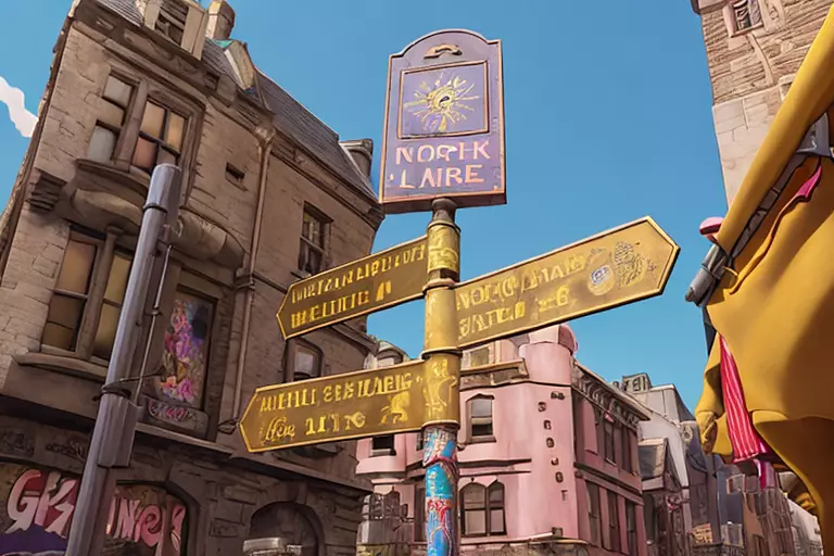
I think it's struggling to make a magical cartoon kingdom look like a rough, urban street vibe. It seems to always go back to the baby pink, yellow and blue colours for cartoon.
Image 6
Text - add graffiti to the buildings, make this entire feel more urban and rough. This needs to be in New York City, add pops of colour, liven this up!
Style - anime
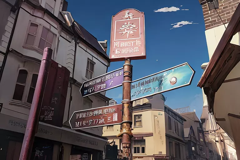
Apparently adding clouds to the sky makes it feel more anime, and the signs have now definitely turned into an asian language. The pops of colour still feel quite muted, even though I've kept the same verbiage to add pops of colour, wonder if it will help to say bright.
Image 7
Text - add graffiti to the buildings, make this entire feel more urban and rough. This needs to be in New York City, add pops of colour, liven this up!
Style - landscape
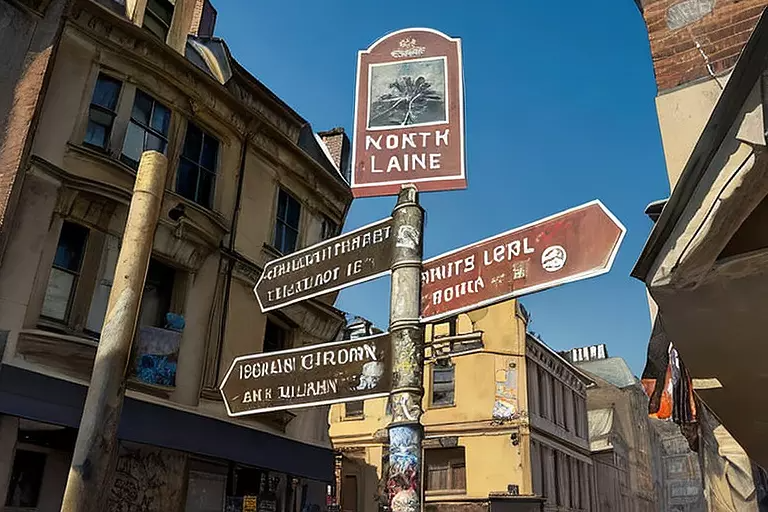
Not loving this one, it's taken out all the liveliness in the image, and it looks like a run-down city.
Image 8
Text - add bright colours to this, while making it feel like you're on an urban city street in New York. Add artistic graffiti
Style - default
Definitely hit the brief to add brighter pops of colour. If I had one more shot, I would try and see if I could keep the verbiage and the pops of colour.
Conclusion
Overall this one was a challenge. I had high hopes with such a cool shot of the signs, but it looks like it was obsessed with the writing and not able to focus on adding detail to much else. I need to figure out a way to keep that urban vibe without losing the liveliness of colour, because it can really be the difference of making something look really intriguing or flat. Unfortunately I'm not sure this one will make the cut for a cover....
We appreciate all the support we get from the Hive community. Remember that you can earn 15% APR paid in Legion, in daily dividends, if you delegate Hive Power to @stickupcurator. By doing so, you also support music and art on Hive because that’s our main focus when curating. You can buy our records on our favourite blockchain game Rising Star or at the awesome NFT Tunz. We also have our own art, video and GIF NFTs on NFT Showroom. For more information or to give us a follow, check out all our socials and say hello! https://www.stickupboys.co.uk
This technology has advantages and disadvantages, it is better that we use it for advantage.