Victor Grey - My Original character artwork (NFT series part -5)
Hello guys, I'm back with a new artwork to share with you guys. This is my favorite one out of all the NFT artworks I created so far. It's partly because the face of this character came out really well upon finishing. As I mentioned in my previous posts creating an aesthetically pleasing face whether it's a male or female is tough. This is the part where reference images in my opinion became useless to me. This is because I draw faces on my own based on the anime style. I mostly use reference images for poses or to get approximate cloth fold patterns to make the artwork look more pleasing.
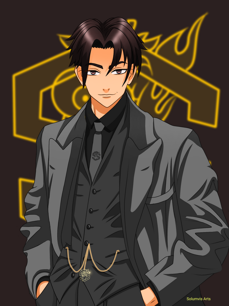
Victor Grey
I'm a big fan of vintage movies which have 3 layered clothing like suits. It just looks so good in any person regardless of gender. So the suits during that time were mostly grey hence I used the surname Grey and Victor as the first name because the suit design I used here is from the Victorian era. If you played Assassin's Creed Unity game then you know what I'm talking about. You can see all the influential people there wearing these kinds of clothes most of the time. It's quite unfortunate that it went out of style. It's understandable considering the hot weather haha.
The process
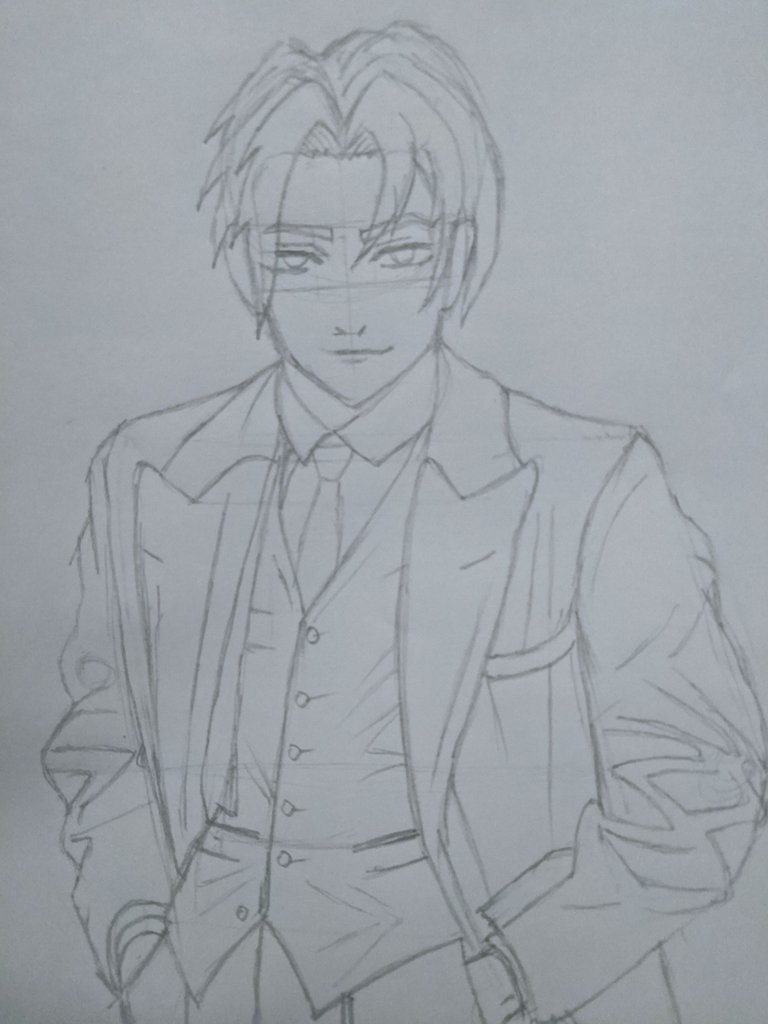
A fine example of what happens when you draw the head last xd. Most of the anime characters have long necks and big or small head depending on the character. Victor is an adult guy so the head size needs to be small so after importing this rough sketch to the ibis paint app I used the lasso tool to reduce the size of the head and added a neck too. That fixed the issues with the lineart.
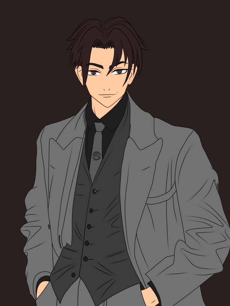
I painted the base colour after fixing the lineart. As I mentioned above the cloth is gonna be painted in grey but at different ranges. I also the spice token logo in his tie too. I'll be adding a spice token like jewellery on his jacket later on.
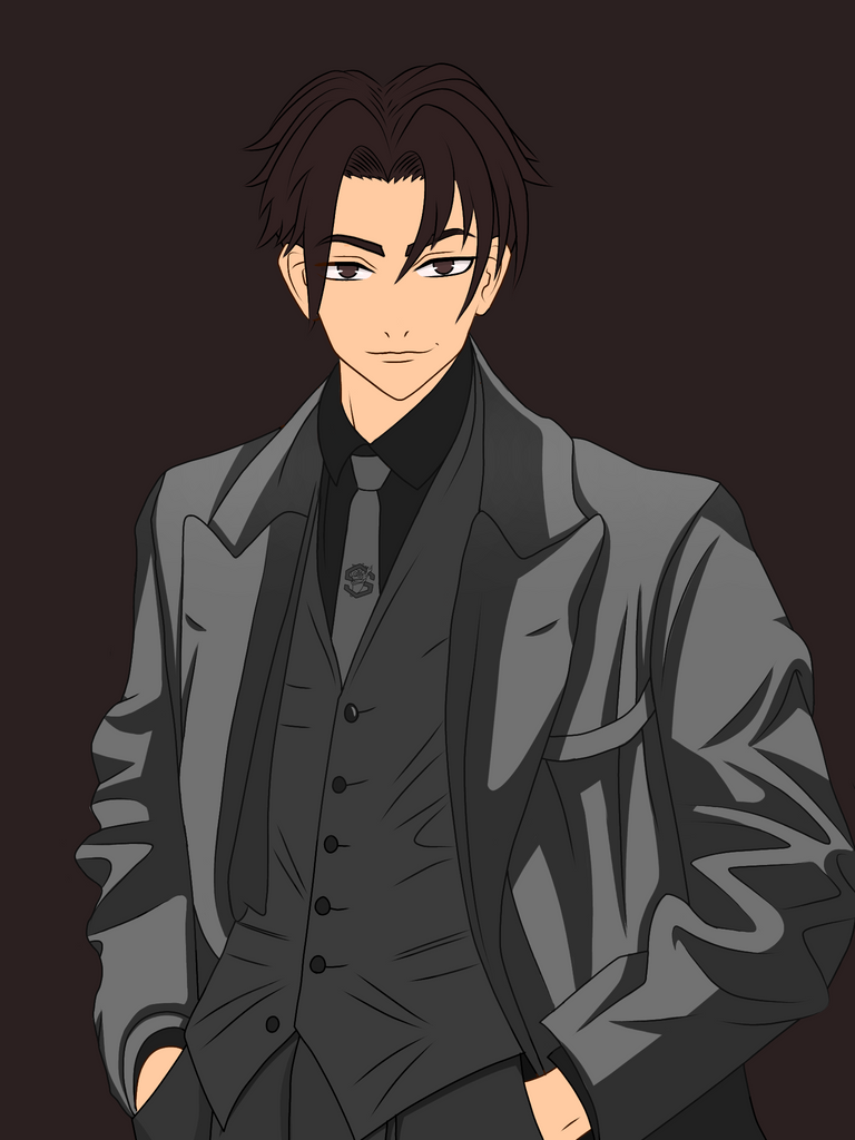
I usually paint the body first but this time the temptation to shade the clothing was too strong. I really wanted to work on those folds and see the final result haha!
I used the reference image to get the shading right. I wanted to add more shades as possible to make it look more 3d using cell shading. I improvised on some areas but the output was really good.
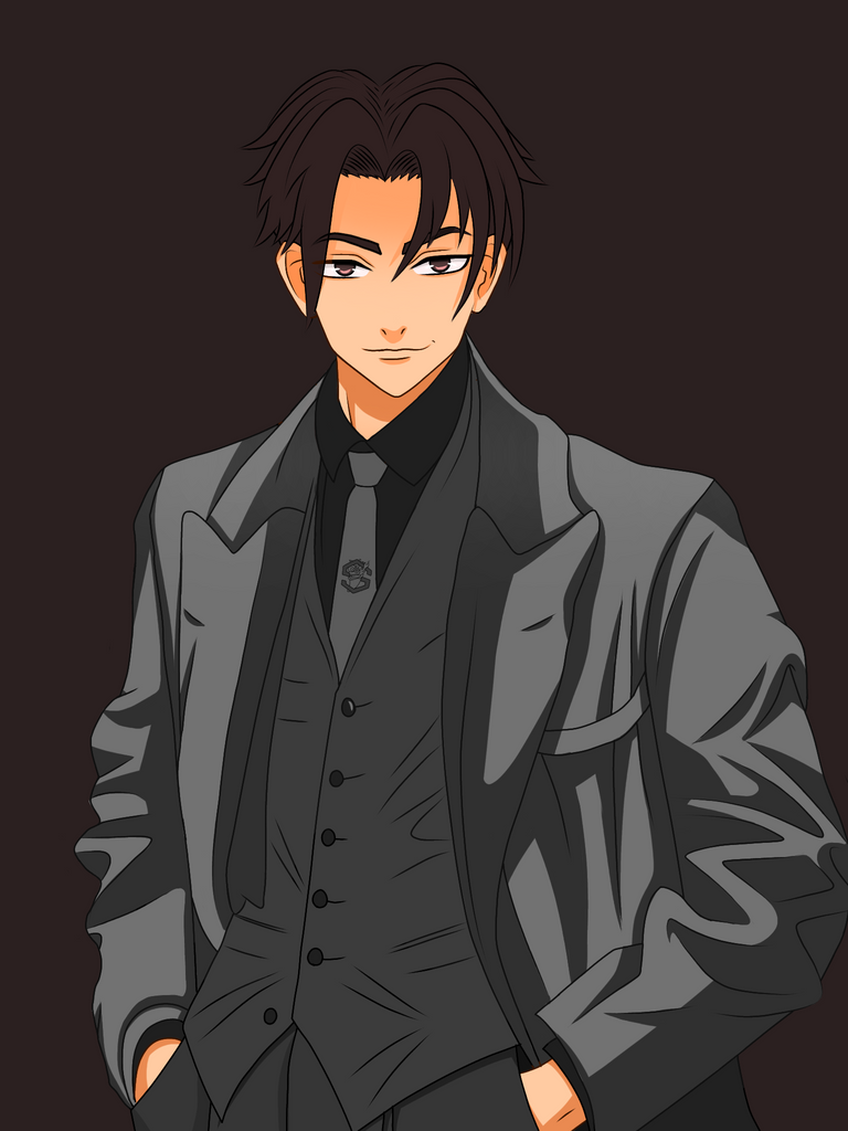
I did the skin shading next and added shadows considering the source of light was from the top. I didn't use sharp shadows on the forehead this time. I wanted a more blended look so I airbrushed there instead.
Since the skin shading areas were less I proceeded to finish the eye shading while I was at it.The pupil is small which means the shading can be done in that single eye layer itself.
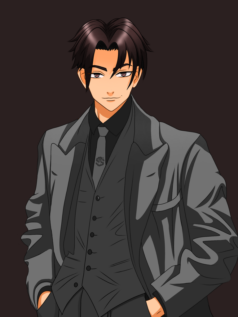
I shaded hair and made higlights on it but in a blurry style. I tried using sharp highlights but it didn't suit the character. This looks much better on his hair. A similar style can be seen on some webtoons.
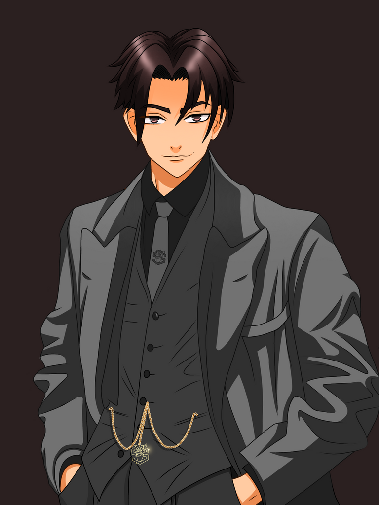
Added the spice token gold jewellery item on his jacket instead of a vintage watch. Upon finishing I noticed that I totally forgot to shade the inner parts of the suit xd. I completed the shading later and added the official spice token logo in the background at 20% blur.

Apps used: Ibis paint x
Duration: 10hrs
Device used: Asus max pro m1
Reference image: click here
Thank you so much for your time :)

Congratulations @solumviz! You have completed the following achievement on the Hive blockchain and have been rewarded with new badge(s):
Your next target is to reach 20 posts.
You can view your badges on your board and compare yourself to others in the Ranking
If you no longer want to receive notifications, reply to this comment with the word
STOPTo support your work, I also upvoted your post!
Support the HiveBuzz project. Vote for our proposal!