Allsvenkan Application on Figma | UX & UI Design
Hello everyone, this is my first time writing in this community, the reason is that I wanted to write a blog about one of my UX and UI design processes but I was not sure if this is the right community. Another problem is that when I start to type, it is quite hard to stop until I have explained everything, but looking at other blogs, I think pictures are more valuable than the text here.
First of all before creating any interference or sketch I needed an idea. I am a huge sports and football fan and the hot topic here in Sweden, where I live, was the Swedish football league Allsvenskan. I checked the Allsvenskan application and it was terrible, in terms of information, colors and bad user friendliness, so I decided to recreate the Allsvenskan app.
 Photo by Dopest
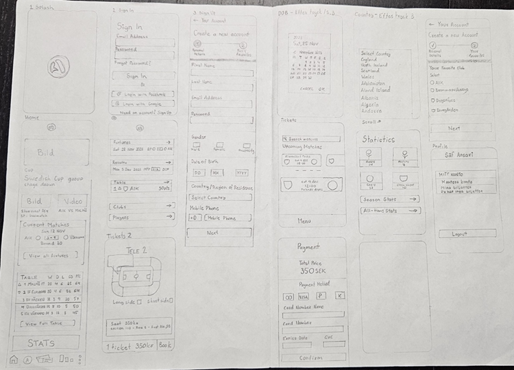
First step was to create a sketch, which is often a guide to the designing process. I looked at various other leagues and their applications, one common thing was, user log in, scores, results, team info and stats. Now, I wanted to add something to make this application a bit different to others. So here in Sweden in order to buy match tickets you have to go to the home teams website and buy from there, but I wanted to add that to my Allsvenskan app to make it unique and different.
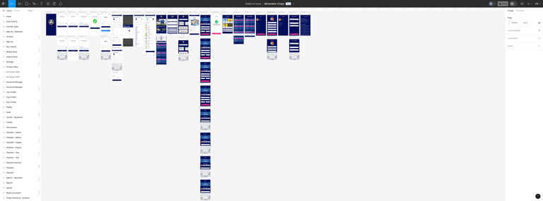
This is the overall sketch with flows and to not make this blog boring, I decided to not include one picture for every screen. My goal was to be clear with my design and color theme so that the app doesn't look cluttered with different concepts, because that won't be user friendly at all. This sketch was just a skeleton for help and not a final design so I knew that there would be a lot of changes on the way.
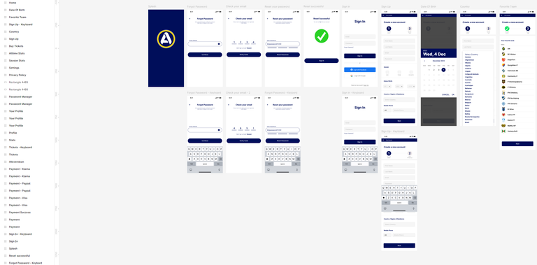
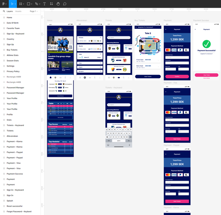
After the sketch was completed, I started to design my application. Some components of a mobile, like time and notification status and mobile navigations are already made and you can just copy and paste them, because I had a lot of those templates on Iphone 13 & 14, I decided to make the design on Iphone 14. The concept and theme was clear so I just followed my sketch and was able to easily make this design. On the way I had to use Photoshop to change the colors of logos to match them with the color theme and it was quite a task to balance everything together. Here is the design I made in pieces so that you can see the screens better.
Log In & Sign Up
Home & Buy Tickets
Stats & Profile
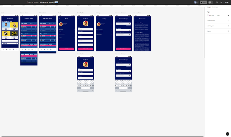
This was the whole flow. Prototyping was hard, because I wanted to add scrollable elements to see all the matches and then few animations and popups as well, but in the end everything went to plan. I didn't have a password changer, privacy policy and settings in my sketch but when I was making the design, I thought without these things the application would look incomplete. So I added them later on, which also explains that your sketch is just a help, and you might forget things while sketching that you think of later.
Hope you enjoyed my process, you have the whole flow as a video down below to make it realistic, sit back, watch and enjoy. Special thanks to @hamza-art for making it possible for me to publish the video.
Congratulations @saif-ul-wahab! You have completed the following achievement on the Hive blockchain And have been rewarded with New badge(s)
Your next target is to reach 700 upvotes.
You can view your badges on your board and compare yourself to others in the Ranking
If you no longer want to receive notifications, reply to this comment with the word
STOPCheck out our last posts:
Very nice app It looks very good and the video was good for understanding the video! Keep up with the work the app is just amaizing
Thanks @hamza-art