3Dart: Risky Whiskey rising star [ESP/ENG]
¡Hola hivers! espero se encuentren muy bien el día de hoy
La semana pasada había recreado en 3D la tarjeta "Pizza box" si te lo perdiste, te dejo el link por acá https://ecency.com/hive-195370/@rowell/fanart-pizza-box-rising-star
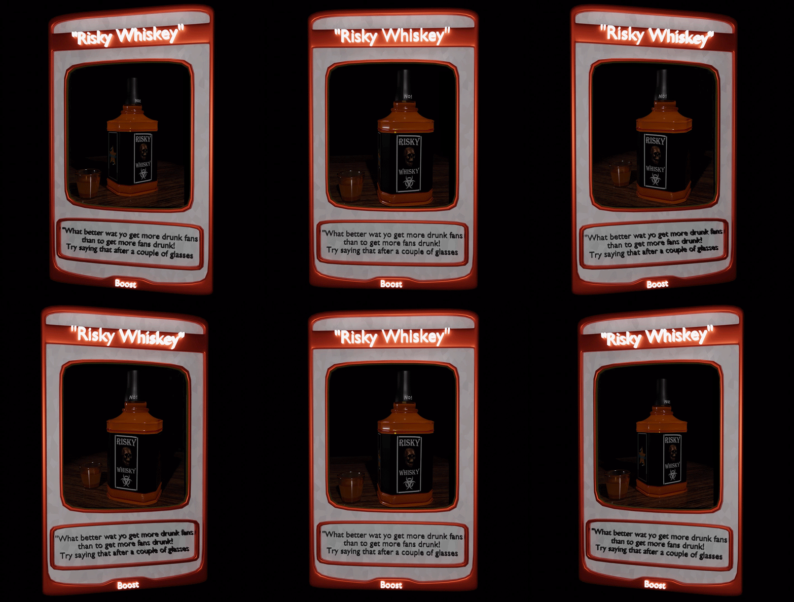
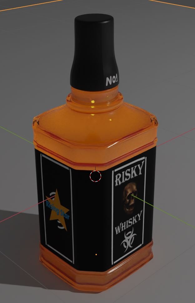
En esta oportunidad elegí la tarjeta "Risky whiskey" para reinventarla en 3D. Espero les guste 😄
Hello hivers! I hope you are very well today
Last week I had recreated the "Pizza box" card in 3D if you missed it, I leave you the link here https://ecency.com/hive-195370/@rowell/fanart-pizza-box-rising-star
This time I chose the "Risky whiskey" card to reinvent it in 3D. I hope you like it 😄
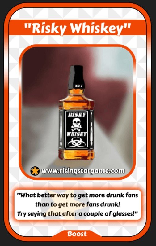
original art
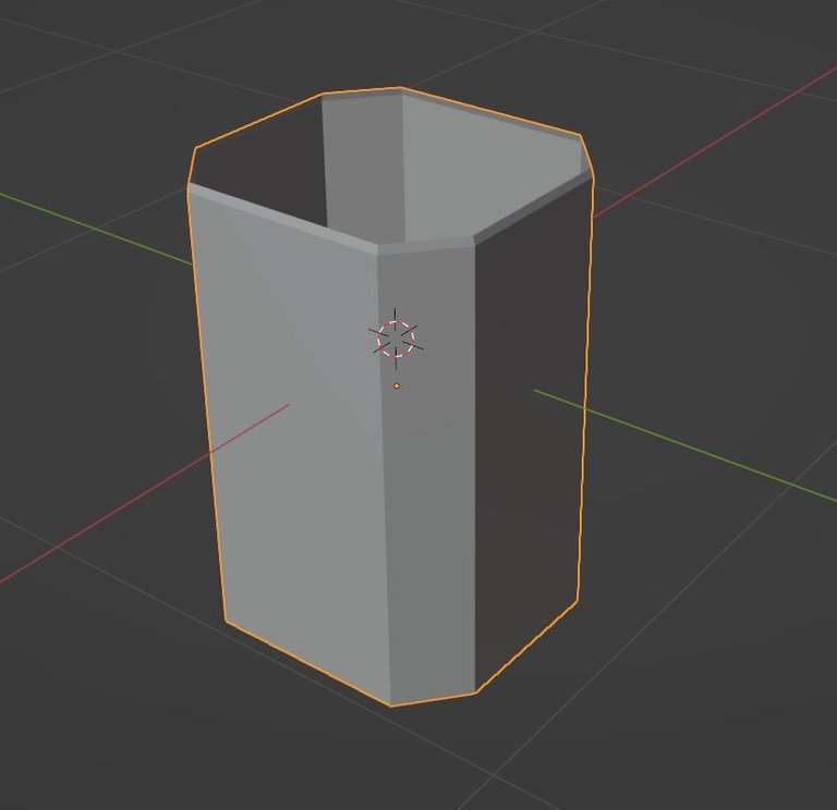
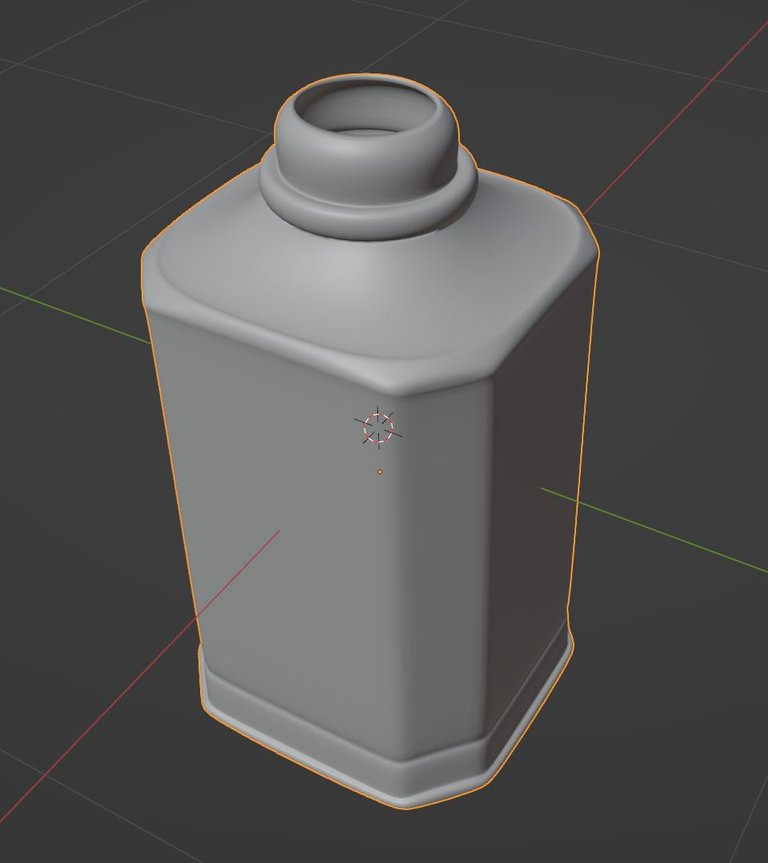
Aunque la forma de botella es algo simple, la verdad se me complico un poco lograrla jajaja. Al aplicar el modificador de subdivisión de superficies había que cambiar un poco la maya, y me tarde mas de lo esperado en hacer la forma de la botella.
Although the bottle shape is something simple, the truth is that it was a bit difficult for me to achieve it hahaha. When applying the surface subdivision modifier, the mesh had to be changed a bit, and it took me longer than expected to make the shape of the bottle.
Luego de terminar la forma de la botella junto con la tapa, llego el turno de trabajar los materiales, me costó un poco llegar al material que obtuve para la botella y el liquido, pero creo que logré un buen resultado colocando una pequeña luz dentro.
After finishing the shape of the bottle along with the cap, it was time to work on the materials, it took me a bit to get to the material I got for the bottle and the liquid, but I think I achieved a good result by placing a small light inside.
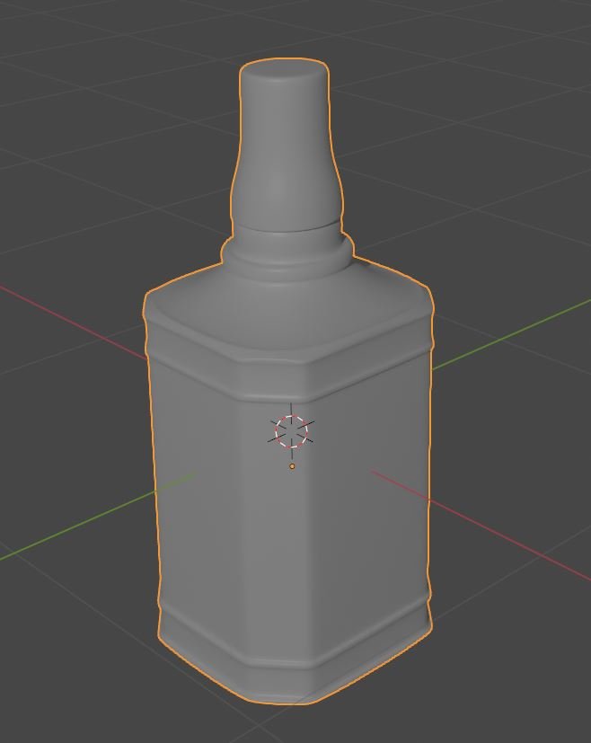
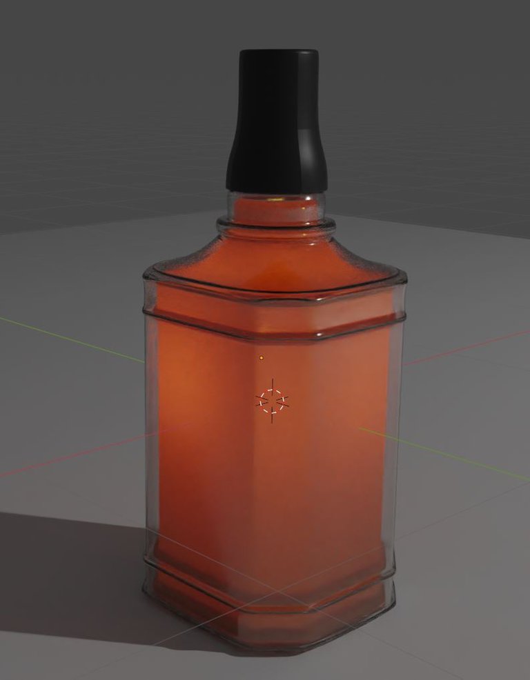
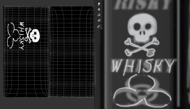
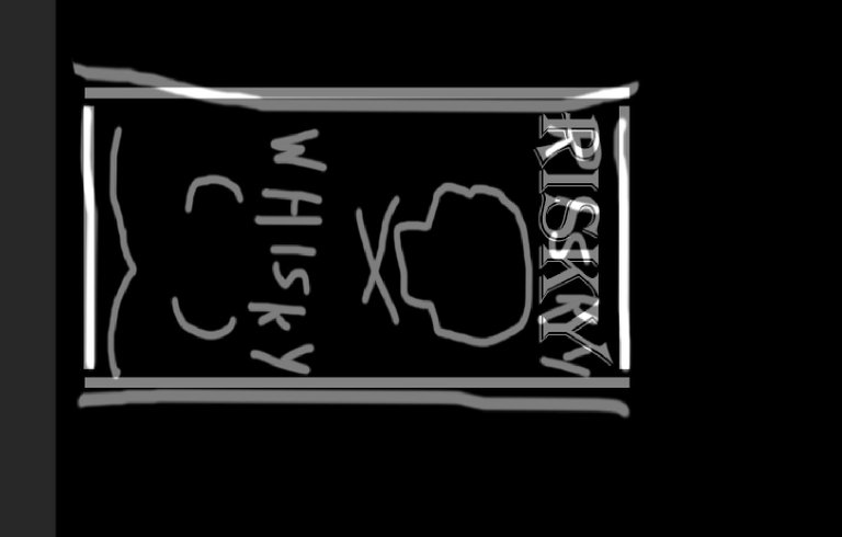
Al obtener el material como lo quería, creé una textura para la etiqueta, donde hice una marca de corte para las UV y luego dibuje un boceto encima para tener la orientación adecuada al editar la imagen dentro de Photoshop. Para hacer el cráneo, le dije a la IA en Blender que lo dibujara y luego lo edité dentro de Photoshop.
Getting the material the way I wanted it, I created a texture for the label, where I made a crop mark for the UV, and then drew a sketch on top of it for proper orientation when editing the image within Photoshop. To make the skull, I told the AI in Blender to draw it and then edited it inside Photoshop.
Después de esto olvidé tomar mas captura jajaja, pero el trabajo fue muy parecido al de la tarjeta de la caja de pizza, utilizando Adobe Premiere con efecto de pantalla verde. Para la mesa utilice un plano y una foto para la textura de madera, y por ultimo jugar un poco con la luces.
After this I forgot to take more screenshot lol, but the work was very similar to the pizza box card, using Adobe Premiere with green screen effect. For the table, I used a plan and a photo for the wood texture, and finally I played a little with the lights.
center>

Este fue todo el proceso para este arte, espero les haya gustado ✌️😄
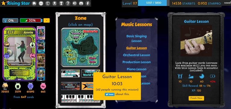
En la ultima semana en rising star he conseguido alrededor de 1500 fans mas y he subido casi un nivel completo, y debo decir que subir de nivel esta difícil para seguir avanzando en las misiones.
This was the whole process for this art, I hope you liked it ✌️😄
In the last week in rising star I have got around 1500 more fans and I have leveled up almost a full level, and I must say that leveling up is difficult to continue advancing in the missions.
Redes sociales / social networks
Twitter: https://twitter.com/Sterleep
Instagram: https://www.instagram.com/rowellcastr/
NFTshowroom: https://nftshowroom.com/rowell/profile

https://twitter.com/301676586/status/1618276832796905473
The rewards earned on this comment will go directly to the people( @rowell ) sharing the post on Twitter as long as they are registered with @poshtoken. Sign up at https://hiveposh.com.
I remember trying to use subd for everything once XD If you needed the extra polys multires may have been better in this instance (doesn't curve quite so much), or if you really wanted the subd, increase the edge weights where you need to (you probably did that, it just looks to me from the wireframe like you kept adding edge loops).
Otherwise something like this might be easier if you just model it with a lot of edge loops and bevels :)
I love the weird brain effect the card and the bottle animations moving in opposite directions has XD Can imagine people glaring at it yelling that they're not as think as you drunk they are XD
Did you have to change the lighting for the final? As I kind of liked the transluscency in the standalone renders, it disappeared in your final.
The truth is that if I use it for almost everything hahaha. I have to learn those tricks. Does it look good with just bicellar? It's that I notice the mesh very strange when I smooth it XD
It's funny about the movement, but you're right, I should reverse it 😁
Nooooooooooo the movement is great XD
and yes, it looks almost the same, thanks for the information. I think I could use a course, learning on my part is a mess XD
Learning is generally a messy process anyway XD Course probably wouldn't hurt? I don't know as I've always just looked up how to do whatever it is I was trying to do if I couldn't figure it out myself, but I have this project that I'm working on forever so I always know what I want to do. It's probably a different story if you want to learn how to do something but don't necessarily have a specific project in mind XD
Congratulations @rowell! You received a personal badge!
You can view your badges on your board and compare yourself to others in the Ranking
Check out our last posts: