monochrome vs color. reasoning (with examples)
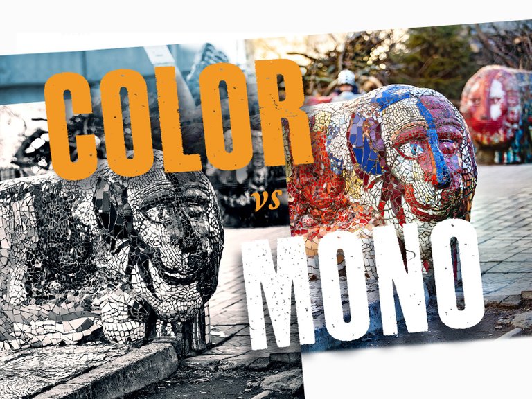
I love color photography... but I love black and white photography too! Color images could not (and are unlikely to be able in the future) to kick out completely black and white ones. Why? and where is the room for using one or another kind? Thats a good question! And the answer is not as obvious as it seems ... I answered it for myself apparently so.
When poor (or incorrect) lighting does not benefit the image, does not provide delicate contrasts and rich play of color, or does not make the color muddy at all, this is a direct candidate for conversion to black and white. Why does the picture need a bad color, from which it will not get anything? Excluding fuzzy color (which in this case only distracts), we highlight the most important details in the image, focusing on the main thing.
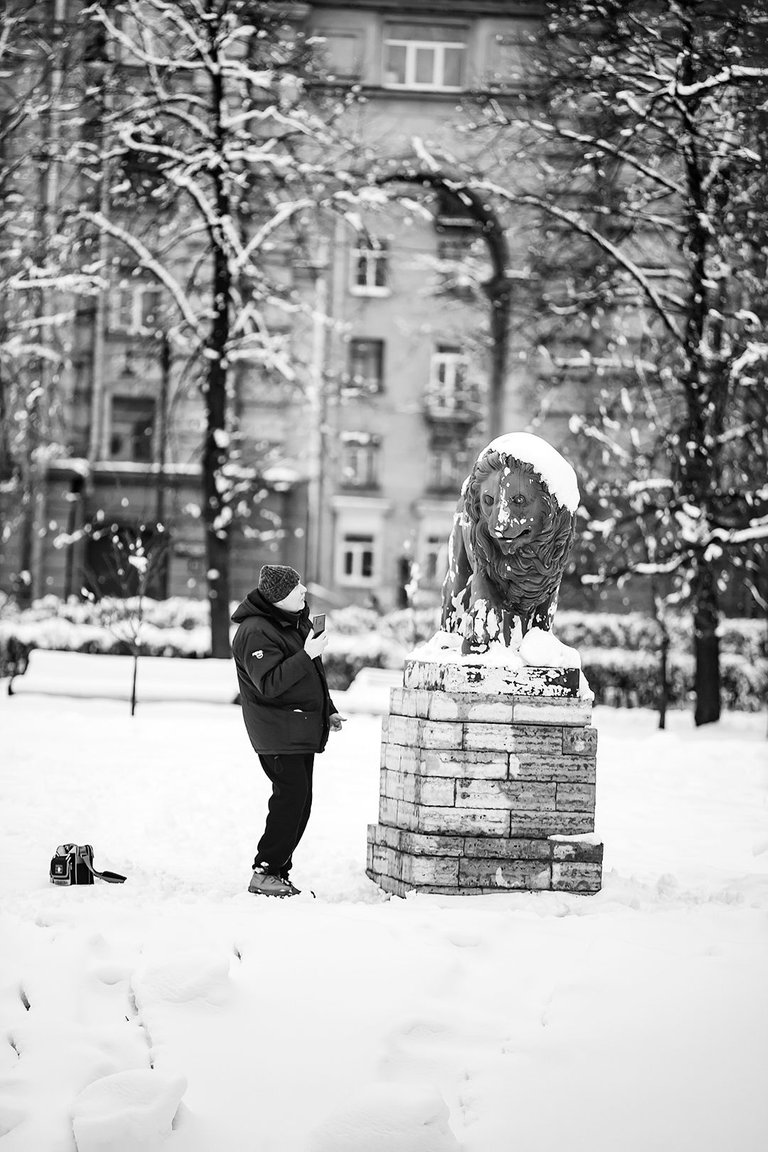
Exploring urban architecture on a cloudy day.
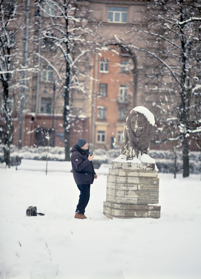

Sometimes it happens so that most of the meaningful information that allows human eye and brain to identify an object, lies precisely in color. Without color - there remains an incomprehensible contour that does not speak to the spectator, since it does not tell his brain anything interesting.
Below is a good example; which version will you choose in this case - color or monochrome?
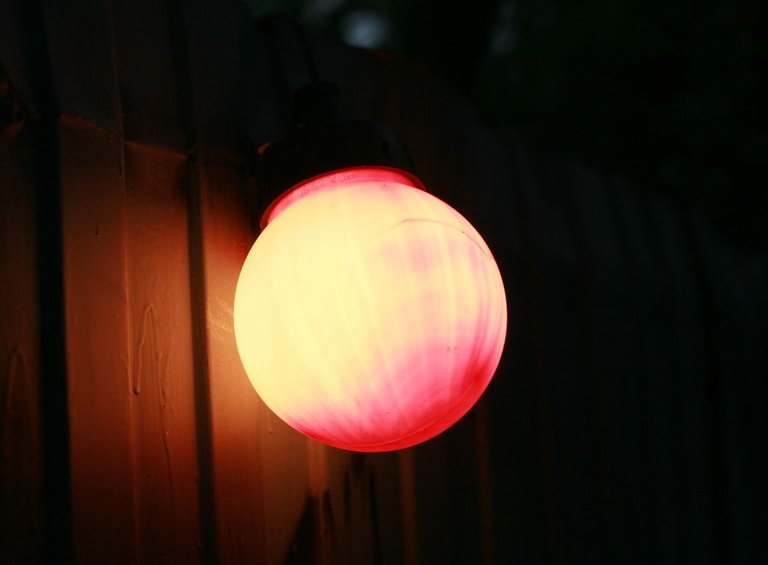
Guess what it is? A mutagenic orange, maybe? no....
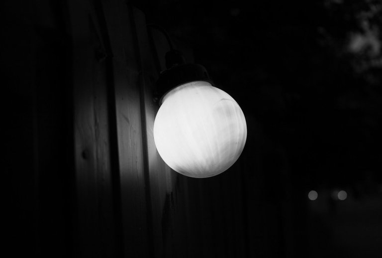
Just a lamp on the fence, an indicator of attention to ongoing construction work.

The situation changes when the picture contains whimsical textures or some kind of stuff that can "feed" the brain, even if it is not a valuable story in itself. For me, these are usually some curious textures ...
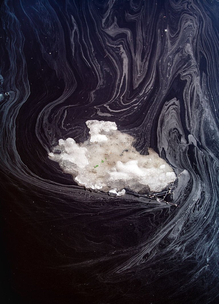
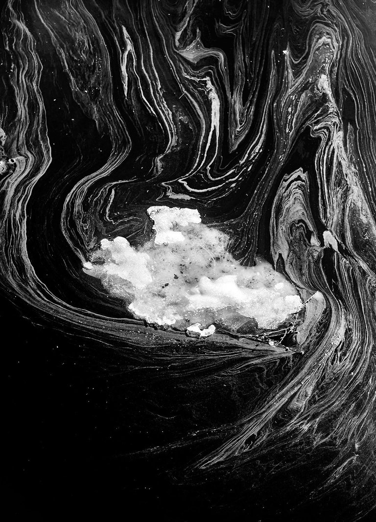
By the way, our human brain is trained by evolution (thats the way it works) to find meaning in any noise, to highlight meaningful information mixed with garbage ... even in cases where there is not any of it at all ! (Remember the famous Rorschach test?) In any detail, we first tend to guess faces, thats a basic pattern.
In my previous post, I showed a piece of ice floating in water. On the left is the color version. On the right is a monochrome conversion of the same photo (contrast was greatly increased during processing). If the photograph does not have interesting color nuances
or contrasts, if the color does not participate in the coding of the image itself, it is very likely that the color version of the picture will turn out less appealing to a human eye, than the monochrome version. Question to the audience: does the picture above confirm this thesis, in your opinion?

The human eye sees the surrounding world in color; thats why a monochrome picture - in contrast with all-time multi-color background involved - is automatically highlighted. Monochrome is always an abstraction that is very different from everyday reality, thus it makes us give a start, stop and pay a especial attention. Perhaps due to this such images can evoke a stronger emotional response.
Look at the shadows...
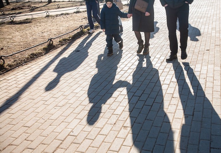
When the color component of the visual component is removed, our eye switches to a different mode of operation and begins to search, recognize, "decipher" the meaning based on black and white contrasts. Now our brain receives "its food": some ratios of black and white, heavy and light, whimsical curvilinear forms, and so on.
Picking of information, its evaluation, analysis, highlighting the accents - in the case of monochrome image, this goes not the same way as in usual situation.
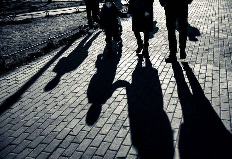
Unlike the picture above, which was significantly improved by hand, this is an automatic black and white conversion of what the camera saw (by the way, the frame was shot against the light, manually, and generally turned out to be overexposed). Why did I add this (unfortunate) version here?
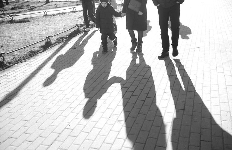
It is supposed as an illustration of idea that 'black and white' (monochrome) visuals do not necessarily gain their value automatically, no, no: they gain value only with certain qualities, namely: contrast, the ratio of black and white areas, interesting textures. To me this is a fundamental issue, I refuse to applaud photographs that gain nothing from a trivia automatic photoshop B-W image conversion.

And a few more illustrations below.
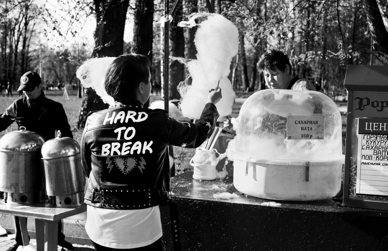
Sugar cotton candies. Unbreakable!
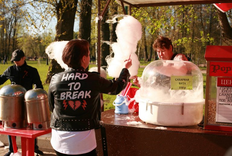
Which version you would prefer here?

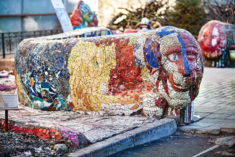
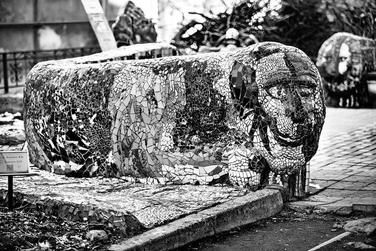
This frame does have some pretty colours, contrasts and nuances. Convert them into B-W, and they momentarily got lost - giving back... what? almost nothing. Most of details are quite tiny here, providing a little or no contrast at all. This case is obvious for me, I would go after colours. And what about you?

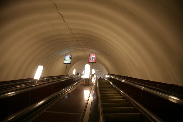
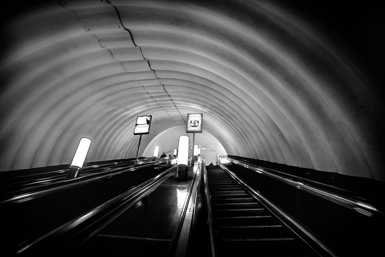
Does these dirty shades have any appeal to you? Solution is pretty obvious here: I eliminate colours, getting a nice monochrome.
| location: | St.Petersburg, Russia | 2022-2023 | natural light |
| camera/lens: | Canon 5D | various | raw-conv |

Да согласен Ч/Б работает лучше в определенных ситуациях - именно нам где мало контраста и мало цвета !
Thanks for posting in the community. If you can add #colourblackandwhite that would be awesome. Thanks
#colourblackandwhite , oki
А фотографии можно размещать в таблицу? У тебя 2 фотки сделаны столбцом.
запросто! но я размещаю не в таблицу, в два див-а (блока).
если интересно, зайди в мое соо грибы, через Peakd, и попробуй сделать черновик, через шаблон который я сделал общественным. там много разных вариантов ооофрмления прописано
!BEER
ну а картинки то как?
так, я погорячился насчет шаблона - или я забыл как это делается, или что-то поменяли, или скорее только для комунити-аккаунта, а не личного использования.. в общем, смотри, проще всего сделать так:
< div class="pull-left">< p>
это левая колонка
< /p>< /div>< div class="pull-right">
это правая колонка
< /p>< /div>
! --------- а тут обязательно линейка, отделяющая этот блок от того что ниже него
знак параграфа не так уж обязателен, но лучше все же использовать, с т.зр. верстки.
внутри колонки такую ячейку < p>< /p> можно повторять сколько надо раз, можно добиваться чтобы текст и картинки слева и справа не совпадали, а текли в колонках не симметрично - смотрится красивее.
можно этот код использовать для написания ru\en. в общем, все можно!
есть один жирный нюанс: < div > это код html, и внутри него обычная местная разметка к какой мы тут привыкли,не действует, но работает самый обычный законный язык html. это например если ты внутри такого див-блока решишь вставить ссылку, или выделить текст жырным, курсивом, etc.
🙏🙏🙏 попробую. Я просто видел у человека из Вьетнама прям таблица 4*4 и кликабельные.
кликабельно и у меня - за счет Peakd.
чтобы сделать кликабельным в коде, нужна или разметка,
или хтмл-разметка. в дивах - только хтмл разметка.
сделать можно все! но заморачиваться по 3 часа на пост не хотца.
и лучше делать сразу наверняка, так сказать, давно проверенные
куски копировать и размножать, таково мое мнение. как то так.
!BEER
View or trade
BEER.Hey @alechi, here is a little bit of
BEERfrom @qwerrie for you. Enjoy it!Did you know that <a href='https://dcity.io/cityyou can use BEER at dCity game to buy cards to rule the world.
View or trade
BEER.Hey @alechi, here is a little bit of
BEERfrom @qwerrie for you. Enjoy it!Learn how to earn FREE BEER each day by staking your
BEER.Красивые фото, некоторые в чёрно-белом смотрятся лучше.
Ну, да. Пост как раз про это. Какие -- в каком издании стоит издавать.
Yay! 🤗
Your content has been boosted with Ecency Points, by @qwerrie.
Use Ecency daily to boost your growth on platform!
Support Ecency
Vote for new Proposal
Delegate HP and earn more
One thing I really like about monochrome images is that you can get a very different perception from the one conveyed by the color image.
Absolutely true. Depends also on the certain colours, ofc. I like trying different variants in channel mixer or photoshop Cameera Raw filer. ☘️
Have a Hive !BEER, my friend
View or trade
BEER.Hey @jotaunive, here is a little bit of
BEERfrom @qwerrie for you. Enjoy it!We love your support by voting @detlev.witness on HIVE .
View or trade
BEER.Hey @qwerrie, here is a little bit of
BEERfrom @pixresteemer for you. Enjoy it!Learn how to earn FREE BEER each day by staking your
BEER.