Rexxie fanart 💙💙💙
Greeting
Hopefully you all are doing well. I came here again. This ia my entery for the weekly contest of @splinterlands . I am very excited for this contest. As usuall I came with am aesthetic amd memorable post. Today made some special. I tried to draw Rexxie which is a dinausour....... These are the species which are not present in thos age. But we cam consider them as aliens. 😅. So let start.
Here I had shared the finall look.
**Final Look**
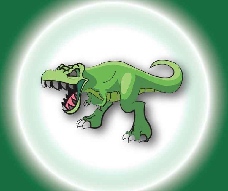
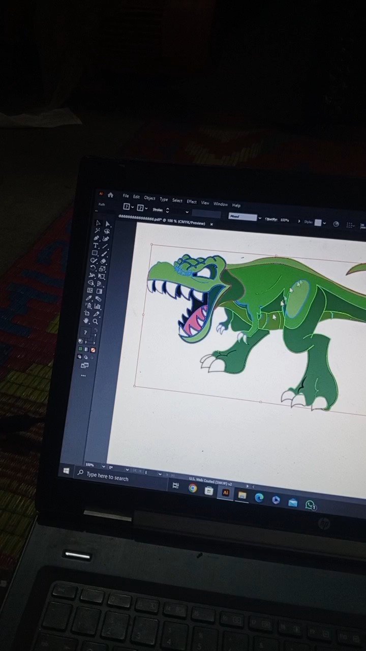
App used
Adobe Illustrator which is an app used to made logos and cards but I always used it for my cartoons or characters😭😅😅
Pen tool and colour panal from the tools of Adobe
Process
You all know that in every post I always draw the face and facial material first. But this time I started the Rexxie from his dome structured body. I draw a slim dome type shape. I did it to gave a seperat shine to rexxie.
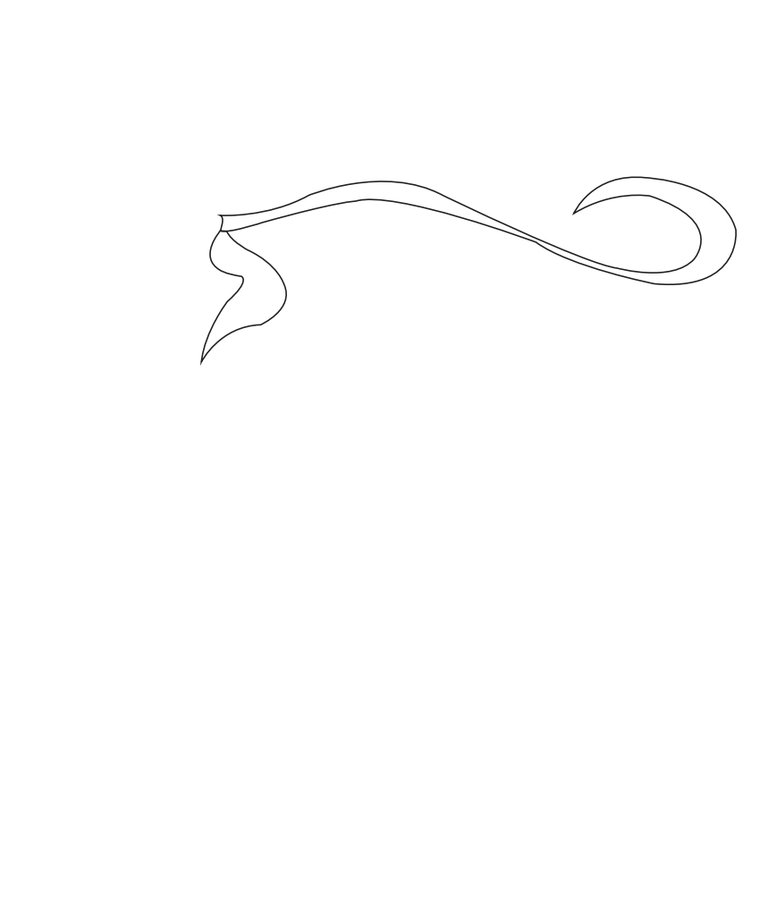
Then I started to draw the belly and one tale amd his one hand.
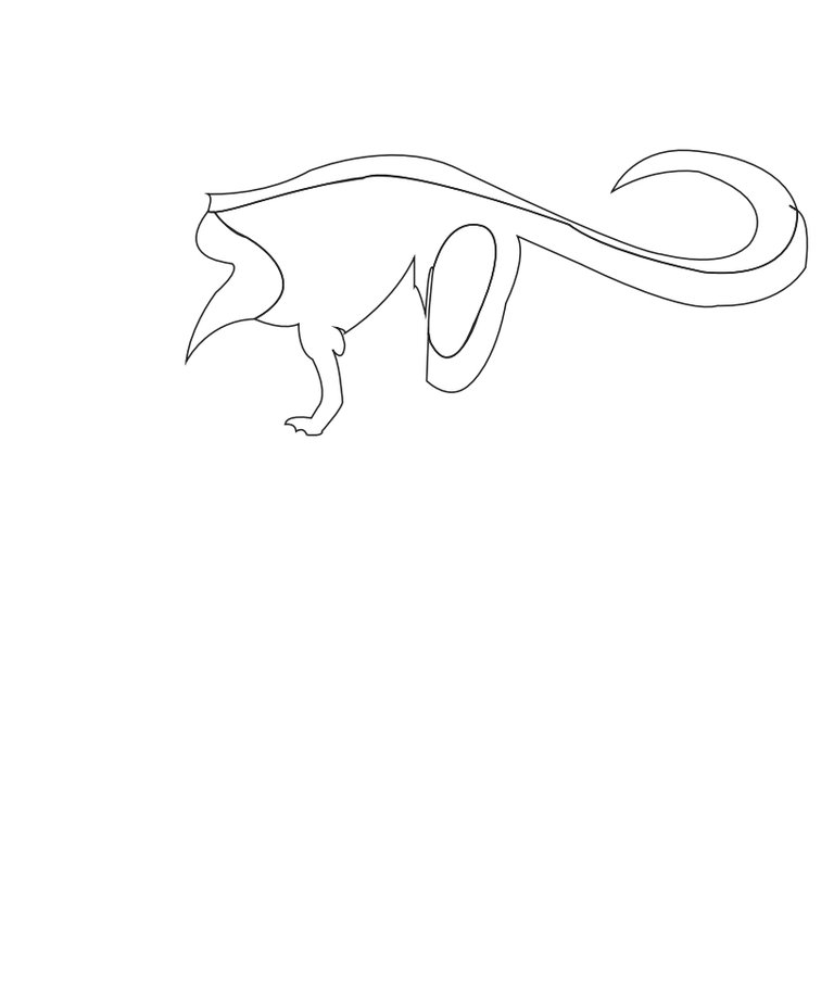
Then I started to the draw the sketch of his leg . The lega of dianasour are large instead of their hands. Kangroo looks like dinasoura but are not in actuall.
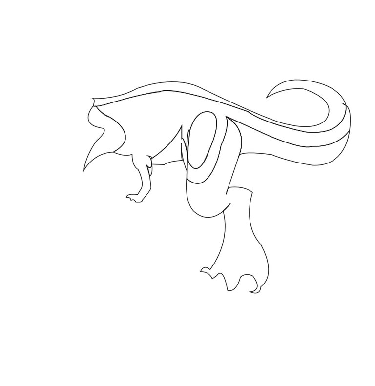
Then I started to draw the sketch of his other body. I will draw the sketch of its face on the last due to the small feature of the face.
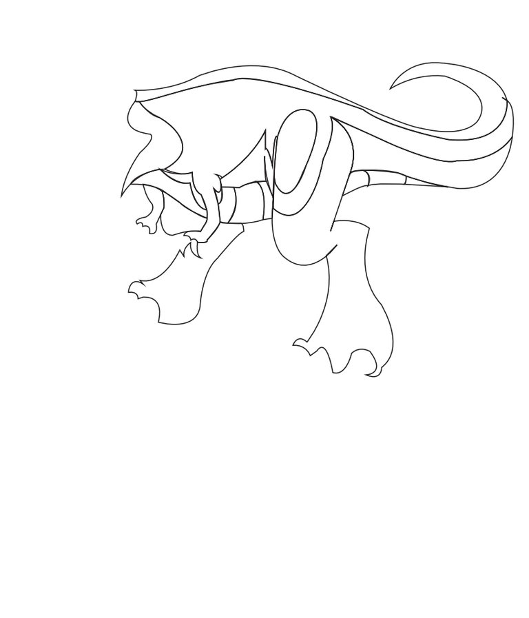
Then I started to draw the sktech of its face. I draw his tooth which are sharp and his tounge ...... Amd his head's feactures.
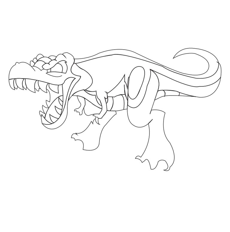
Then I started to draw rhe nail of the hands and the feet. Now the sketch is complete. Here is the finall look of sketch.
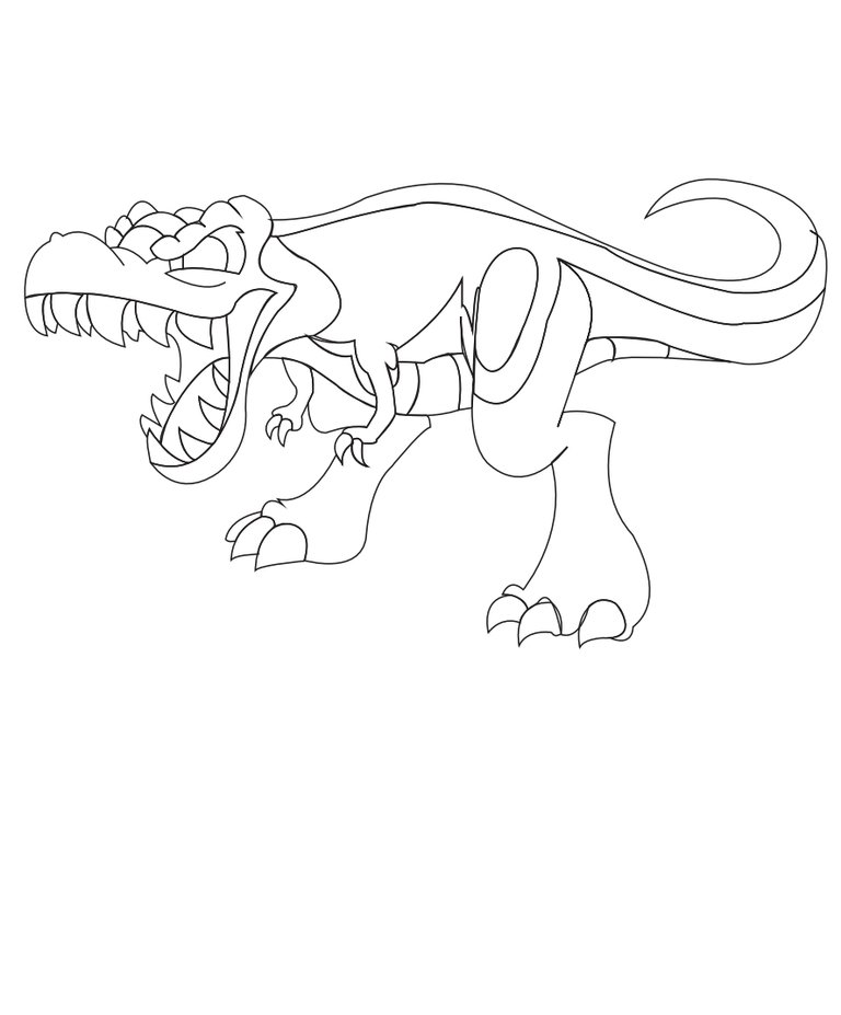
Colouring
First of all I colour the different shades of green in the body of the rexxie to give it shine as in the real pic.
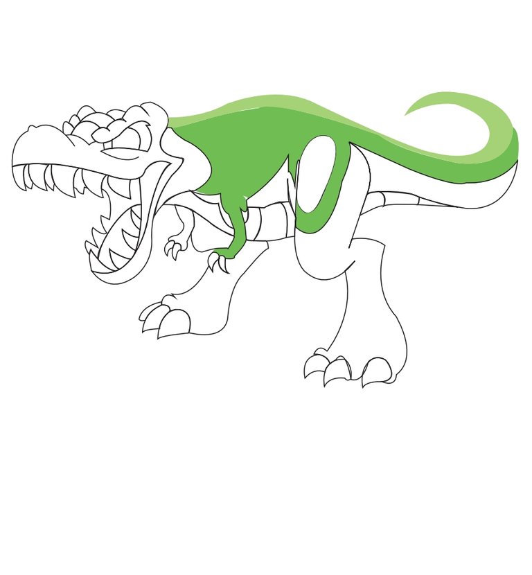
Then I colour the dark green in the remaning body. It looks dangerous... Due to its features and now colours. I colour in his head light green and in his backward tooth black and outward tooth are coloured with white. Let me show you
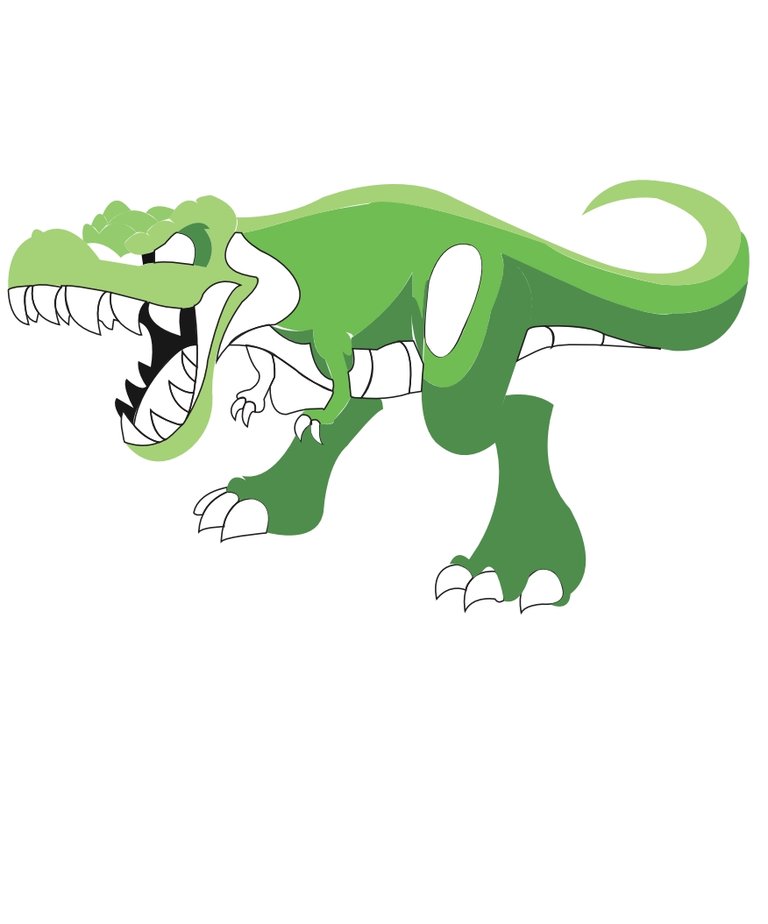
I colour in his eye and then in his tounge. Now I outlined the small featured with black.
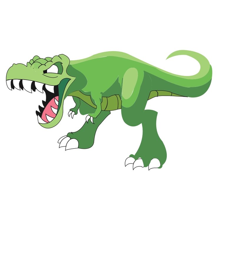
I outline the whole character with the hwlp of black colour.
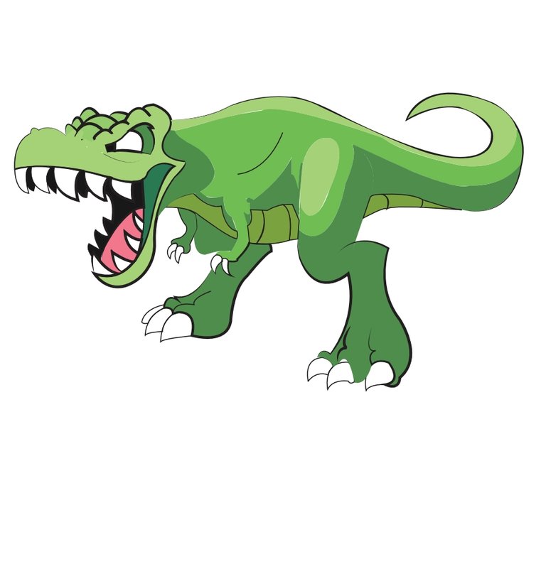
Then I drop shadow by using effects prwsent in the menubar of the adobe....
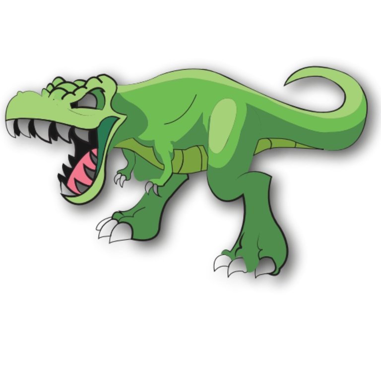
Then I put a background behimd it of green and white colour which totally changes the look. Amd now it is impressive. Really It seems as eyecatcher.
Here is the finall look.

I hope you will like it. I will come back soon with a new and aesthetic post inshahallah.
Thank you so much for loving my post amd visting it
Allah Hafiz and Take Care
See you later guys
Love a lot
Good art but can you like to share complete process? Moreover three speak didn't curate any video less than 1 minutes. Hope, you are having a good day.
Ooh yeah I understand . I will be carefull next time
I always share complete process .
Done a nice job. It's seems tough but you made it🤍
Yeah I made
Nice
that looks great ,thanks for sharing.
I also like digital art, it is fun to play with colors on mobile.
I loved it, keep it up😁
Thanks