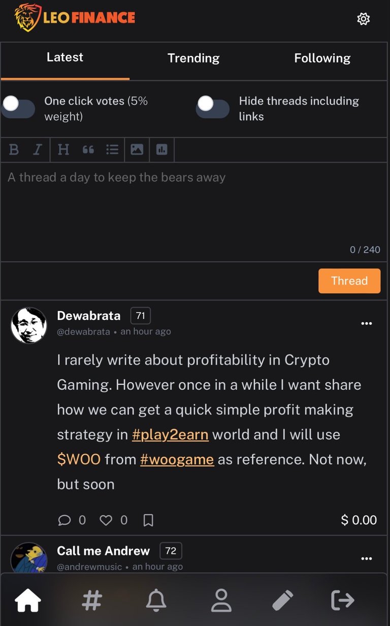
Project Blank From Chaos To Clarity With The Predictable Update To Enhance User Experience

The Leofinance as of recent are living to expectations as regards deliverables as promised by the team the the project blank UI which was scheduled to launch 1st of may actually happened, the update of the user interface was a bit chaotic for some users has they find difficulties in carrying out task and post creation.
In recent events it has been observed that using the new UI is better thorough the web application view on laptop, in a recent development as regards this chaos the leofinace development team put up an AMA session which this was discussed extensively. The team said they are committed releasing updates every Friday which they aim in creating structure and a sense of predictability for it’s users.
More GIFs, emojis will be coming to project blank which is said to the centered on creating a more engaging environment for threads and also elevating the user experience generally.
Grab an opportunity with Web3(the third stage of the internet as we know it) by signup on the Leofinance platform, a financial base platform which has tight ties with it’s community and it’s built on one of the robust blockchain technology hive.
If you are curious about what cryptocurrency Leofinance is an encyclopedia of financial information and knowledge you can start here by using the link. Help grow your financial literacy with reading articles on the platform from which is about cryptocurrency, stocks, investment, real estate etc.
Underneath their sleeves is the PolyCub which was lunched on defi 2.0 ecosystem and a lengthy list of other Leofinance influenced project which can generate massive APY for you as an investor when you are actively part of the pool, there are different kinds of options that are available to you when you click this link as shown before now.