A BACKGROUND TRY ON THE ACRYLIC AND CHARCOAL PORTRAIT PIECE OF A LADY ON YORUBA TRADITIONAL ATTIRE
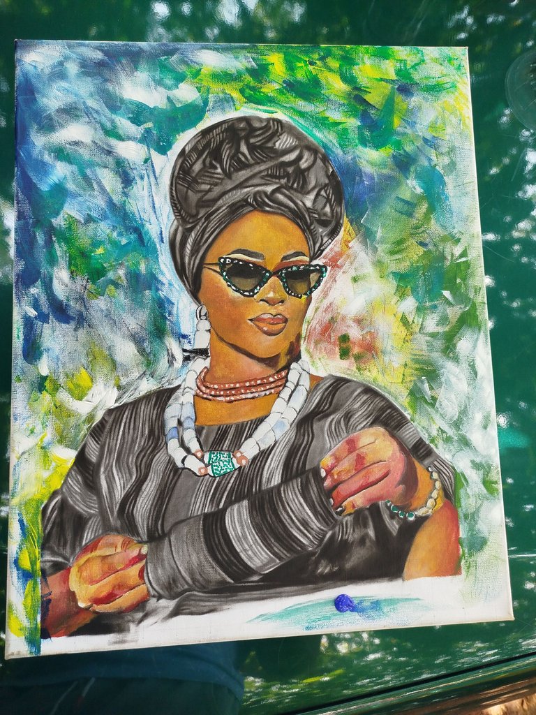
A beautiful day to you all hivers, I want to share with you my experience and process I had in giving this piece a background design colour.
After the completion of this piece, I was thinking and wondering what background would best fit it. I tried 3 different approach and design but settled for the last technique I tried.
The first technique was to leave the piece plain with a bright and light background that is painted white
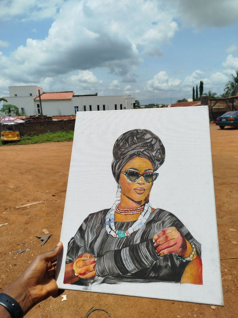
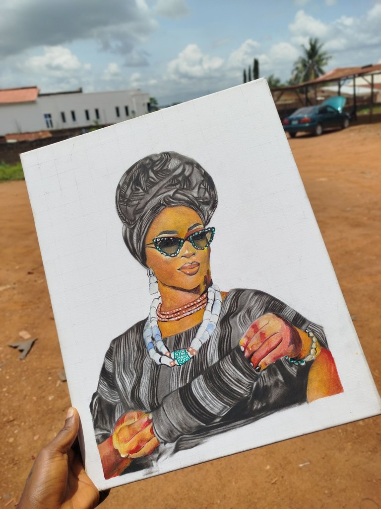
On another hand, I decided to give an approach of different colours giving it an admire concept but I felt the colours were too much on it and it's making the piece look so dry. Seeing it below:
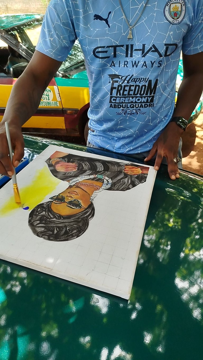
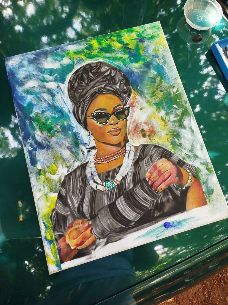
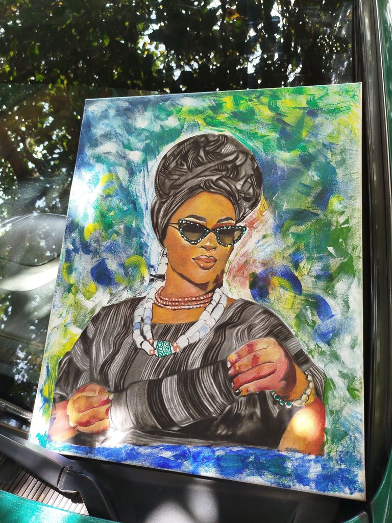
So then, I decided to give it a rough design and plain colour background which looks so perfect and unique to me. See below;
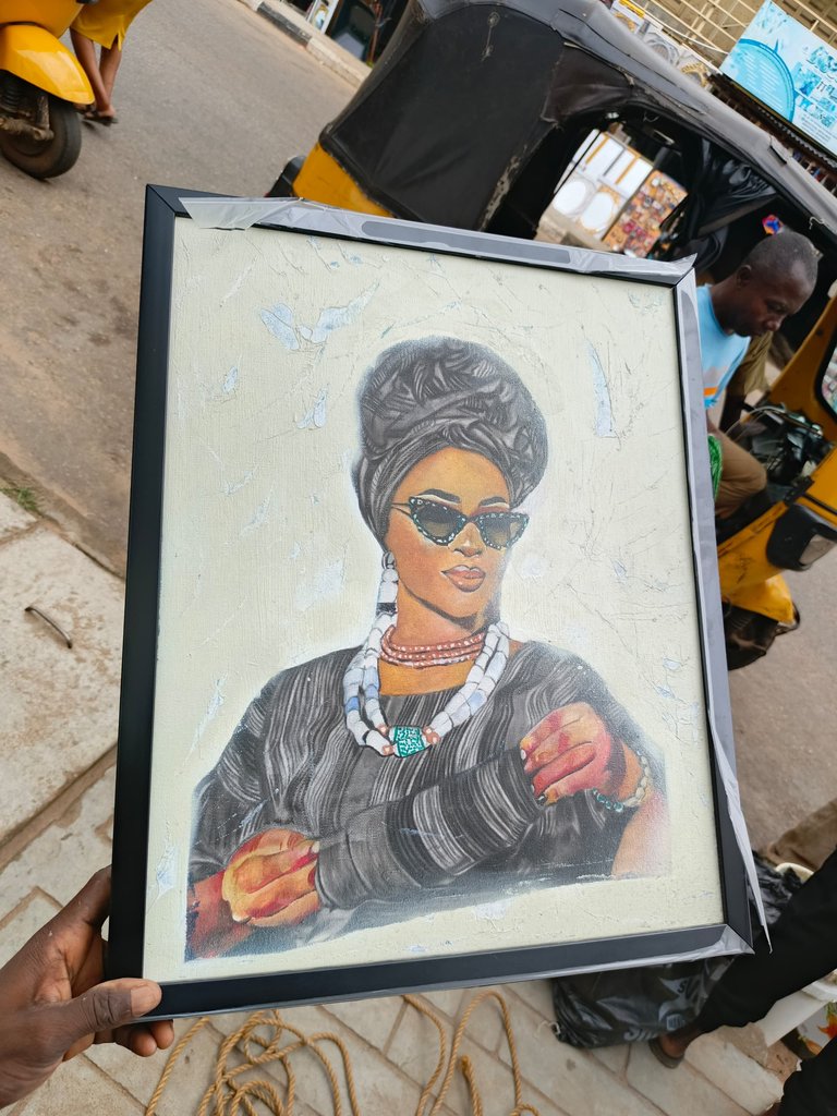
Oh what a beautiful process.
Which of the he backgrounds would you prefer?
1,2 or 3?
Wooooowww un gran artista
Thank you so much 😊🙏