Side by Side
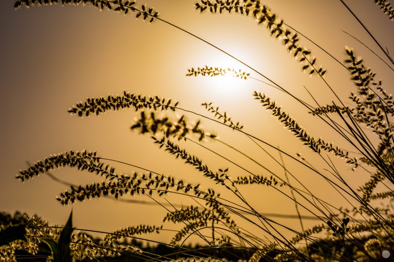
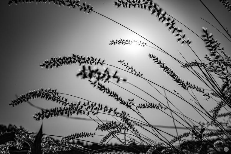
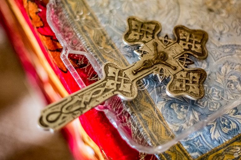
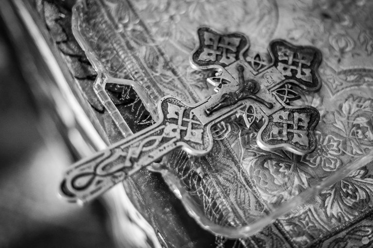
Isn't it a brilliant idea to provide the two versions of a photograph, side by side?
The color version, giving the "full" picture and the black and white version, focusing on the "soul" of it, accenting on the shapes and everything else...
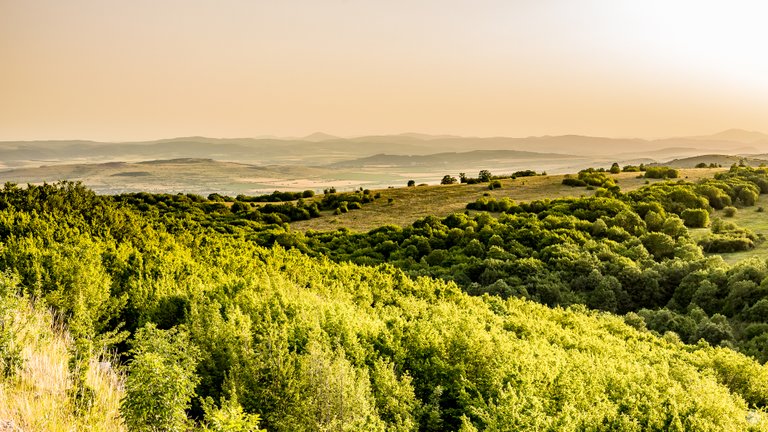
Here are a few photos, different perspective I took on the same trip, to illustrate that concept.
I hope you'll agree that sometimes, colors are an important part of the message itself, but sometimes they are just a distraction.

Thank you for your time and support, please check out below few other ways to encourage me in my endeavors and stay in touch!
You could get a license here for some of my visual works approved by the quality review team of Adobe, Inc.: https://stock.adobe.com/contributor/206416265/lightcaptured
I use and recommend those services below, following my referral links is a win-win for both you and me:
- Trade on one of the biggest exchanges: https://www.binance.com/en/register?ref=L9YP0QXH
- Great exchange with staking rewards if you are in EU: https://bitvavo.com/?a=8BD90E2321
- Probably the oldest and most fun Bitcoin faucet with extras: https://freebitco.in/?r=41678934
Copyright: Light Captured
For licensing my photos, please contact me!
Have a great day, stay safe, stay strong and let your muse be always on your shoulder!

I gifted $PIZZA slices here:
@lightcaptured(4/15) tipped @malos10 (x1)
pixresteemer tipped lightcaptured (x1)
lightcaptured tipped daveks (x1)
Learn more at https://hive.pizza!
Yay! 🤗
Your content has been boosted with Ecency Points, by @soulsdetour.
Use Ecency daily to boost your growth on platform!
Support Ecency
Vote for new Proposal
Delegate HP and earn more
Thanks so much, @soulsdetour :)
Beautiful!
If you could add #colourblackandwhite that would be great. Thanks
Thank you!
I had the sneaking suspicion I am missing something important! :)
Point taken :)
!PIZZA
i preferred the colors version! the one of the cross is really great, i loved the focus
Thanks, buddy!
!PIZZA
Very much agree with your idea of the sometimes distracting color. It's the same with people, sometimes we focus on their "colors" and not their essence.
In the photos you show both sides of the coin, but there is always the light that allows us to understand the concept of the image.
Beautiful photos
Thanks so much! :)