Zircon Chill - Coffee Shop with Tropical Vibes and Unique Design and Architecture
In today's era, the growth of coffee shops is increasing in my city. Every week, I always get info about a new coffee shop or cafe from social media or my friends. Each coffee shop has its own characteristics and charm, not only relying on quality coffee, the coffee shop is also willing to make an impression on every visitor.
Social media brings big changes to the restaurant, cafe or coffee shop industry. Entrepreneurs are not only required to have a menu of delicious and quality food and drinks. Visitors to restaurants, cafes or coffee shops also want to share interesting photos when they come to that place. Therefore, each coffee shop or restaurant has a different design and architecture to make visitors come to their place. A few days ago, I visited one of the coffee shops or cafes in my city that was going viral. The coffee shop or café is called Zircon Chill, what's the attraction? Let's discuss.
This coffee shop or café is located at Sei Rotan Baru Street no. 23-25 Medan City. The location is on the edge of the highway and close to the center of the crowd. One problem is finding parking for the car, because Zircon Chill has a relatively small area and sometimes have to find parking elsewhere.
Initially, my intention was to come on Saturday night to relax while listening to live music. However, Zircon Chill was too crowded and I couldn't find a parking space. Finally, I came back to Zircon Chill on weekdays with a more quiet and relaxed cafe condition so I was free to take photos and also ask the staff. In addition, the advantage of coming in the morning can also feel the atmosphere of a cafe or coffee shop that feels like our own.
Santorini Design and Vibes
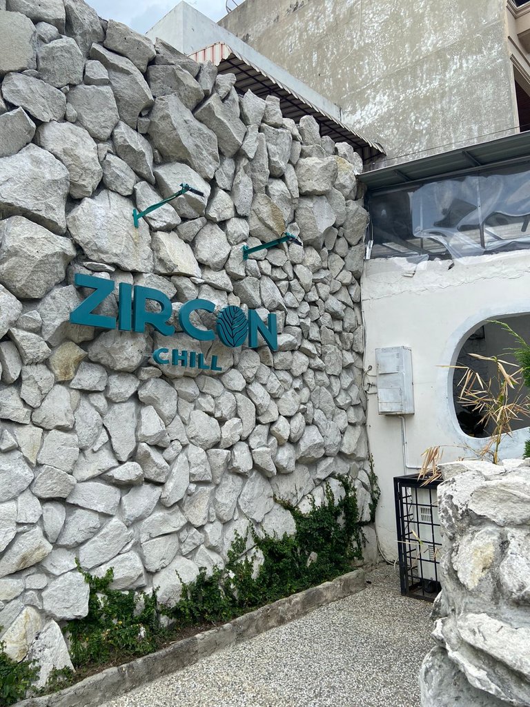
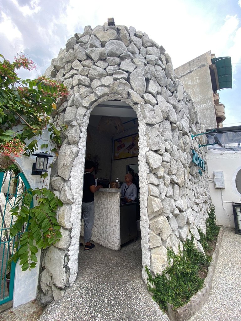
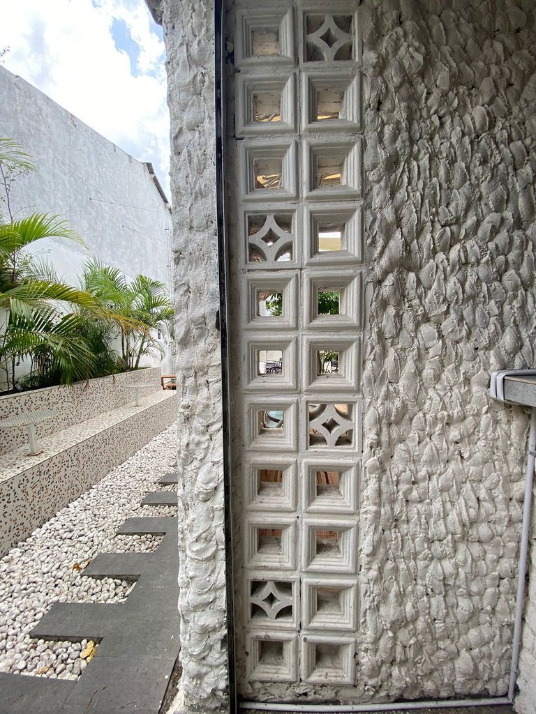
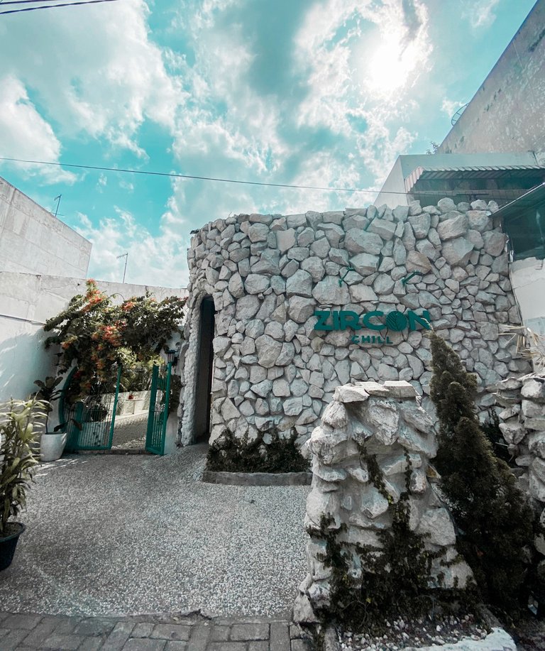
From the front, the Zirchon Chill has a very unique design style. The entrance has a stone wall arranged as if we were in Santorini Greece. This style of stone wall design is currently popular, there are also many housing or cafes that make walls like this. The front of Ziirchon Chill is a very beautiful photo spot, from the entrance we seem to know that this cafe will be a very instagramable place.
We can also see the design and architecture inspired by Santorini from the inside of the Zirchon Chill. We can see the characteristics of it from the touch of white color of the core building on the walls, the stone floor that uses natural colors and also bright colored ornaments to create a cozy and cheerful impression.
Outdoor Space and Tropical Vibes and Design
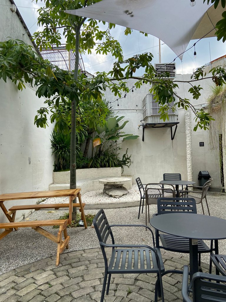
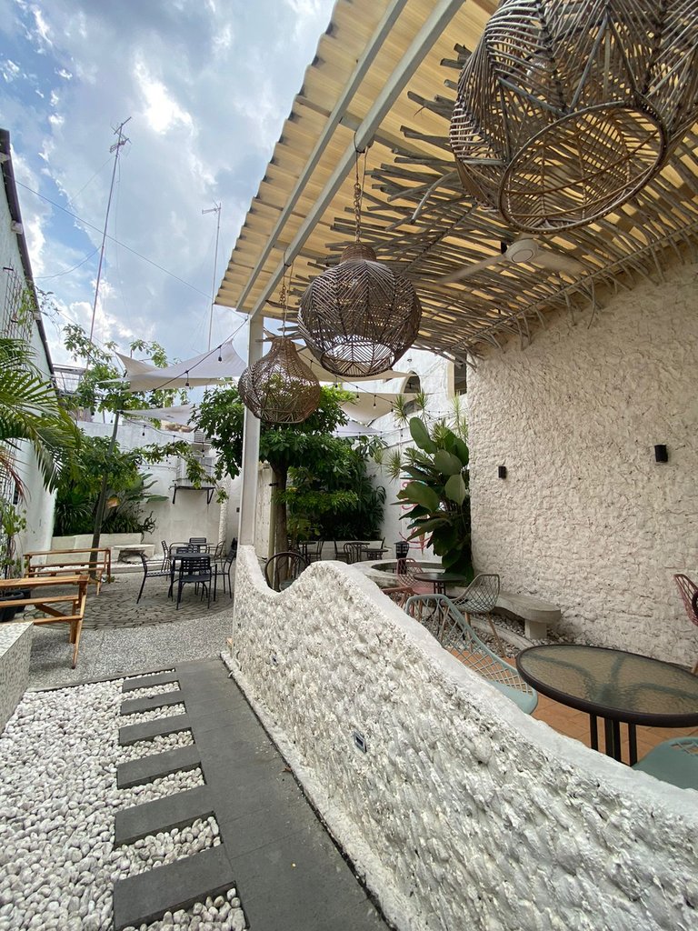
The outdoor part of the Zircon Chill is the most favorite place of visitors. This outdoor space is the most spacious room of Zircon Chill. Zircon Chill outdoor furniture uses various materials such as iron chairs, wooden chairs and tables and also benches made of neatly arranged concrete arrangements. The layout of furniture such as tables, chairs and benches is arranged very neatly and aesthetically, the distance between tables is also ideal so that if visitors are crowded and full, we will not be disturbed.
To make the impression of "green" in every corner, we will find green plants such as palms or monstera that have green and wide leaves. The position of the plant placement is very important for a cafe or restaurant that carries a tropical concept, if you put the plant in the wrong position, you will only feel the impression of being stuffy.
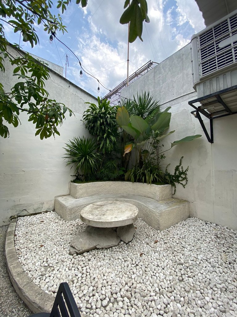
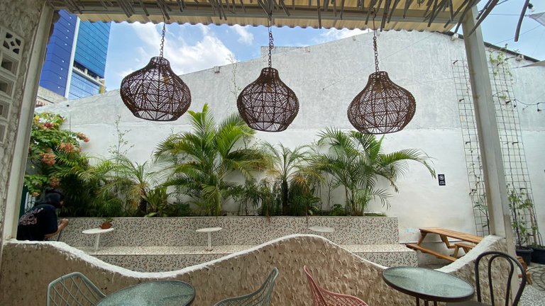
I really like the outdoor part of Zicron Chill, when I'm here I feel like I'm on vacation. I understand why many people take pictures in all corners of Zircon Chill's outdoor space.
Indoor Space of Zircon Chill
According to workers from Zircon Chiill, the first building of this café is an outdoor area. Initially, the owner wanted to make a cafe or coffee shop with a full outdoor concept, but the weather that often changes from sunny to rainy and the small indoor space used as a bar table and cashier made the owner take the initiative to create an additional indoor room.
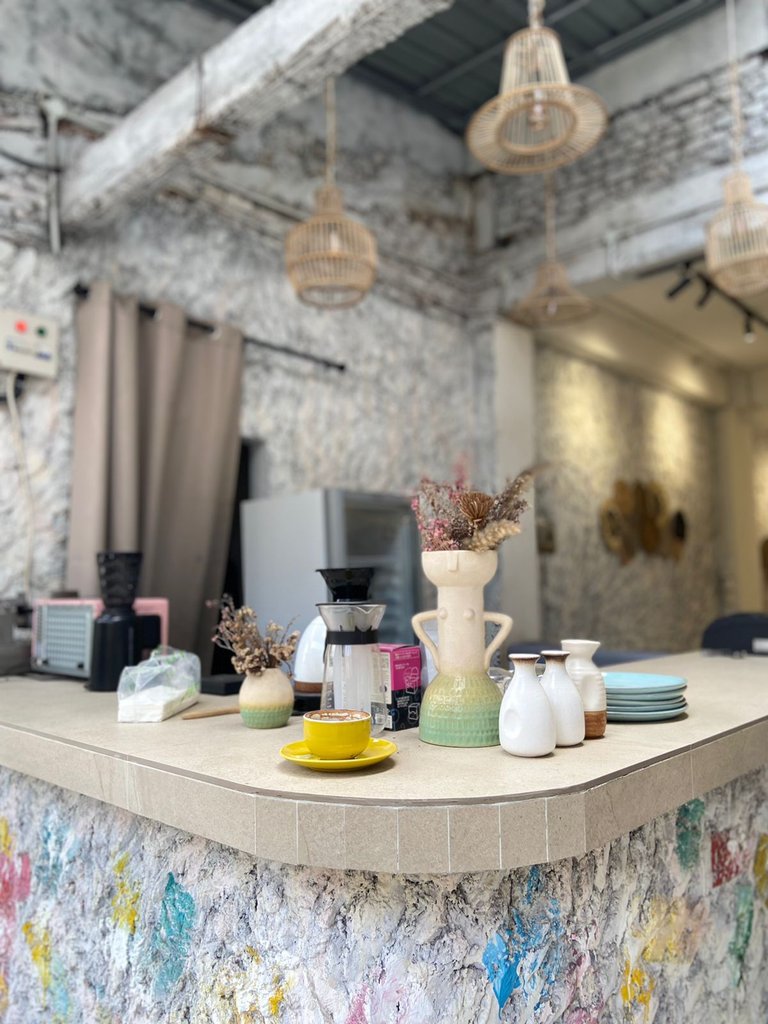
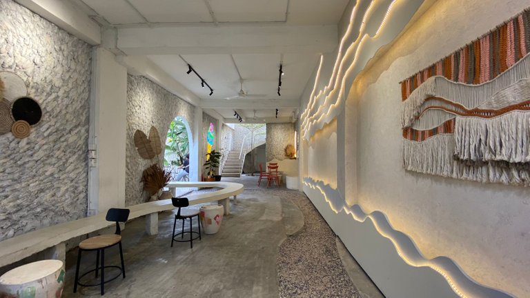
The indoor part of the Zircon Chill is no less cool and aesthetic than the outdoor space. This cafe also made the walls with a coral stone wall design in gray and white colors. The combination of stone walls with the floor is also very fitting. The floor uses cement which is left natural. In addition, there is a one meter section which is not cemented but replaced with crushed gravel.
Zircon Chill also has a long table made of brick and cement. We often see the use of cement and brick construction in cafes or coffee shops that carry industrial concepts. This design is more cost-effective than having to paint the walls or install ceramic tiles on the floor. In addition, a natural impression is also obtained because it utilizes the natural color of cement.
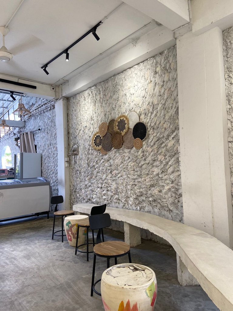
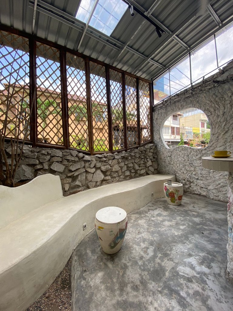
To prevent the impression of monotony in this indoor room. Zircon Chill adds interior decorations such as wall hangings and various arts such as jars, curtains, or several other objects. Not to forget, the lamp ornaments made of woven bamboo add to the aesthetic impression of this place.
For me, the greatest strength of the Zircon Chill is its clever use of small spaces and a very strategic but also very beautiful layout. Many buildings fail to arrange the room and make the right design so that it creates a narrow impression in the building. Zircon Chill is built in a not too wide area but when we enter Zircon Chill, we feel like we get a very different dimension and feel.
It was a very pleasant experience to visit this cafe. See you on my next trip.

Call me Isdarmady, because I have a full name that is very long, namely Isdarmady Syahputra Ritonga. I am a head of the family who work as Farmers Vegetables Hydroponic and Consultant Hydroponics, sometimes I also sell coffee from various regions in Indonesia.
I have expertise dispensing coffee with a variety of techniques and tools brewing, because I have the desire to make a coffee shop with hydroponics as centerpieces. Help me realize that dream.
Thanks for read, vote, re-blog and support me in Hive. Maybe god will reward the kindness, let’s success together.
Congratulations @isdarmady! You have completed the following achievement on the Hive blockchain and have been rewarded with new badge(s):
Your next target is to reach 50000 upvotes.
You can view your badges on your board and compare yourself to others in the Ranking
If you no longer want to receive notifications, reply to this comment with the word
STOPCheck out the last post from @hivebuzz:
Support the HiveBuzz project. Vote for our proposal!
Your content has been voted as a part of Encouragement program. Keep up the good work!
Use Ecency daily to boost your growth on platform!
Support Ecency
Vote for new Proposal
Delegate HP and earn more
I agree they did very good job in designing both outdoor and indoor space. It is so clever how they arrange the long line and curve indoor which helps our eyes to move along without interupting with strange colour or object - make the place look bigger and nicer. I can see they are growing climbing plants on the walls outdoor, it will be really nice one they all grow bigger.
thank you for stopping by @dora381
that's right, the arrangement and arrangement of space in the building will help create a spacious and spacious impression of an area or building. We certainly have come to a place or building that has a large space but poor spatial planning, we will feel cramped.
it also allows our eyes to move freely to observe all corners of this coffee shop or cafe.
Greetings this way! It looks like a lovely place to me. That rustic, minimalist style is something that is still in vogue in various parts of the world. This one in particular seems nice to me because it doesn't stick with the common use of wood but takes stone as its main source of decoration and construction. The exterior looks just as you describe, fresh, especially with the use of gardens.
Although I will tell you that I sincerely love the interior, it seems to me that the touch that gives a lot of personality to the place is the use of those paintings or textiles that give another texture. It is perfect. Besides, a good coffee shop is never too much. Very nice article, beautiful place.
hello @carminasalazarte thank you for stopping by and appreciate this post
Yup, the rustic, minimalist style and added tropical elements are the favorites of many coffee shops or cafes for their business concepts and can also make a positive impression on the visitors who come.
The use of wood as a design and construction was popular a few years ago in my city, almost all coffee shops or cafes use it and it is very risky to the environment. Initially, the coffee shop used used wood or leftover wood and re-varnished but due to the high demand for wood, many new cafes with large capital bought forest wood which made illegal logging cases high in that era.
Luckily, since last year. awareness of business owners and visitors has begun to appear. People prefer to come to coffee shops with industrial concepts that use stone and cement colors or fresh and fancy outdoor cafes. I think it's better than having to cut down trees to make new wood or planks.
Zircon Chill tried to combine the two concepts and executed it well. Interesting, whether this concept will be imitated by owners of similar businesses because people from my country really like to imitate something that is in demand or viral.
Wow! I had no idea about logging due to demand. It seems to me that changing to a more ecological and practical concept, is much better than sustaining a trend in design just because of fashion. I hope new venues will think of this one as a reference to what is actually viable. Regards.
Yup, the issue of environmental damage was discussed a few years ago when cafes or restaurants started competing to use wood as decoration.
That's right, I think apart from thinking about fashion and trends. A building must make a lasting impression for every visitor or viewer.
Cool! A Santorini-inspired coffee shop! Looks like the coastal vibe is clearly evident as simulated from the famous Greek location but if there would be one design detail I've noticed, that would be the lack of the iconic sky blue color commonly found in most of their architecture. Regardless, that superb establishment is an absolutely fantastic space that's trying to be different from the competition. 😊
Do you have any idea of the type of stone used for that cafe's main entrance? Is it the same coral stone implemented for the interiors @isdarmady?
thank you for stopping by and appreciate @storiesoferne
That's right, there should be a touch of sky blue in this architecture to complete the Santorini touch in this coffee shop. I imagine if there was a cafe like this on Indonesian beaches, it would be very cool, seeing the huge potential of beaches in Indonesia.
I don't know the type of stone used, but usually the stones used are river stones of good quality. The use of this stone construction also seems to be popular at this time.
Oh I see. I'd also think that those special stones would be readily available locally, giving that cafe its vernacular vibe. And this would also prevent the additional costs of importing these building materials from foreign locations. 😊
That's right, the need for construction like stone seems to be from local. Indonesia is surrounded by many volcanoes and rivers and it looks like it could be empowered well.
"vernacular vibe" i like that term.
That's a vibe for sure. Loved the aesthetics.
Keep sharing your experiences man! Good luck
thank you for stopping by @praditya
I'm so glad my travel posts can inspire others.
Thank you for sharing this amazing post on HIVE!
Your content got selected by our fellow curator @priyanarc & you just received a little thank you via an upvote from our non-profit curation initiative!
You will be featured in one of our recurring curation compilations and on our pinterest boards! Both are aiming to offer you a stage to widen your audience within and outside of the DIY scene of hive.
Join the official DIYHub community on HIVE and show us more of your amazing work and feel free to connect with us and other DIYers via our discord server: https://discord.gg/mY5uCfQ !
If you want to support our goal to motivate other DIY/art/music/homesteading/... creators just delegate to us and earn 100% of your curation rewards!
Stay creative & hive on!
It is indeed very unique. This is the first time that I have seen such a design. Good evening my friend.
thank you for stopping by @afterglow
I'm so glad you came to this blog.
You're welcome (^_^)
Hello Isdarmady, I congratulate you for your post, the Zicon Chill Cafe you show us is a delicate, open and elegant structure. The photos are excellent and it provokes going to the place to enjoy moments of relaxation and tranquility in good company. Receive a fraternal greeting
thank you for stopping by @besamu
This place is indeed very comfortable, and also spoils our eyes. In addition, the food and beverage menu choices are also very tasty and delicious.
Congratulations @isdarmady! We're delighted to specially curate your awesome publication and award it RUNNER-UP in Architecture Brew #78. More power!
Thank you for subscribing to Architecture+Design, an OCD incubated community on the Hive Blockchain.
thank you very much @aplusd
You are most welcome dear @isdarmady. 😀
Cool cafe design. I like how they used natural materials mixed with concrete and metal. You're right, they managed to break the straight longitudinal narrow space by breaking them up and using curves, round furniture, and patterns.
thank you for stopping by @discoveringarni
That's right, the space utilization of this cafe makes it look bigger than it should be.
the selection of furniture and accessories is also appropriate and not excessive, we can still enjoy a balanced composition of design and architecture.
the cafe is really cool. someday i will go to that cafe. I think if a cafe like that will be crowded if Saturday night or Sunday come there. I think it's true what my brother said earlier, come to the cafe on weekdays, not holidays or weekends. so it feels like your own cafe.
That's right, come on weekdays to get the best impression from this cafe.
thank you for stopping by @maytom
👍