POV: Say Goodbye to your Gold | Aria Bandit - Splinterlands Art Contest

Hands up!
Hello friends, today I come with the intention to rob you, yes, just as you read, I'm going to rob you, leave your upvotes right here below, because today I am one more bandit, and the gold I will take from you will be your upvotes, comments, and reblogs.
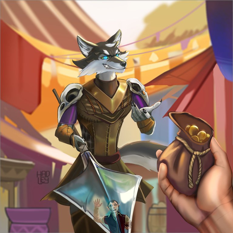
And it is that among the Splinterlands cards I have, Aria Bandit is my only gold card, and it's a bit ironic because Aria bandits are usually the ones who steals the gold. Maybe he has already accumulated so much that he has put it on his own card. In battle, it hasn't been very useful to me, but still, look how cool it looks stealing from people. So I've set to work and made him do what he does best. Besides, I wanted to give that detail of having a very polished tip on his spear, just so his victims see their faces of fear when being robbed and give up their belongings faster.


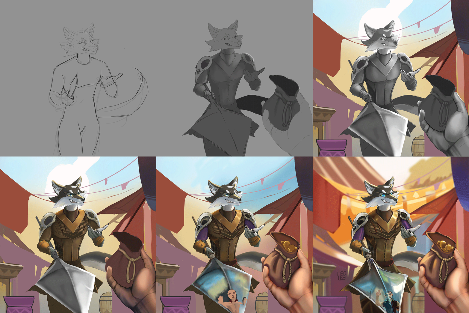
-Step 1:
I wanted this scene to be a POV, for you to feel firsthand what it's like to be inside Splinterlands. It's a pity that your first impression is to be left without your belongings, but that's Splinterlands for you, a world where everyone fights. By the way, I had to pose myself to draw this bandit, and that's why at first he has a knife because that's what I had at hand in the kitchen. But then I decided it would be better to leave him with the spear and figure out how to achieve the perspective of the spear tip.
 |  |
|---|

-Step 2:
It is supposed that these bandits only attack in the barrens, but I do not doubt that there is some bandit from A'lan's gang who wants to be bolder and approach to strip the merchants of nearby towns of their belongings. So already from the work in grays, I had a clear idea of the setting I would use, simulating a market with some baskets and sales stalls but without falling into ultra-detailed work. So I stayed only with their silhouettes.
 |  |
|---|

-Step 3:
Taking into account the colors of the background, I adjusted the bandit to the lighting of the environment and focused mainly on his face, trying to make him as mischievous as possible. And that his leather clothes had some details that made him look great and thus attract the viewer's attention.


-Step 4:
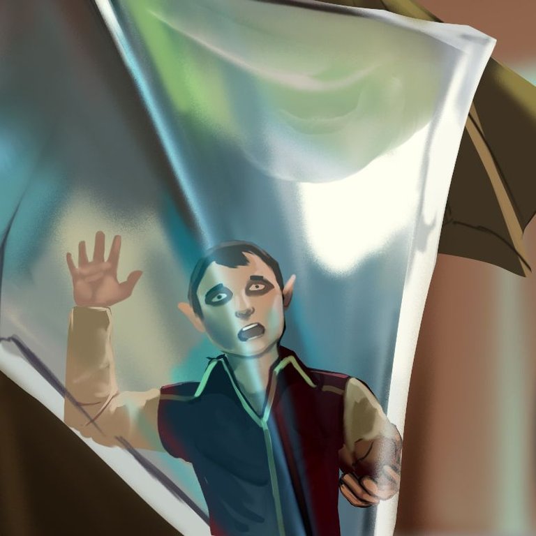
We come to the most difficult part: painting the reflection of the victim in the bandit's spear was a great idea. But that meant that I really had to paint another character. So I tried to fit his silhouette on the tip of the spear. And again, I had to use myself as a reference so that the character would have a surprised face, one hand up and with the other handing over the bandit's new savings.
 |  |
|---|

-Step 5:
The victim had turned out well, but since it is a reflection, I had to make sure that the tip of the spear was shiny. So I applied the "screen" blending mode to make those highlights and the result was decent. So I went on to finish the background by adding more elements worthy of a colorful market. And since I gave quite a lot of yellow to the background as a reference to the color of the card. And at once made his blue eyes stand out more to show that he is a criminal to be wary of.


I will leave you a GIF with the whole process on it, so you can better appreciate the illustration process.


See you in a future post!
Thank You for Supporting My Artwork
TWITTER |TERRA VIRTUA |NFT SHOWROOM | INSTAGRAM
⬆️ Follow ⬆️


You have this medieval style of painting which is very cool keep it up.
Hey thanks, I try to keep a dynamic style in my paintings, and I'm addicted to details
that's cool am very new here am trying to grow myself am more of a based comic style/digital graphic illustrator but your style is really lovely hope you grow bigger than the level you are