18+ At The Gallery - NSFW
Today I'm going to show you some artworks that need the #nsfw tag, so please turn around and leave if you are not comfortable with such content or if you're disrespecting your work schedule hanging out on Hive 😏
Last week I had an interesting experience while visiting a museum. I mean every museum visit is an interesting experience, but this was different as I've never been part of such experience before. The artist name is Marcel Iancu, he was born in Romania and emigrated to Israel before WW2. So everything you see here has to be looked at through a filter that was used back in those days.
When I stepped in the exhibition hall, saw a black curtain in the back of the room, which seemed a bit strange. I didn't know what to think, my first impression was that maybe they had no time to finish some work (which reflects poorly on them), or that an accident may have happened and they chose to cover it with the curtain.
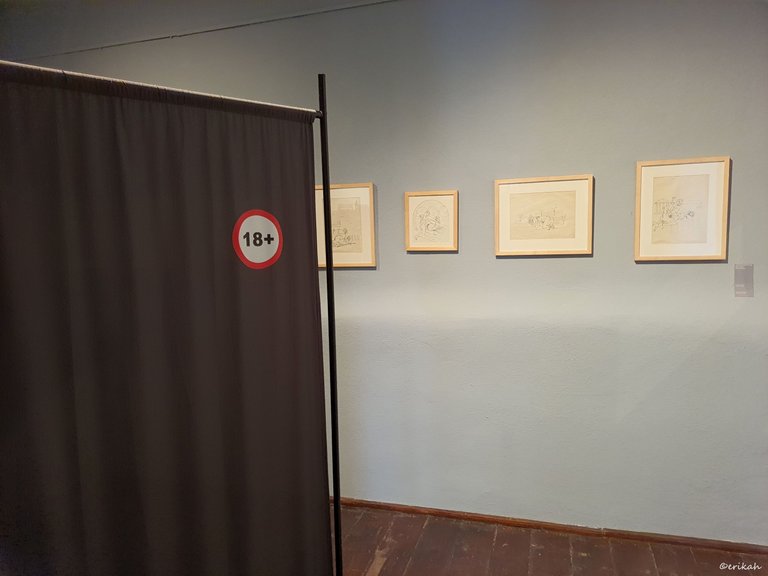
When I got there I saw that there was nothing like that, but the 18+ content hidden behind the curtain.
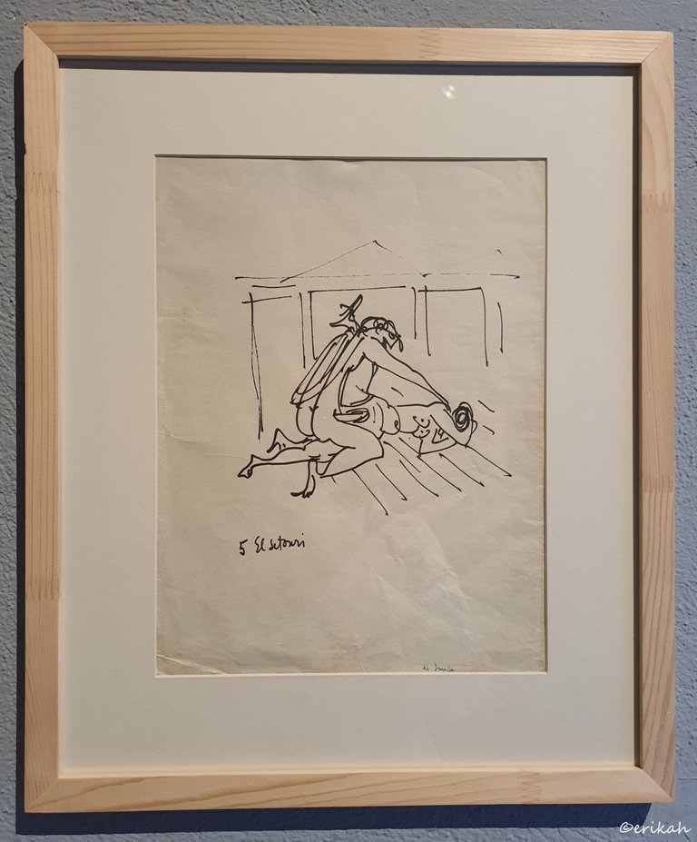
There were erotic drawings on brownish paper, but there's a possibility the paper was just old and that's why it looked brownish. In any case, the brownish color was perfect.
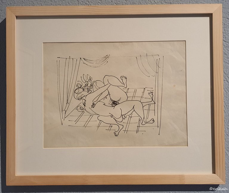
What surprised me the most was the simplicity of the drawings. I mean it is pretty explicit, detailed, you know what the artist meant to express, but without too much artistic fuss.
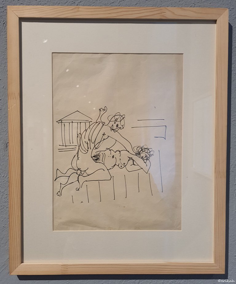
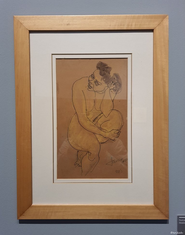
If you look at this one above for example, there are just a few lines put together, no shading, no other techniques used.
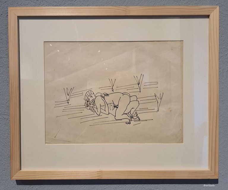
My next thought was how many times the artist must have drawn it and I tell you why. Artists usually are drawing small and thin lines, going over the same path multiple times, adjusting it as they like. This is ink on paper, there's no such thing here. There's one continuous like and if you miss, you need to redo the whole thing.
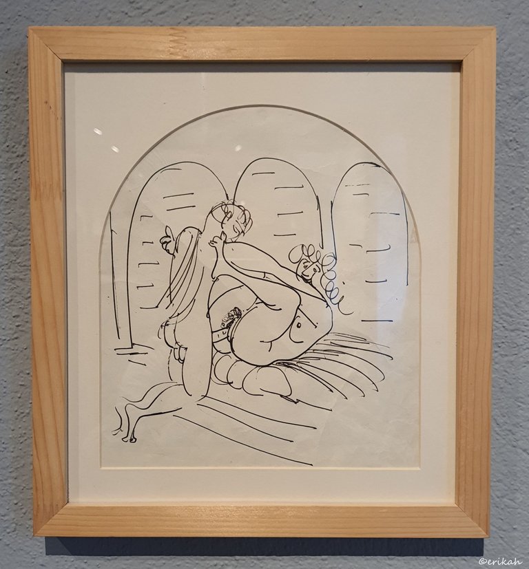
If you have a closer look at this drawing, you can see that the lines are continuous, which means it the artist must have done them in one go, without lifting the ink up of the paper. To do that, you need a lot of practice, some talent ad a steady hand.
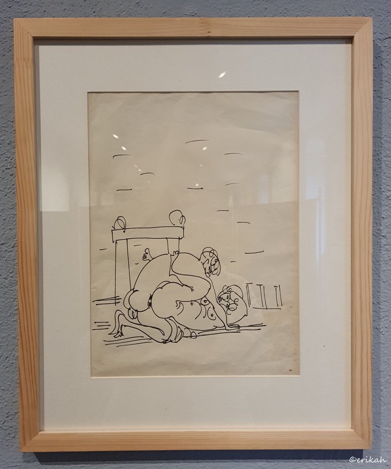
This is not fine art, but that doesn't mean it's easy.
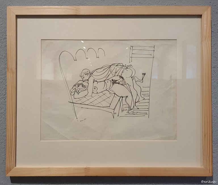
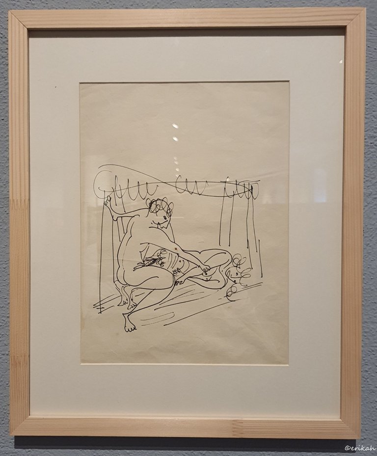
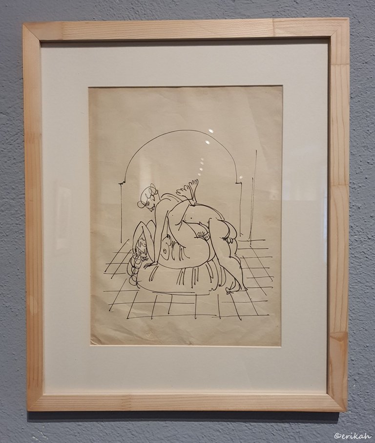
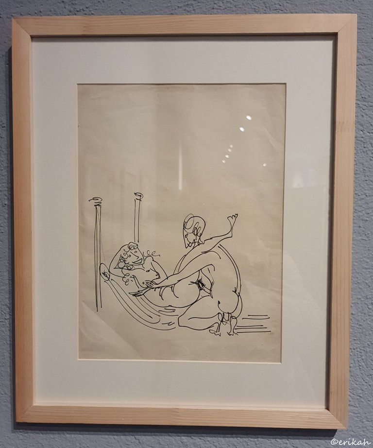
I was wondering when had the artist created these artworks as back in his days 18+ topics were taboo.
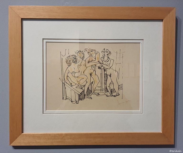
Next there were nudes, mostly featuring women as I suppose featuring men was not very common. I mean sculptors loved to feature men as male body seemed fascinating, but not painters. Marcel Iancu lived between 1895 and 1983.
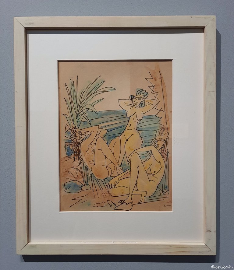
This is not fine art either and the drawings, paintings are simple, but that's the beauty of it. Made in 1940, I suppose it was unusual back then.
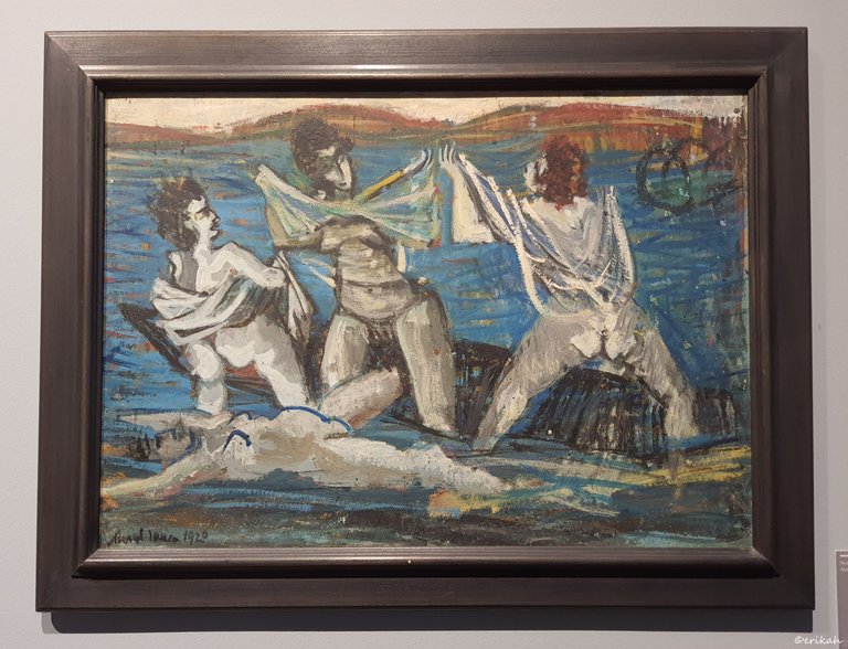
Nude paintings were not a rarity. This was created in 1920 and it is oil on cardboard and wood.
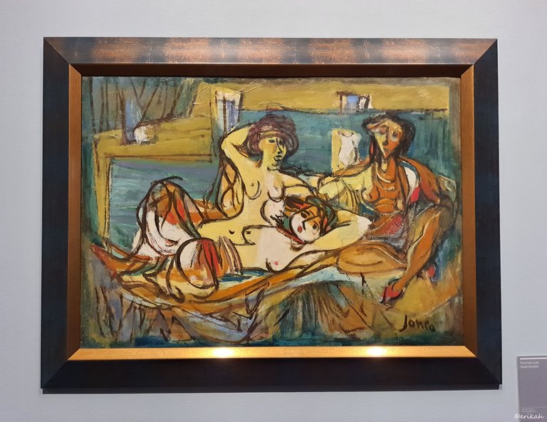
I love the color combination here.
I had to break the content in 3 parts as the artworks are very different and can't mix them. This was the second part and my first NSFW post. As I said in my post, this is not fine art, but I can still highly appreciate it as it takes some talent to be able to illustrate the act this way. I have kept the best part for last, so stay tunes.
Sooo, which one is your favorite this time?

If you're a newbie, you may want to check out these guides:
- Communities Explained - Newbie Guide
- Cross Posting And Reposting Explained, Using PeakD
- Hive Is Not For Me
- How To Pump Your Reputation Fast - Newbie Guide
- Tips And Tricks & Useful Hive Tools For Newbies
- Community List And Why It Is Important To Post In The Right Community

I find this to be fine art. It's a type of continuous contour design and it's very expressive. I think it's very difficult for those that don't do it but easy for those that are into this style.
If you notice, not many of the artist's lines overlap. If it was just sketching then many times the man and woman would probably overlap when one figure crosses another.
I'm with you though... this is very detailed and graphic yet with such minimal application in most works. Cool post and now i see what you meant about the tag.
Thank you for the nice comment. It is a special art that seems simple but it is not, that's why I appreciate it. I was looking at the details as that's how you learn and learn to appreciate the artworks. I liked it a lot.
And I'm glad you agree on the tag use :)
Dear @erikah,
Your support for the current Hive Authentication Services proposal (#194) is much appreciated but it will expire in a few days!
May I ask you to review and support the new proposal (https://peakd.com/me/proposals/240) so I can continue to improve and maintain this service?
You can support the new proposal (#240) on Peakd, Ecency, Hive.blog or using HiveSigner.
Thank you!
Done!
Thank you for your support @erikah, really appreciate it! 👍
You're welcome 😊
Cool art and i think this "simple" style is even more difficult to master because you have to be able to show what you want to mean with only little lines,
You may be right and I think so too as you need to have a steady hand and be precise. But this artist certainly knew how to do it.
for something he have his own exposition... he's a master!
Gangbang 😀😀
Looks like you need to learn.
Gangbang??
Idiot.
Thanks very much