R Language - How to Create Dot Plot in R
In this post, we take a look at How to Create Dot Plot in R language. It's similar to the scatter plot except the part where you put in the data and how it looks overall. The design wise it is definitely unique plot and also has the variety of different points that gets into the plot.
Previously I covered the calendar plots in R. Basically it was the calendar library which is often used for people who want to plot the data against some dates. Like say lunar calendar or the calendar with some weekend days data.
Make sure to use the RStudio IDE so that you would be able to easily get the plots and also the package installation and also the usage of the data against the plot would not be that difficult. So in that context it would be reasonable to try the plots.
I have created a video to give you an overview on How to Create Dot Plot in R. You should give this one a try.
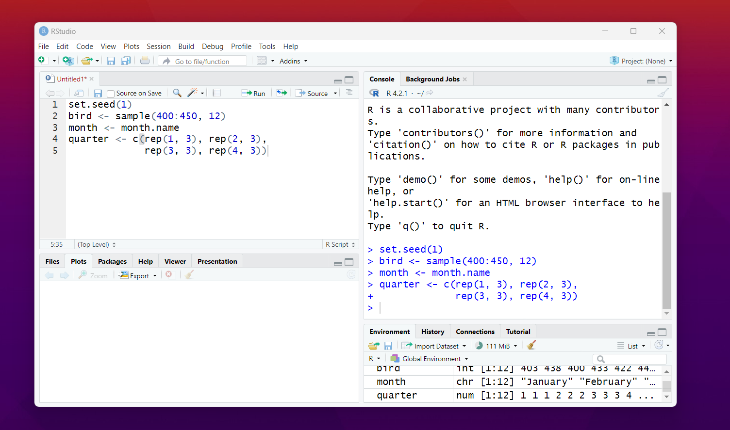
In this tutorial, first thing you would be doing is the sample data. Like say you have some samples like bird visitation. You visit the birds in particular month and you want to draw the dot plot there.
So here's the sample data.
set.seed(1)
bird <- sample(400:450, 12)
month <- month.name
quarter <- c(rep(1, 3), rep(2, 3), rep(3, 3), rep(4, 3))
Now that you have this data, you can go ahead and build on the same. Your data in the RStudio should look like this.

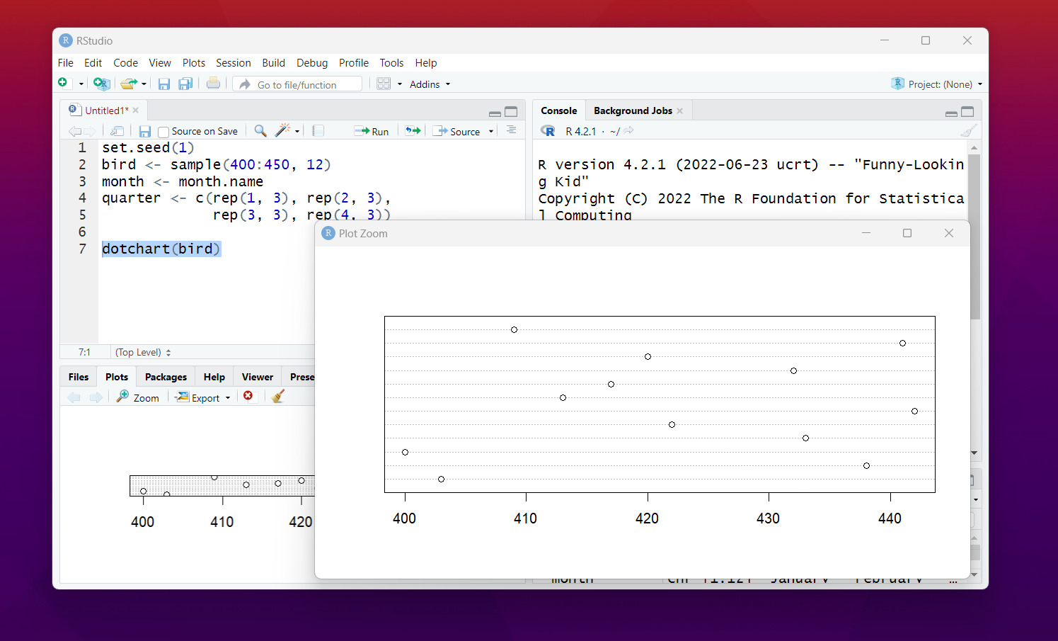
So here's the observation of simple data related to birds.
dotchart(bird)
The output plot should look something like this.

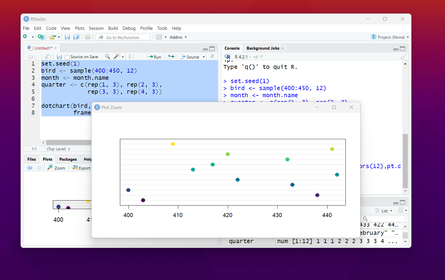
I also added some custom properties and it would show you some new results out of the same.
dotchart(bird,pch = 19,col = hcl.colors(12),pt.cex = 1.5,
frame.plot = TRUE)
Here's the new output.

So we have learned how to draw the dot plot and also managed to change some of it's properties. As you can see it would be reasonable to make use of the variety of properties and different data when you want to plot some dot plots. You may want to test out some of the datasets from the Kaggle.
That's it, we have learned how to draw the dot plot and it would be fun to chart them out with variety of use case. Some of the use case would be useful in context of the dataset from the kaggle. Like say you want to try out some university data or the data from the UN and the govts. It would be fun for that.
Next series I would be adding one more new plot. And then maybe I can show some different graph and chart library. It was fun making some of the specific charts and the graphs. Overall I would say some of these graphs are easier to build and draw upon but overall it can be fun to try them out as well.
If you like data science, cloud, database related content you may want to check out my channel from the above video and you may want to keep tab on it. Your share and the subscription would help me a lot. Especially I want you to share the video as that would help me reach more students.
If you happen to like this content, do give me feedback over there and that would help me improve my efforts in near future.
Thanks for your contribution to the STEMsocial community. Feel free to join us on discord to get to know the rest of us!
Please consider delegating to the @stemsocial account (85% of the curation rewards are returned).
You may also include @stemsocial as a beneficiary of the rewards of this post to get a stronger support.