R Language - How to Create CalendR Plot
In this post, we take a look at How to Create CalendR Plot in R. It's one of those tutorials where you will learn how to play with the calendars and use them for visualization. Something you can find that a lot of data specific jobs would require.
Previously I explained to you How to Create Dendrogram Plot in R. You can check that tutorial and see if you can make something like that yourself. It's one of those population specific plots which are worth trying out. And now the calendar related data can be plotted which includes the Lunar data with todays tutorial.
Make sure to use the RStudio IDE for plotting these plots and they can turn out to be pretty useful for you to plot. I think they can be exported into the JPG and the PDF file format too. So it's something worth exploring for your use case.
I have created a video to give you an overview on How to Create CalendR Plot in R. You should give this one a try.
For this tutorial, you can make use of the following libraries. So do check the code below.
install.packages("calendR")
library(calendR)
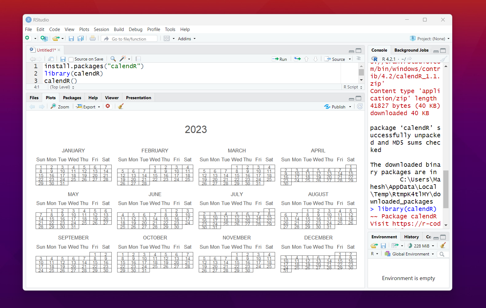
Now to see the calendr in action you can use the following function.
calendR()
This should give you the below output.

The function that you would see which does not mention the year, it would default to the system year. So today being the day in the year 2023. So they can easily see the output like that. So the export options people have with the PDF and the JPG for the output of the file.
calendR(year = 2024)
Now the thing is that we have new year coming up right? So we can see the output for the year 2024. You can go as far as the system supported calendar. And same can be done for the lunar calendar.
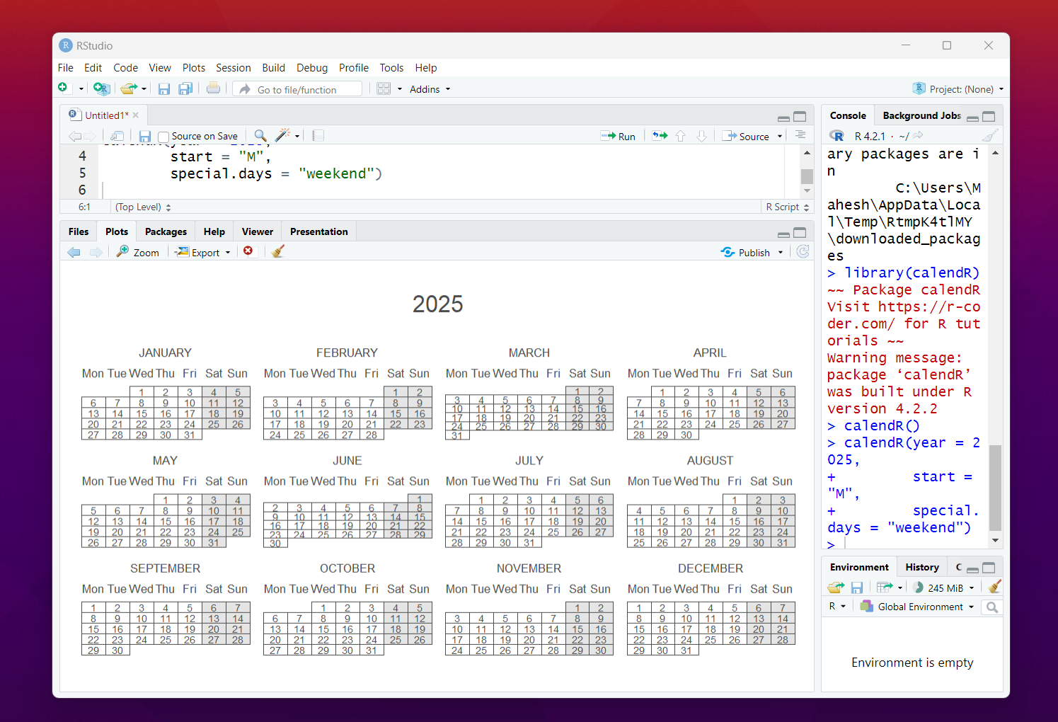
Now let's discuss the scenario where you have the Monday as the start of the day and you want to highlight the Saturday and Sunday as the days of the weekends. You can make use of the calendar update in that case for better output.
calendR(year = 2025, start = "M", special.days = "weekend")
You can check the output for the same below.

That's it. There are lot more things to explore in the documentation. I would be covering the Lunar data specific charts separately and It'd be fun for sure. But if you are planning on exploring this on your own. You may want to try out the docs.
I have cleared a lot of small things. I am soon going to cover some of the Oracle cloud related tutorials. But that's a bit far ahead in the near future. So hopefully I am sure to get your attention with the data science for now. And in near future more of content in the analytics would be shared.
One interesting app is SPSS. I have covered Jamovi recently and I wish to cover the SPSS in near future. As of now I feel like the app has not much given weight and there are paid apps out there which have lot of tutorial. So I will cover jamovi some day.
If you are into data science and wish to cover some of the libraries and want my help through videos then do let me know. I would love to upload the content and then maybe that would help both the sides in terms of solutions.
If you happen to like this content, do give me feedback over there and that would help me improve my efforts in near future.
Congratulations @devpress! You have completed the following achievement on the Hive blockchain And have been rewarded with New badge(s)
Your next target is to reach 600 comments.
You can view your badges on your board and compare yourself to others in the Ranking
If you no longer want to receive notifications, reply to this comment with the word
STOPTo support your work, I also upvoted your post!
Check out our last posts:
Support the HiveBuzz project. Vote for our proposal!
Thanks for your contribution to the STEMsocial community. Feel free to join us on discord to get to know the rest of us!
Please consider delegating to the @stemsocial account (85% of the curation rewards are returned).
You may also include @stemsocial as a beneficiary of the rewards of this post to get a stronger support.