3d render of backalley - Multiverse film scene
Hi artists, today i'm gonna show u my render of a Back Alley from my upcoming animated film.
basically, this is set with the cyberpunk/futuristic theme, and it has been built in Blender 3d.
so, what exactly does it take to craft such a scene? - It isn't a lot to be honest, if you know what you're doing. the key is finding superb blender tools to slash your workflow time(considerably).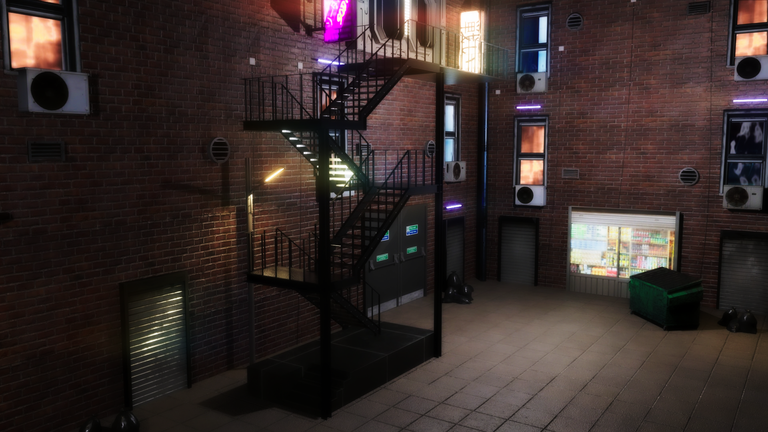
The main props of this scene are:
- a tall enclosed aall with modern bricks, like an apartment complex.
- a Fire Escape stairs, leading to the top floors, originally this is uniquely designed for just one WINdow on the top floor. can you spot it? xd
- a Scifi structural 3d metallic window. you can't get a closeup view of it because of my camera angle but, i can show it closely next (bt will it reveal the innermost room secrets?)
- oh yeah, quite visible, ACs units, lighted windows, dim windows, store fronts.
- let's not forget the dumpstars and trash lying around, with ofc the neon light signs.
And Voila.... Check it Out Below!!

Concept:
it's a pretty perfect scene, which can still be improved (to be more realistic), now i can give the realism as 6/10. Why? - You feel as if you're in a magical miniature world, don't you think so??
now, it ISN't meant to give the feeling of miniature, so maybe i've more work to do, but magical then yes. i think i could solve the problem by changing the camera properties during the main animation rendering, AND scaling the world ofcourse. we shall see!
this world is meant to depict a Mid-Income slightly rough(like street) area but still cozy working families i guess, it's set in a time like 20 years from now, what are ur thoughts then, does it match the concept?
A little Editing + Behind the Scenes for You!
maybe u didn't catch me (if u dnt know much abt 3d), bt I've edited the image render above, the original image has the natural lighting of the world, the neon effects are more down-toned and it doesn't got as much contrast xd.
So THIS IS IT!
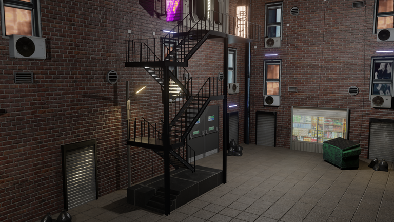
gosh, i can't lie but i prefer the edited version, it's much more badass and less cute. sadly, i will have to render with the normal view when my animation is ready BUT if i wanted to ramp it up, guess what i have to do?
...
well, i gotta set my mind on x5 render time for each frames, plus i gotta add more lighting techniques(and learn them first), i gotta make the world more complex(not individual lighting)to get the contrast that affects darker areas etc.
regardless of my choice, my animation is still gotta be good-looking because this is one of my best scenes so far!
enjoy some eye-pleasing behind-the-scenes
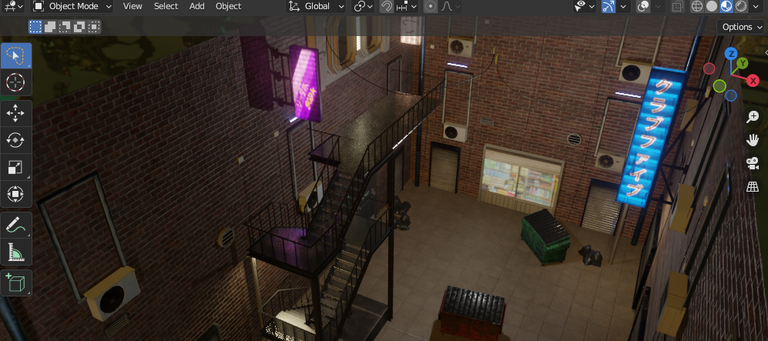
birdseye view
solid view
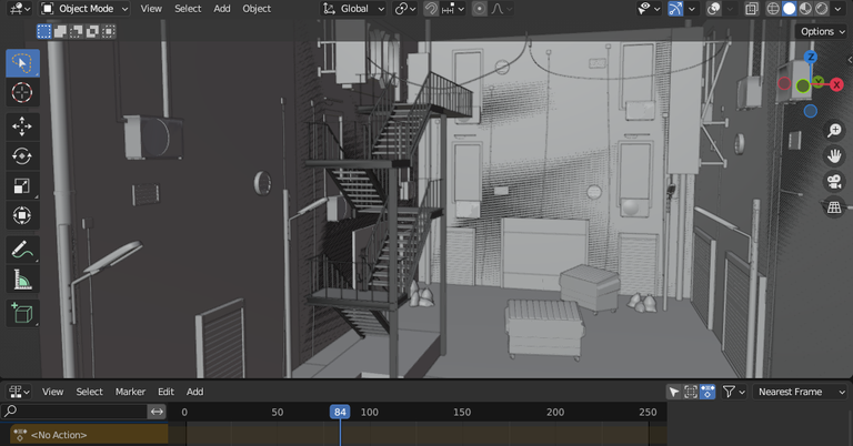
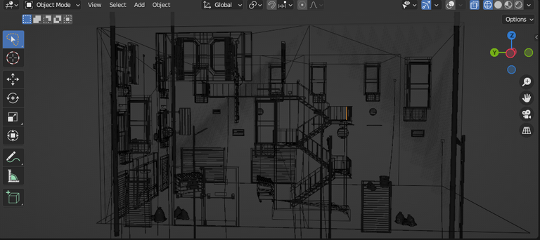
wireframe view
and with that i end this insightful post about 3d backalley render and my animated film... see you soon!
It's a good job, it reminds me a lot of the video game Deus Ex Revolución, the areas between the buildings in the first part of the game.
thanks, looked at that video game, didn't seem to be a much futuristic game bt cool. 🤞
Yes, it is true, the game intended to show itself as a future that was as close and possible as possible.
As a kind of alternate reality, it didn't create too far-fetched a reality.
oh i see, i think that's really cool and i'm also interested in stuffs like that. (like), a virtual world that is realistic (quite possible in say 20 years from now), rather than fantastical worlds with aliens n creatures etc.