🍉 [MELN] Weekly EXODE Wrap-Up #49
Hello, Pilots!
There has been a lot more art revealed this week, while the EXODE team is still hard at work on the Alpha 4 UI and the interactive reports.
📰News:
Elite Card Art
We have been informed that some cards will have different art for their Elite version. As an example, this is the standard Second Sister:
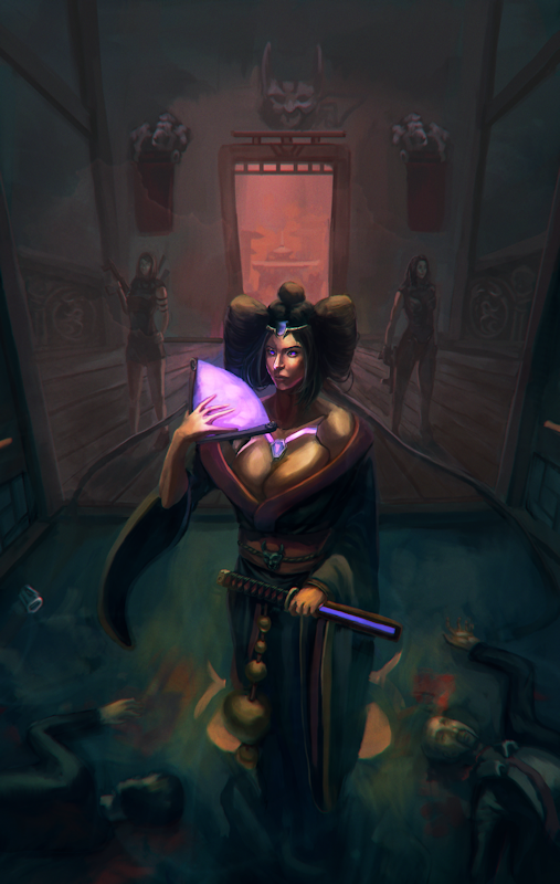
While this is the Elite Second Sister:
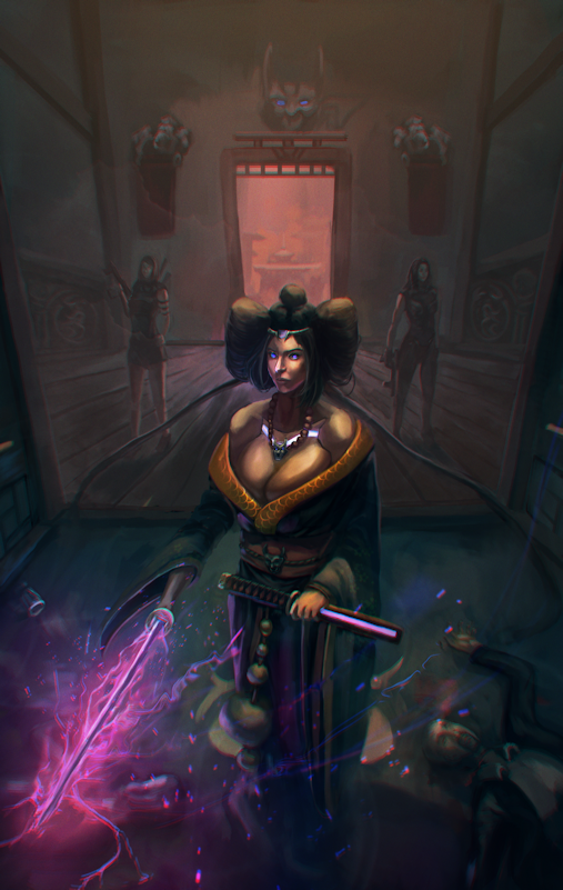
More Card Art
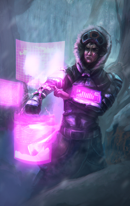
This is a draft of a new Beta Card called the "Antares Supersettler".
Miscellaneous Art
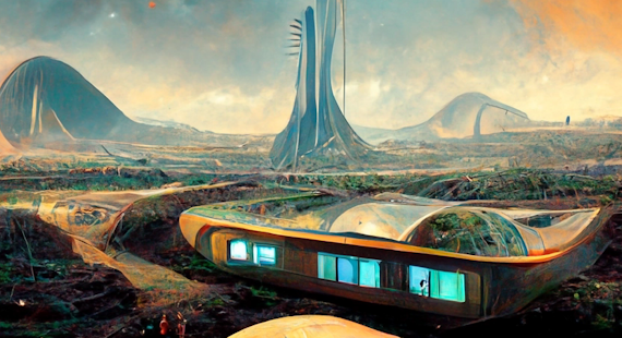
We are getting to see more art of backgrounds and other non-card related things, such as this colony illustration:
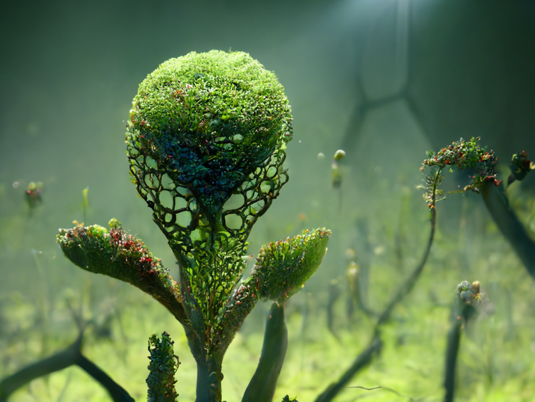
Or this plant illustration:
More art will be created for technologies and other in-game content.
🎁Giveaway:
This week, 3 different people have a chance of winning:
1x LITTLE Buddy
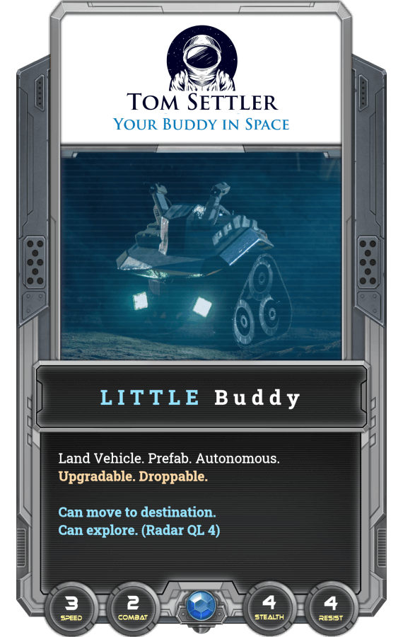
This card is similar to the Friendly Eyes in that it is also autonomous, but different because it is a land vehicle. The other main difference is that the radar is one quality level higher, and it has combat stat. We have yet to see how important a combat stat, and one level of radar will be, so I'll stick with the Friendly Eyes for now. I feel that there is less chance of it being destroyed since it can fly. I hope I don't have any flying hostiles!
🎉Previous Winners:
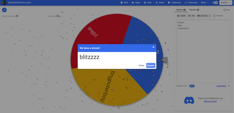
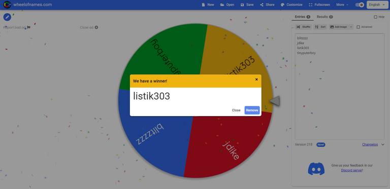
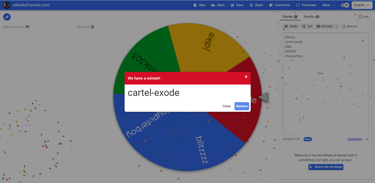
Congratulations @blitzzzz, @listik303, and @cartel-exode You have been sent Holidays # 998f74fe9605b851c8f8988dd5bc4b2f, # bcfa756b1b44a6e749de793a8bb16016, and # a8ee2b4442ca20fffc7f86d8a2fee201 respectively.
My favorite comment came from @jdike
I suppose the sistser might be hell of a fighter, perhaps with some sneaky features, as well. The hyperbrainer I do not know. Would be really cool if he could create like some kind of alternative reality or "disguising the 'real' reality" (sorry for that one). But I think until we really know for sure some time will pass! ;) I hope I still have a !PIZZA to share
PS: And big thanks for your prizes!!
You have been sent Syndicate Hacker # 85f908f401c361d019dba1e2ab855be0.
➡️How To Enter:
- Upvote this post
- Reblog this post
- Comment what you think of the background artwork and any suggestions you have for what could be better illustrated.
The winners will be chosen by random on Monday, August 15.
As usual, I will be tipping comments with #hivepizza!
I will also be giving a 'SurPRIZE' to my favorite comment.
EXODE is a real-time strategy space colonization game here on the Hive Blockchain. If you still have not bought your starter pack and signed up, use this Referral Code(c956af8) and you'll also receive 2 free Alpha Booster Packs with 5 NFT cards each and a free Epic Alpha Character. For more information and links, check out the developer's page, @elindos and this post by 🍉 [MELN] Head Scientist @proto26. Join the EXODE Discord Server!
Looking at the draft new cards the artwork looks a little more cartoony than most of the older cards. I assume this is because the finishing touches have not been done. The previous cards are smoother in transitions in the colors. It makes them look much more realistic even though you can tell they are art works and not pictures. I like the soft look of the previous issues.
The picture of the plant thing is totally incredible. That kind of artwork showing up as a picture of the plant you are researching would be very cool. If it could be parameter driven generation and create illustrations like that, you would truly have a break through.
Really looking forward to the coming artworks ...
Good helpful feedback sckoarn, I'm sure the team appreciates it.
!PIZZA
mmm i would like a background with some sort of "filter" that gives to the background artificial movement like in this image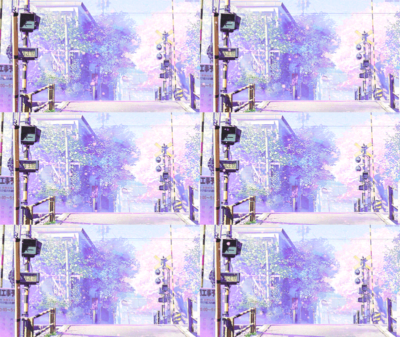
I actually love the idea of this! It seems like a simple thing they could add to make it a lot cooler, although it may be more complicated than I think it is.
!PIZZA
I'm loving that colony illustration, i feel this background pictures are really important and the guys are doing a great job with the details and environment feeling.
I can't suggest any changes because i love it, but i can say that the themes maybe can change, i would like to see the same or another picture but red with the house destroyed with a volcano making some damage or something like that, maybe you can re-use the foundation and make another ambient just with some little changes.
Thats it!! love the work keep going.
I agree completely. Backgrounds are super important for immersive art. People love drawing characters but if those characters don't fit into the world then it doesn't make sense.
Also good solutions to cut down on the workload.
!PIZZA
I think there ist Always room for improvement but it is looking already good! !PIZZA
For sure.
!PIZZA
PIZZA Holders sent $PIZZA tips in this post's comments:
birdbeaksd tipped taradraz1 (x1)
birdbeaksd tipped noctury (x1)
birdbeaksd tipped blitzzzz (x1)
jdike tipped birdbeaksd (x1)
birdbeaksd tipped jdike (x1)
birdbeaksd tipped amaillo (x1)
blitzzzz tipped birdbeaksd (x1)
noctury tipped birdbeaksd (x1)
birdbeaksd tipped sckoarn (x1)
birdbeaksd tipped bfc4exode (x1)
@birdbeaksd(8/20) tipped @listik303 (x1)
Please vote for pizza.witness!
Love the detail in the background artwork.
The shot of the plant actually looks like a macro mode photograph. There's an incredible amount of detail in it. Would be great to see where the artists got their "inspiration" from when drawing that. 😱
I'm also really impressed by the artwork for the Elite version of cards. Most card games would just slap a gold border or holographic foil over it, but this one makes subtle (but obvious) changes to the card details. A nice refreshing change indeed. 😊
!PIZZA
I must agree, I loved the plant art as well.
Also agree with the Elite art, I used to play Splinterlands and their version of the better cards was just a gold border lol.
!PIZZA
Thanks!
@listik303
Always.
!PIZZA
Thanks again!
And again I really LOVE the artwork - here Exode can compare itself to the top of the industry! As for my personal taste: Only point where I could see any improvement on is the colony illustration. I find the building in front somehow a bit odd - like there is something wrong in terms of perspective - but again that might just be me. ;)
!PIZZA
Fair enough. I don't see anything wrong with it but I am not an artist.
!PIZZA
!1UP
Click the banner to join "The Cartel" Discord server to know more!
You have received a 1UP from @luizeba!
@oneup-curator, @thg-curator, @vyb-curator, @pob-curator, @neoxag-curator
And they will bring !PIZZA 🍕.
Learn more about our delegation service to earn daily rewards. Join the Cartel on Discord.
IGN: @bfc4exode
I do really like the idea of creating different art for Elite versions of the card, and the plant is awesome, very realistic looking. The colony background is a nice upgrade from the barren planet surface. It would be fun to have that background upgrade at cetian milestones in colony progress, and if we came across an abandond colony we could derrive the level of progress made there by the look of the ruins and potentially plunder their level correct left items that survived the atmosphere.
!hivebits
!1UP
Posted using 1UP - Play2Earn & NFTs
Success! You mined .9 HBIT & the user you replied to received .1 HBIT on your behalf. mine | wallet | market | tools | discord | subscribe | <>< daily
Contest: Nominate a symbol for the quark.
I LOVE the idea of the backgrounds "upgrading" as your Colony progresses, very cool idea!
!PIZZA
Congratulations @birdbeaksd! You have completed the following achievement on the Hive blockchain and have been rewarded with new badge(s):
Your next target is to reach 5000 upvotes.
You can view your badges on your board and compare yourself to others in the Ranking
If you no longer want to receive notifications, reply to this comment with the word
STOPSupport the HiveBuzz project. Vote for our proposal!
There is definitely a marked difference in the style of the alpha cards and the artworks being released now. Don't get me wrong, that is in no way negative. In fact, I think it makes the entire collection much more colorful (no pun intended). How boring would it be if everything looked the same? Exode art is growing and evolving.
Greens and blues are pleasing to my visual receptors so my favorite background art s the colony/farm with the habitat. I could see the plant image being the icon for a tech or something related. I have no idea what to suggest for improvement; I am always blown away by what the team offers. And to think these aren't even the finished, polished products!
Thinking... Processing... Perhaps more planet landscape art!