Splinterlands art contest | Satha Toledo
Hello friends good evening.
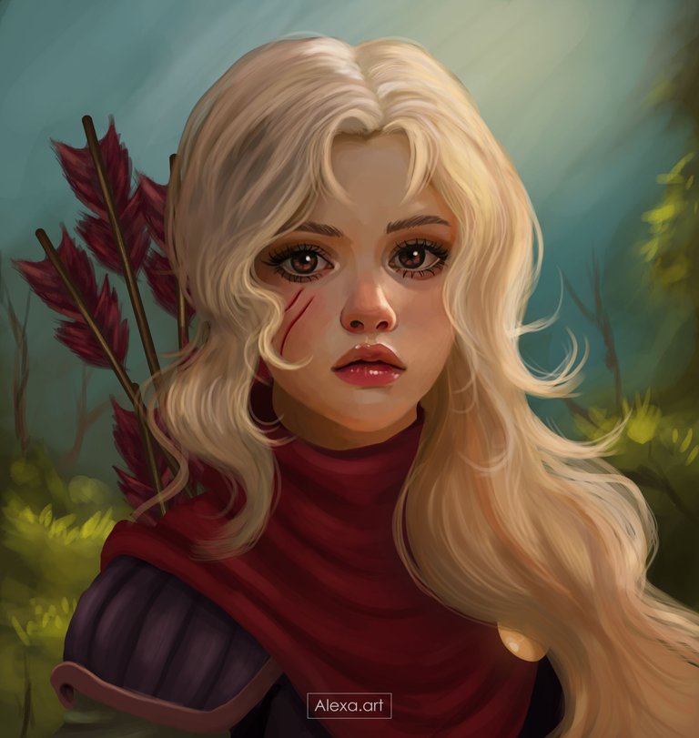
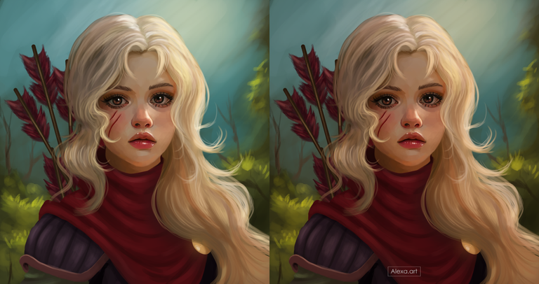
After a week absent in the @Splinterlands contest today I come back with a Fan art of Satha Toledo, I really liked the appearance of this card, she looks like a very rough and bold girl, however, I wanted to try giving a twist to this rough appearance and show a more tender and angelic face, respecting the part of the visible attire because I really like her clothes, this is a drawing that I had to start from scratch twice because the file was damaged, but I filled myself with patience to start again and show this result, I think that her expression reflects how I felt in these moments of stress hahaha, I hope you like it.
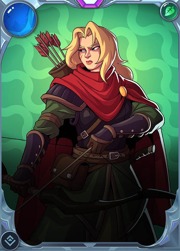

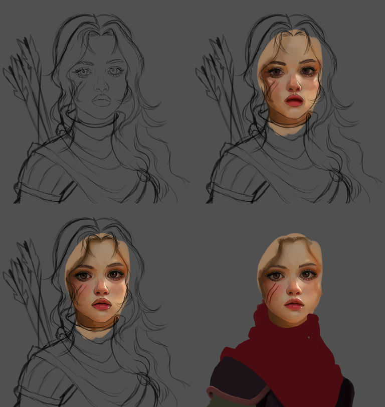
I started my sketch trying to make the costume as similar as possible but changing the face a lot, as I mentioned I wanted a more tender and innocent face, I started adding color to the skin using mostly warm tones like beige, some browns and orange, in a new layer I added more colors to the skin and mixed them to leave a soft texture, I started to fill the clothes with colors similar to the original card.
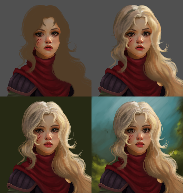
Then I started to paint the folds of the fabrics with lights and shadows and then I started to paint the hair, the hair was what worried me the most since I think blonde hair is the most difficult to paint, I started to experiment with many shades of beige, white, brown and also some grays, then I started to give more detail changing the size of the brush and creating different lines of hair. The background was improvised, I felt that she would look good in a background that looked like a forest or something like that, I started painting with a watercolor brush letting myself go and at the end I created these plants in the corners and a blue background that simulates part of the sky, I liked how it looked, something rustic in contrast with the character.
I painted the arrows on her back and of course I added a layer of light where I illuminated a little more the eyes, mouth and nose, however, this time I didn't want to abuse the brightness.
Finally I edited the image giving it a little warmer tone that combined everything with the environment where I imagined she would be.

Tools:
- Photoshop CC 2022
- XP-PEN deco 01 v2
Herramientas:
- Photoshop CC 2022
- XP- PEN DECO 01 V2
Foundation: alexa-artx
Rarible : alexaart
KnownOrigin: alexaart
Terra Virtua: AlexaArt
Opensea: alexa-art
Makersplace: alexaartx
Ghostmarket : alexa
NFT Showroom: alexa.art
Twitter: Alexa_Ys
Instagram : artx.alexa

Precioso !
Gracias!!
Incredible!!@ love her hair colour
Thanks alot dear!
https://twitter.com/AlienArtHive/status/1775221664394944997