Splinterlands art contest | Runemancer Kye
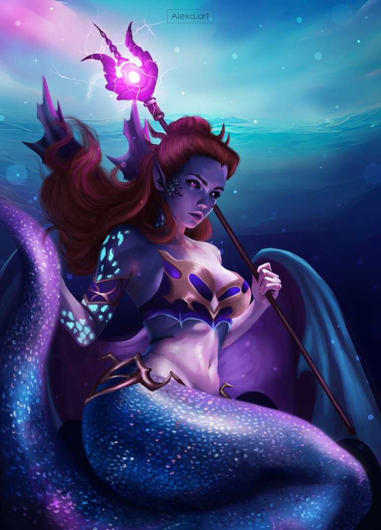
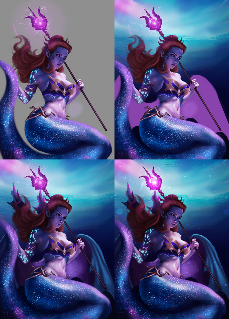
Greetings friends, this week for the @Splinterlands contest I felt quite motivated to make this card, I was really waiting for that motivation and patience to be able to represent this card, because it is one of my favorites aesthetically and I must confess that I was very afraid to do it because of the many details it has, however, I took two days in which I dedicated myself 100% to this drawing, I just finished it today and I love the result, I wanted to make this version with many similarities to the original but I also wanted to make some changes like for example the costume, making a lighter top but of a material similar to the original, I also wanted to make a tail with a lot of light to simulate those scales that I was so afraid to paint, I spent many hours to be satisfied, but I'm really happy with the result, I hope you like it as much as I do.
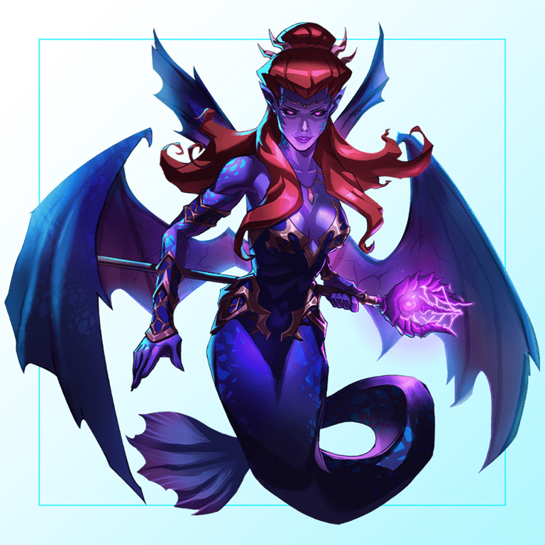

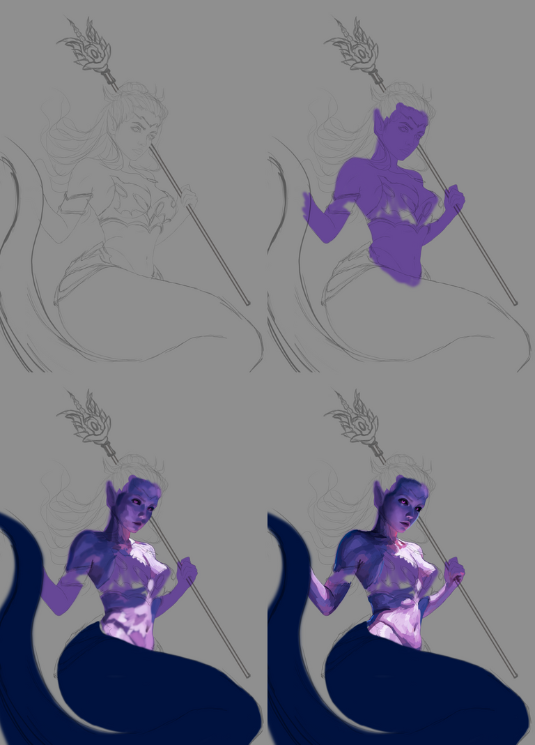
I made my sketch, which was not easy because I had some problems with the tail that little by little I was fixing until I had a cleaner sketch, the colors I used are based on the original card, but with a lower saturation to not make it so bright, I put a purple base on the skin and then I added a new layer where I started to add shadows and lights, for the tail I used a dark blue base.
Then I created another layer where I started to blur the colors of the face, giving it more shape.
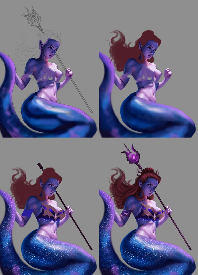
I mixed all the tones in the rest of the body creating a volume and folds in the part of the abdomen, I also chose some tones for the tail which I applied using a diffuse brush and without much detail, I mixed a little these colors until softening them and giving that smooth aspect to the tail, I painted the hair with this reddish tone as a base.
The tail was a subject that had me quite worried because the scales are a fundamental part and I wanted to make many scales, I filled myself with patience and I began to draw a million small points and circles of quite saturated colors that, when seeing them from far away give that illusion of scales, although this was the most tedious part, I loved the effect it had, I continued painting the top of the clothes, this time I used a king blue to lighten and a darker blue for the shadows, I made up a bronze design covering the top and added shadows and highlights to give it volume, then I painted the cane with dark purple and 3 different shades of purple and pink to start give it details.
The hair still needed those highlights to give it movement, so I added a dark brown for the shadows and a light reddish for the highlights.
Then came the moment I enjoy the most and that is to add small illuminations, and that's what I did in all the parts that should stand out, I also painted some rays coming out of the cane.
For the background I did this kind of ocean, without many details, then I painted the wings, for which I subtracted the colors of the original wings but in a less saturated range, finally I added the last details, a little shadow on my character, some lights and a little color adjustment.

Tools:
- Photoshop CC 2019
- XP-PEN deco 01 v2
Herramientas:
- Photoshop CC 2019
- XP- PEN DECO 01 V2
Foundation: alexa-artx
Rarible : alexaart
KnownOrigin: alexaart
Terra Virtua: AlexaArt
Opensea: alexa-art
Makersplace: alexaartx
Ghostmarket : alexa
NFT Showroom: alexa.art
Twitter: Alexa_Ys

This post has been manually curated by @steemflow from Indiaunited community. Join us on our Discord Server.
Do you know that you can earn a passive income by delegating to @indiaunited. We share more than 100 % of the curation rewards with the delegators in the form of IUC tokens. HP delegators and IUC token holders also get upto 20% additional vote weight.
Here are some handy links for delegations: 100HP, 250HP, 500HP, 1000HP.
100% of the rewards from this comment goes to the curator for their manual curation efforts. Please encourage the curator @steemflow by upvoting this comment and support the community by voting the posts made by @indiaunited.
Thanks for support team!
You did a spectacular design, I liked the color combination you used. Congratulations 🎆
Thank you so much 😊
I love the soothing colors in this drawing!
Thanks alot @fijimermaid 🙏🙏
Do you know you can win a Chaos Legion pack and many other things just by following some simple steps ?? Check out our Latest Daily Showcase and Participate our latest Giveaway. Thanks
Great job, you have an admirable technique
Thank you so much!
Fantastic one. Full respect. Wow that's more than beautiful. ❤️ Surely you will win. 😊
Aww thanks alot!
Amazing. Love the colour pallette
!SLOTH
Learn more about the SLOTHBUZZ Token at Sloth.Buzz and consider sharing your post there or using the #slothbuzz next time
(1/4)
Thank you! 💙💜
Fantastic~~😍😍
Thanks ❤❤
Omg the colours 😍 this is breathtaking dear. Welldone
Thank you so much dear @leeendah 😍
Thanks for sharing! - castleberry#6859

Thank you 🙏🏻
Beautiful, sensuous, and ready for a fight.
Oh yeah! 😁 Thank you🙏🏻
Tremendamente genial. Te caracteriza un estilo único en tus trabajos. Felicidades lindo resultado.
Muchísimas gracias!