Continuum Seer

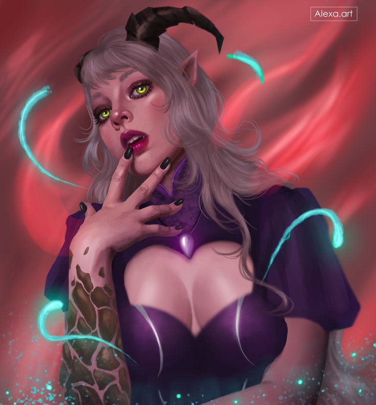
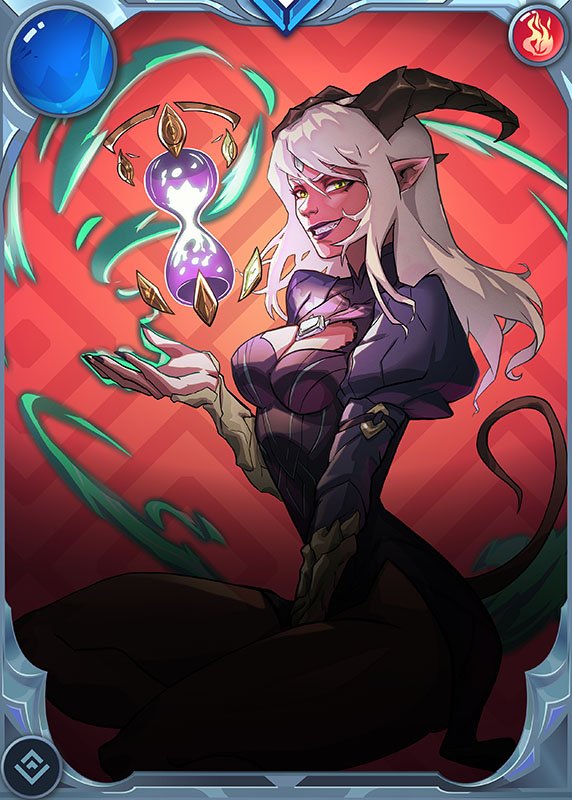
Very good evening everyone, this week I have chosen the Continuum Seer card to recreate it in my style, this card is pretty cool and visually appealing, I wanted to draw her face and torso, adding cyan lights around her, the background is not my favorite but I wanted to add it in this color which is very similar to the original card, I have never done this so I thought it was a good idea to add that background color, the suit is similar but not the same, I liked this design a little simpler, some details were missing like this hourglass that we see in the original image but I really didn't know how to incorporate it in my drawing and I didn't want to discard this sketch because I really liked it, despite all the difficulties I love the final result, I hope you like it.


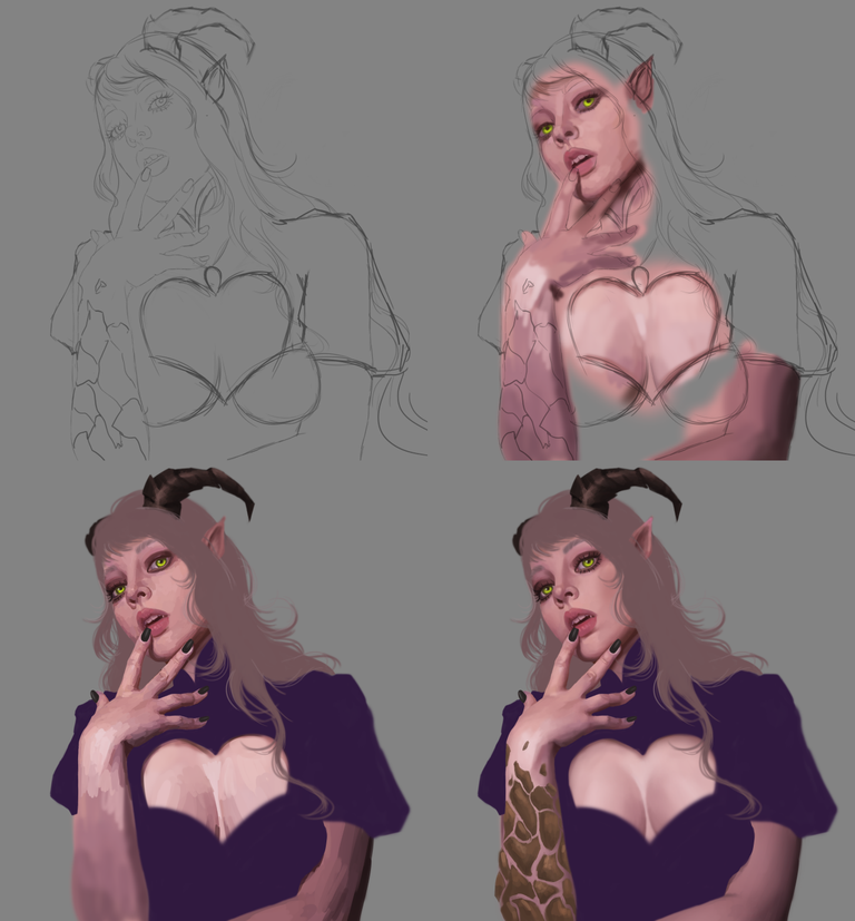
I made the sketch and chose the tones for the skin, at first I placed a fairly pale pink skin tone and for shadows I used browns, in a new layer I added more colors giving full shape to the face and then I began to mix them to leave a smooth texture, then I added base colors in the hair, horns and costume, in her hand I painted rock textures that I could see on the card, I did it with a little darker tones than the original.
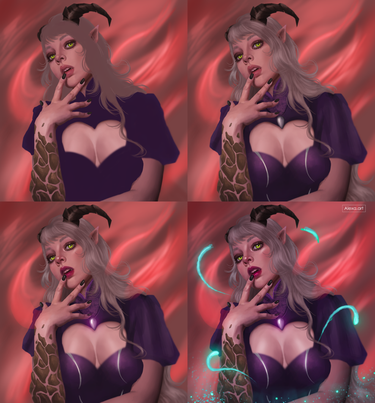
For this point I decided to paint the background before forgetting the idea I had of adding a background color similar to the original card, believe it or not sometimes I think of things and in seconds I forget them, so I played with different shades of red and flat brushes, then I realized that my character was very pale and did not combine well with the background, so I added a little more color to the skin giving it a warmer and darker tone, I started to detail the clothes and hair using lights and shadows and then I wanted to add more color to the face and change the color of the lips, I also added lights in certain parts of the face that I wanted to highlight, I painted different lines of cyan color and some dots in the lower part to give that “magic” effect, I finished my drawing editing the image to give it more contrast and improve the color.

Tools:
- Photoshop CC 2022
- XP-PEN Deco Pro
Herramientas:
- Photoshop CC 2022
- XP-PEN Deco Pro


Buen trabajo fanart !!
Gracias!
👏👏👏👏❤🏆
Amazing as always 😍
!PIZZA
!PGM
Thanks!! 🥰
$PIZZA slices delivered:
@eustace-kidd(2/5) tipped @alexa.art
Haz reproducido bastante bien el concepto principal de la carta. Los detalles son hermosos y el trabajo con la piel es sensacional. Excelente trabajo 👌
https://x.com/AlienArtHive/status/1839047978050310498