Colors are sad too

Good evening Aliens.
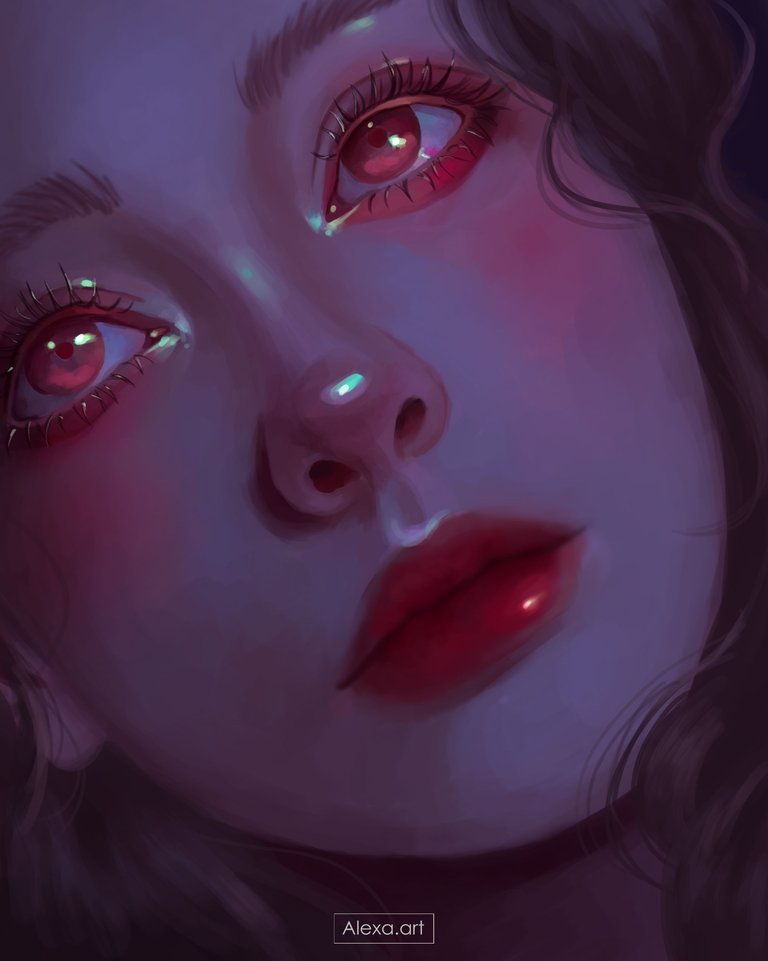
Today I wanted to experiment with a different color palette, this time I used purple, pink, red, brown and even green colors for some illuminations, this was practically an experiment and I really liked it, I love those touches of light with that green color and the reddish tone inside and outside the eye, everything together gives me a nostalgic vibe.
When I imagined this drawing I thought of using “normal” colors at first, but I've been a little down in the mood and I wanted to represent my mood a little in the choice of colors that despite being striking at the same time are desaturated and that manages to capture emotions a little sadder.
I hope you like it.

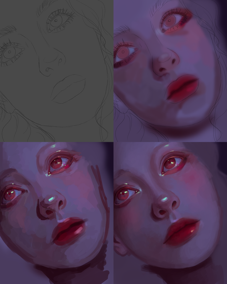
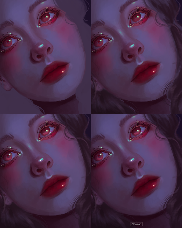
This time I wanted to paint a very close face although I wasn't looking for an extremely realistic portrait, but I wanted to highlight a lot the eyes, so I made my sketch and the color choice started by placing a lilac base color all over the face, for the shadows a darker desaturated lilac and in some parts like the eyes a dark pink and a lighter pink, for the lips I used an almost red tone, then I added a new layer adding more shades to give a complete shape to the face, this time the nose was quite difficult I don't know why, but finally I managed to give it shape when I went to the next layer where I started to mix all the colors leaving a soft and much more detailed skin.
I painted the hair and added some highlights and shadows, without detailing too much because the hair is almost not visible, I added more color to the face giving more red tones on the cheeks, nose and under the eyes, intensified the highlights in all the parts I wanted to highlight and then I did a very light image editing since I was quite satisfied with the final result.

Tools:
- Photoshop CC 2022
- XP-PEN Deco Pro
Herramientas:
- Photoshop CC 2022
- XP-PEN Deco Pro


https://x.com/AlienArtHive/status/1833601086579708033